From 2006 to 2026 — a word about the new site
-
@WillReyesDan Happy to address the double click head-on, because it was a deliberate decision: there are four views for the results (Grid, Browse, Modern, Compact) — and I wanted you to actually find them, instead of landing in one view and never learning the others exist. Your choice is saved.
Honestly: I'd prefer to have just one search button. But I was worried people would freak out even more because they couldn't find "their" view anymore. If a majority here wants the direct one-click path: tell me — that's exactly what this thread is for.
About the grid: "feels like a mess" doesn't give me much to work with yet — what exactly bothers you? Spacing, image sizes, information density? Write it up point by point and it gets handled.
-
I'm still getting aclimatised to the new UI, but depsite initial trepidation it's growing on me, and I can definitely see many areas that have improved tremendously.
Please don't let put off by the negative comments. I wouldn't expect everyone to like the changes, at least not at first glance, but while criticism is always expected it only carries any meaning when it's expressed politely, constructively and, above all, qualified. If "garbage" is all the feedback someone can give then it should be ignored. That's not feedback, just moaning.
-
So: tell me specifically what feels like a step backwards to you — point by point. Lists like that are being worked through faster here than ever before.
@joker
My biggest blocker is here, this is site-breaking for me:
https://community.gaytor.rent/post/341229 -
@joeythomas91 how did you even manage to run compact view on mobile? notice that even in your own screenshot there are only grid and browse view avaiable. if you're on mobile you should be using grid view. but in case you really want to use the table mode, that issue you mentioned have already been fixed yesterday, the table will not expand beyond your screen size anymore.
the problem is, table mode will only work if you enable desktop mode.
-
how did you even manage to run compact view on mobile? notice that even in your own screenshot there are only grid and browse view avaiable.
It appears as an option when adjusting browser zoom level, which I've had to do numerous times to make the site navigable on my mobile phone.
if you're on mobile you should be using grid view.
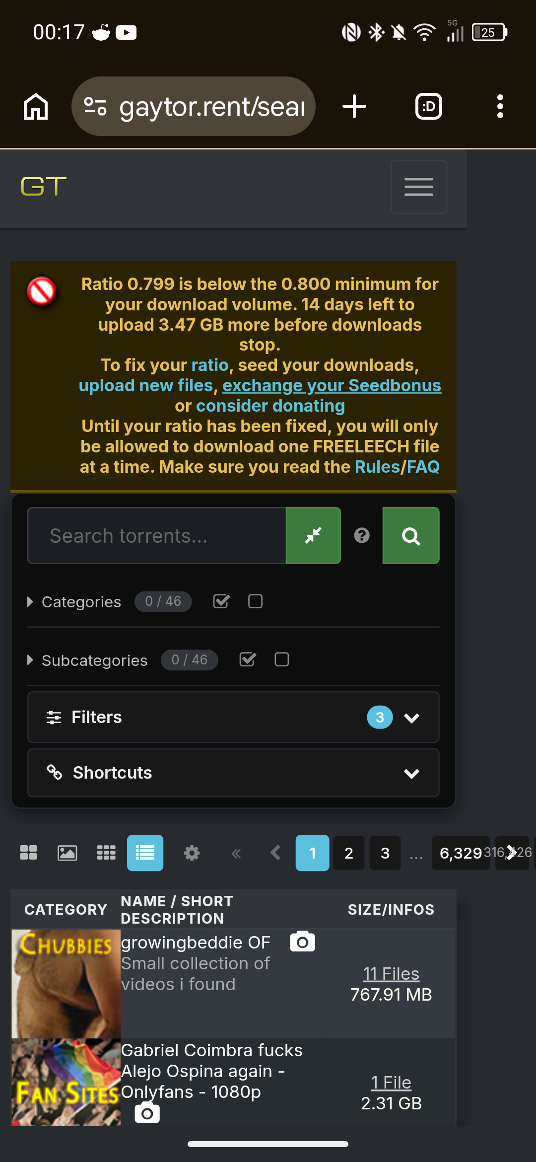
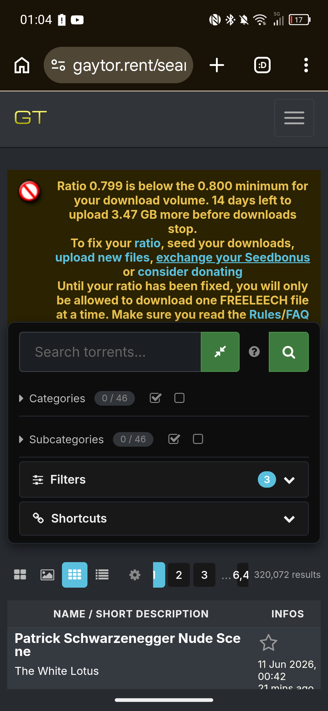
The table from the old site is much more convenient on a mobile device. I'd only see the thumbnails I want to see, and torrent name and description was neatly listed.
in case you really want to use the table mode, that issue you mentioned have already been fixed yesterday, the table will not expand beyond your screen size anymore.
Thank you for pointing this out, I appreciate it. However, the UI doesn't have the same restriction; the page navigation buttons extend off-frame and the text overlaps each other.
Also, the view is now only showing one category image per torrent, whereas the old site showed all/top categories per torrent. And, the ability to scroll through a description is not working.
-
@joeythomas91 said:
Also, the view is now only showing one category image per torrent, whereas the old site showed all/top categories per torrent. And, the ability to scroll through a description is not working.those features you are describing never existed in the Legacy view, they are from Modern view (the 3rd button in your screenshot), there all subcategories are visible and you can scroll through the descriptions.
-
@joeythomas91 Update: this is now fixed properly. Two things were wrong — the table really could grow wider than a phone screen (that part went out the evening after your screenshots), and on phones the Compact/Modern views were hidden from the view switcher entirely. That was the wrong kind of fix. As of today all four views are selectable on every screen size, and the tables fit (and fill) the width cleanly from small phones up to desktop. Please reload once — and if anything still pushes the page sideways on your device, tell me right away.
-
@ianfontinell @Joker
Thank you both. I appreciate the support with this.@ianfontinell said:
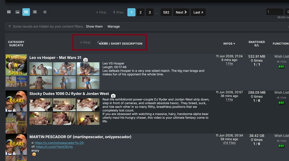
they are from Modern view (the 3rd button in your screenshot), there all subcategories are visible and you can scroll through the descriptions.Can you point me towards the subcategories? They don't seem to be showing in Modern view:
@Joker said:
all four views are selectable on every screen size, and the tables fit (and fill) the width cleanly from small phones up to desktop. Please reload once — and if anything still pushes the page sideways on your device, tell me right away.Everything lines up now, thank you.
Perhaps it would be better to move the page-arrow buttons to the next line? As you can see in the screenshot, the page numbers are now truncated. Adding a line break and moving that to the next row would give more room for the buttons to display cleanly. -
@joeythomas91 said:
Can you point me towards the subcategories? They don't seem to be showing in Modern view:actually my bad, it's categories aren't showing in modern view on mobile
-
@joeythomas91 Both done — and you called the pager fix yourself: the page arrows and numbers now sit on their own row under the view icons, so nothing gets truncated anymore. The category and subcategory icons are also back in Modern view on phones (compact, so the table still stays inside your screen width). Please reload once. Thanks for the precise reports and the screenshots — that's exactly what makes these quick to fix.

-
@WillReyesDan Good news on the double-click: the direct one-click path to search/browse is in now — no more landing in a view and then clicking again. As for the grid still "feeling like a mess": I genuinely want to fix whatever bugs you there, but I need specifics to work with — is it the spacing, the image sizes, the amount of info per card? Point it out and it gets handled.

-
@ianfontinell And you caught the mobile category gap yourself while walking joey through the views — that one's handled now too: the category and subcategory icons are back in Modern on phones, and I trimmed the wasted padding around that first column so the description gets the room it deserves. Looking forward to that changelog of yours.

-
I appreciate the work you've put into this. I do but....
The visual hierarchy of it is just all over the place right now. I feel like it prioritizes showcasing features instead of usage.
I think one the primary example of this is the sizable section relegated to tags right after the title section instead of the torrent description and size.
There's also this overload of buttons, For example there are three "Add a comment" button. Also there's the gift bonus points being individual buttons instead of being a drop-down.
To end this with a positive note, I really like tags and the "more like this". That must've been a hell to implement, algorithmically.
Anyway, Cheers for the hard work and looking forward for further developments to this fresh exciting direction.
-
I think the redesign is a step in the right direction. It will take time getting used to, and sure there will be some adjustments to be made, but I've honestly seen worse upgrades. Thanks for the great work
-
Most of the changes are fine but there are a couple that are irritating.
Not having pic thumbnails along the top of the listing in the compact (legacy) view and not having the file/comment listings as a hover pop-up.
-
@Joker I appreciate your fast work, it feels better now.
1- As for the grid view part, you can see this snapshot, some icons are overlapping and I feel like the category picture is a little bit big
2- Is there a way to make the pictures in "Browse View" bigger like in the old version?
3- I'm using Firefox on PC and I get "Allow www.gaytor.rent to send you notifications?" all the time I clicked Block multiple times but it keeps happening since the browser temporary block i
-
@WillReyesDan All three handled:
1 — the overlapping pager bits: I couldn't reproduce that overlap at your window size no matter how I scroll — can you tell me your browser + zoom level, and whether it survives a reload? If it does, a full-window screenshot would help. I want this one.
2 — bigger Browse pictures: done — there's a new setting for it. My page → Search settings → "Browse-view tile width": Normal / Large / X-Large (the old-site feel is roughly Large). Columns still auto-fit your window.
3 — the notification prompt: fixed properly. The site now asks once — if you block or dismiss it, it never asks again; only re-enabling desktop notifications in your settings re-arms it. Reload once and the nagging stops.
The category picture size is noted. Thanks for the precise list — exactly how this thread is supposed to work.
-
@underlvr Both of those still exist — they moved into settings:
File/comment lists on hover: My page → Search settings → "File-list / comments popup" → set it to Hover (default is Click so popups don't ambush you while scrolling).
Thumbnails on hover in Compact view: already live — hover the torrent title (or the camera icon). Want it even lazier? Set "Thumbnail hover trigger" to Row and the strip opens from anywhere on the row, old-site style.
Worth a stroll through the My page — there's a setting for almost everything now.
-
@SalbakutaMas Thanks — noted, all three points are on the list. (Small footnote: two of the three "Add a comment" buttons are the deliberate top+bottom pair for long comment threads — but I hear you on the overall button density.) And glad the tags + "more like this" land well — that pipeline is exactly where a lot of what's coming next builds on.
-
@joker
Encountered an issue today: embedded images (rather than attached photos) within torrent descriptions distort the Search page on mobile view.Link:
https://www.gaytor.rent/search.php?view=modernStandard view (note right-hand column is not visible)
Zoomed out view
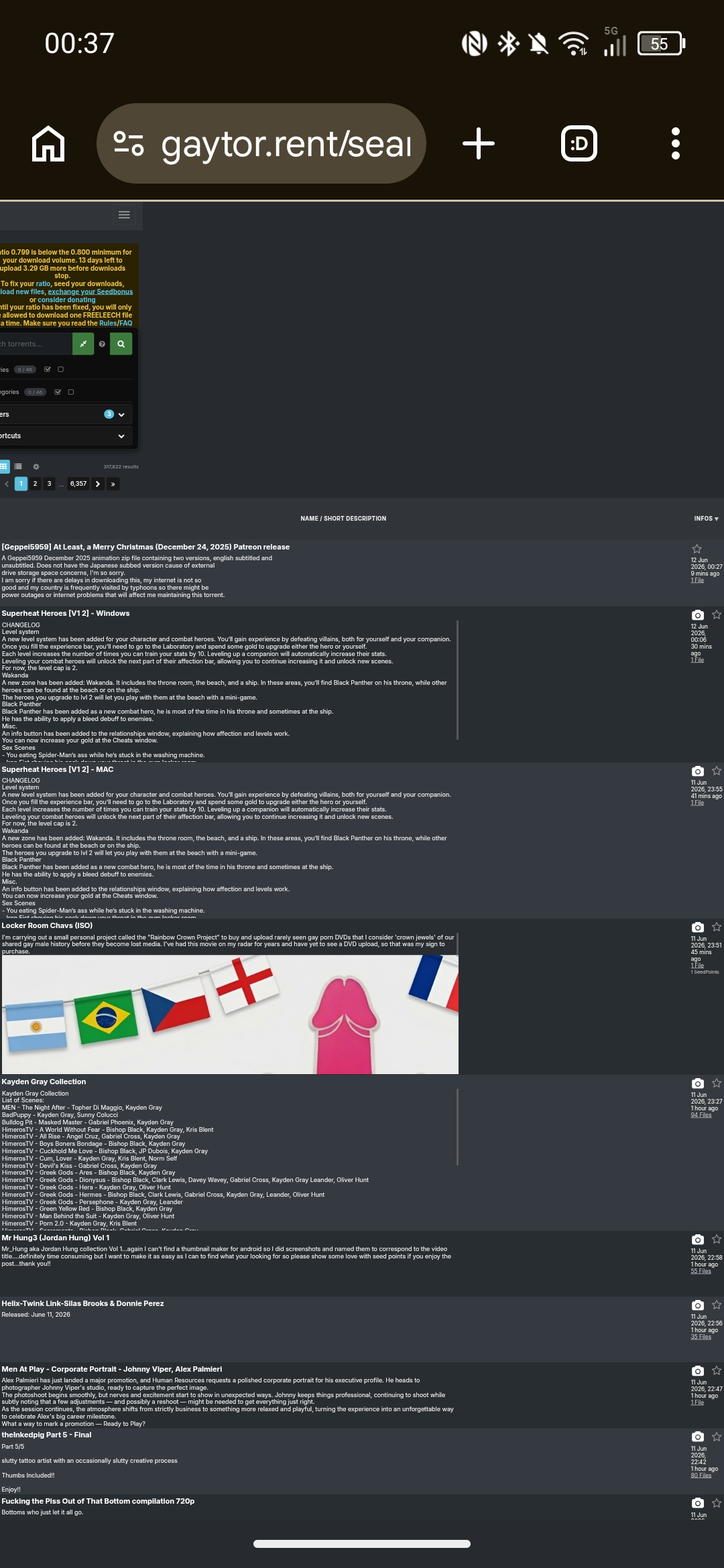
Clicking on a category to avoid the torrents with embedded banners allows the table to load normally.
Suggested workaround would be to prevent embedded images from displaying in torrent descriptions on the Search page, either removing the image outright or perhaps replacing image with "[Embedded image]" or "[Open to view image]" if you wanted a CTA prompt.Edit - forgot to say, because the page structure is affected, the lightbox ends up misaligned.
Hello! It looks like you're interested in this conversation, but you don't have an account yet.
Getting fed up of having to scroll through the same posts each visit? When you register for an account, you'll always come back to exactly where you were before, and choose to be notified of new replies (either via email, or push notification). You'll also be able to save bookmarks and upvote posts to show your appreciation to other community members.
With your input, this post could be even better 💗
Register Login