From 2006 to 2026 — a word about the new site
-
I think the redesign is a step in the right direction. It will take time getting used to, and sure there will be some adjustments to be made, but I've honestly seen worse upgrades. Thanks for the great work
-
Most of the changes are fine but there are a couple that are irritating.
Not having pic thumbnails along the top of the listing in the compact (legacy) view and not having the file/comment listings as a hover pop-up.
-
@Joker I appreciate your fast work, it feels better now.
1- As for the grid view part, you can see this snapshot, some icons are overlapping and I feel like the category picture is a little bit big
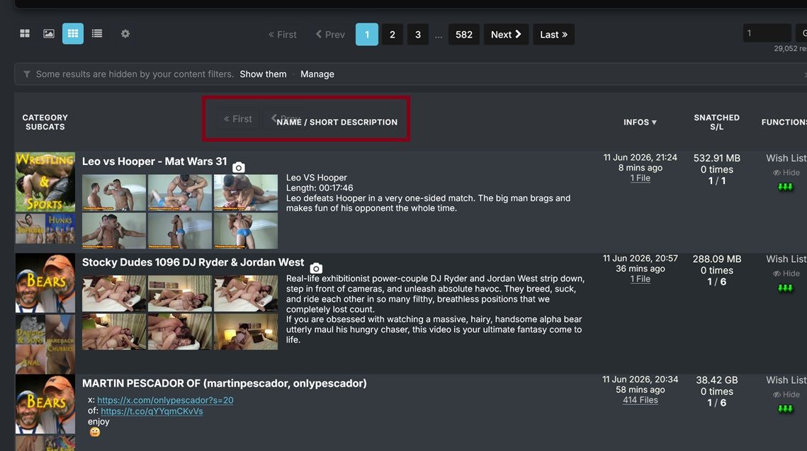
2- Is there a way to make the pictures in "Browse View" bigger like in the old version?
3- I'm using Firefox on PC and I get "Allow www.gaytor.rent to send you notifications?" all the time I clicked Block multiple times but it keeps happening since the browser temporary block i
-
@WillReyesDan All three handled:
1 — the overlapping pager bits: I couldn't reproduce that overlap at your window size no matter how I scroll — can you tell me your browser + zoom level, and whether it survives a reload? If it does, a full-window screenshot would help. I want this one.
2 — bigger Browse pictures: done — there's a new setting for it. My page → Search settings → "Browse-view tile width": Normal / Large / X-Large (the old-site feel is roughly Large). Columns still auto-fit your window.
3 — the notification prompt: fixed properly. The site now asks once — if you block or dismiss it, it never asks again; only re-enabling desktop notifications in your settings re-arms it. Reload once and the nagging stops.
The category picture size is noted. Thanks for the precise list — exactly how this thread is supposed to work.

-
@underlvr Both of those still exist — they moved into settings:
File/comment lists on hover: My page → Search settings → "File-list / comments popup" → set it to Hover (default is Click so popups don't ambush you while scrolling).
Thumbnails on hover in Compact view: already live — hover the torrent title (or the camera icon). Want it even lazier? Set "Thumbnail hover trigger" to Row and the strip opens from anywhere on the row, old-site style.
Worth a stroll through the My page — there's a setting for almost everything now.
-
@SalbakutaMas Thanks — noted, all three points are on the list. (Small footnote: two of the three "Add a comment" buttons are the deliberate top+bottom pair for long comment threads — but I hear you on the overall button density.) And glad the tags + "more like this" land well — that pipeline is exactly where a lot of what's coming next builds on.
-
@joker
Encountered an issue today: embedded images (rather than attached photos) within torrent descriptions distort the Search page on mobile view.Link:
https://www.gaytor.rent/search.php?view=modernStandard view (note right-hand column is not visible)
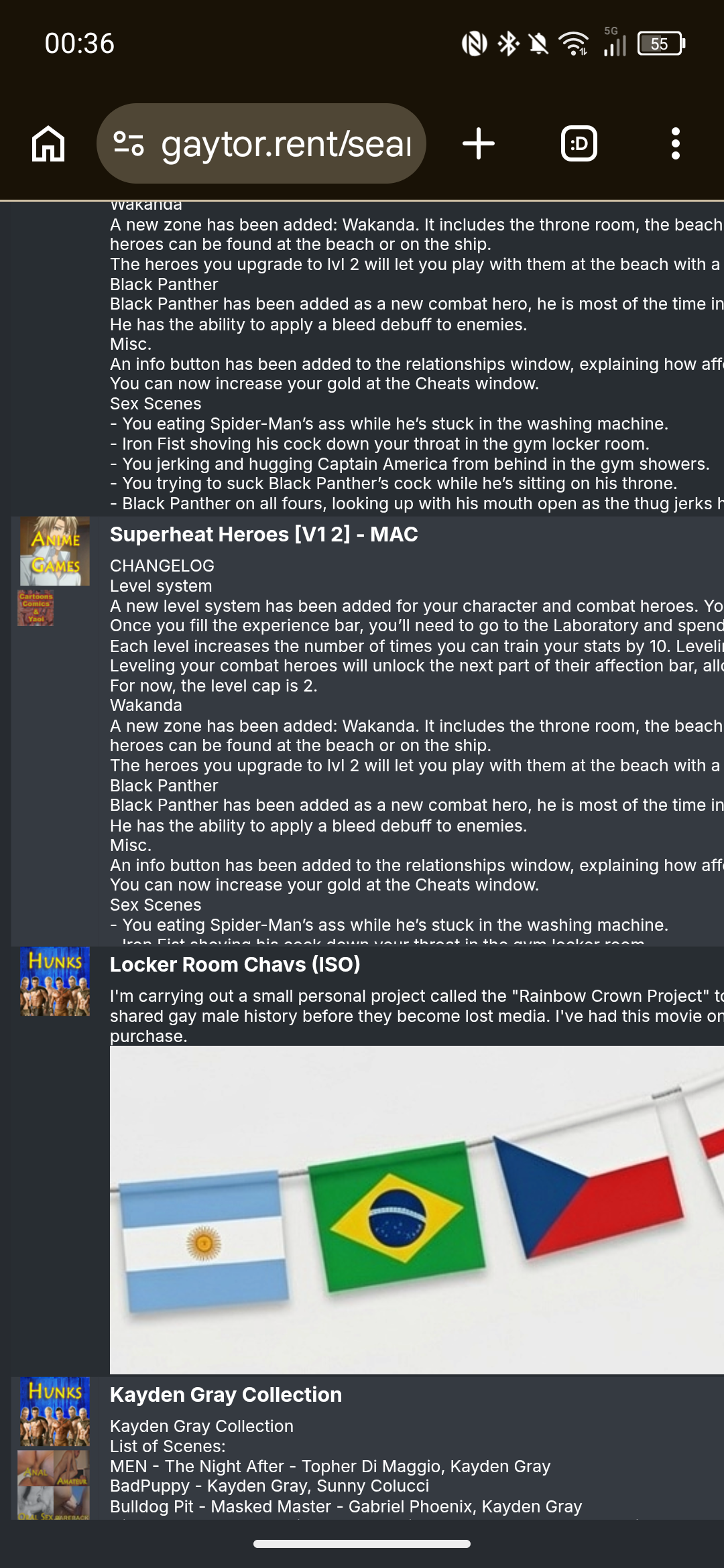
Zoomed out view
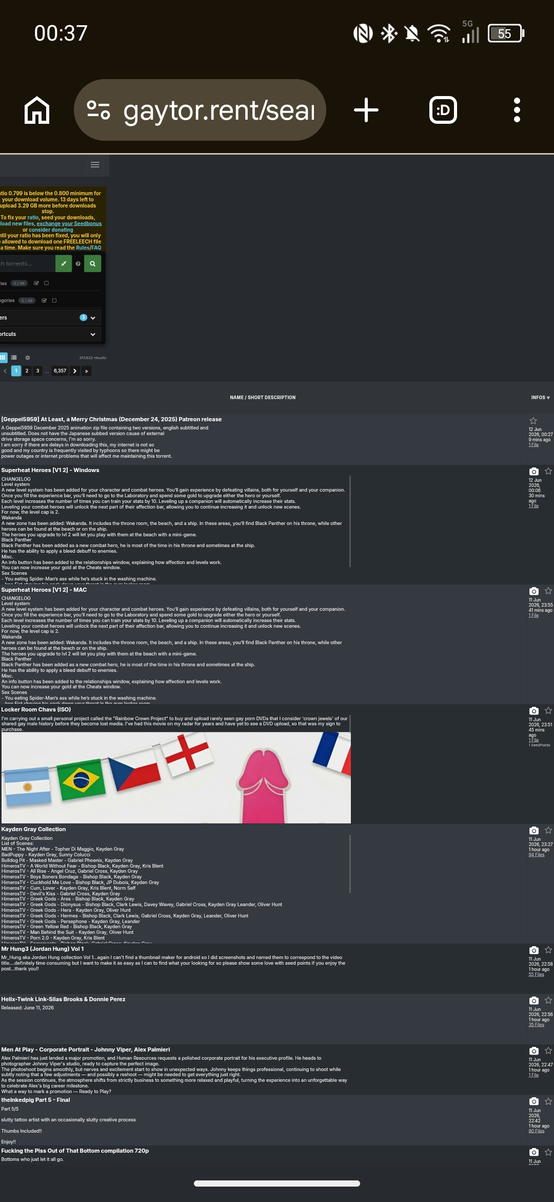
Clicking on a category to avoid the torrents with embedded banners allows the table to load normally.
Suggested workaround would be to prevent embedded images from displaying in torrent descriptions on the Search page, either removing the image outright or perhaps replacing image with "[Embedded image]" or "[Open to view image]" if you wanted a CTA prompt.Edit - forgot to say, because the page structure is affected, the lightbox ends up misaligned.
-
@Joker Hi, I rarely comment in the forums and I'm not a huge user of torrenting (certainly not compared to some of the superusers!), but I found the new site to be immediately usable. Great job to the seamless migration.
Did I need to pause for a split second to understand the new filters or layout options? Sure, but the site is still immediately recognizable and usable.
Some comments:
-
Grid View - Thumbnail - The thumbnail photos are in a horizontal landscape mode, which tend to cut off heads.
-
Grid View - Thumbnail Carousel - Sometimes when I flip through the thumbnails, it opens full lightbox. This tends to happen to torrents further down on page
-
Torrent Page - Text - The text "well seeded (59 seeders) — a reseed request isn't needed right now" could be better aligned in the sidebar versus the [Request Reseed[ button
-
-
Most of the changes are fine but there are a couple that are irritating.
Not having pic thumbnails along the top of the listing in the compact (legacy) view and not having the file/comment listings as a hover pop-up.
There is an option to turn these on/off and even change how they appear in your profile settings. The pop ups are turned off for files by default, but you can go into your settings and turn them on. You can also choose whether they pop up simply by hovering over the number of files in the results page, or if you have to click the number of files to make it pop up.
Click your username in the top right corner of the page on the torrent side, then go to "Profile". Down the left side click on "Search", then in the row of tabs at the top of the page, click on "Results list". The option you'll be looking for is "File list / comments popup".
-
Hi Dear. Thanks a lot for all the time, attention and, obviously, all the love you poured to this site!
Changes are sometimes painful, and it takes time to get used to them, and reap all the benefits of these changes, and I am sure that people eventually will do that and appreciate all the effort you put in them, and the improvement.
I would like to quote nevertheless that I see now you can't rate a torrent unless you already downloaded it... which is not entirely right. Previously I was able to make a partial download (Specially of those larger uploads with a zillion of files) and rate the torrent.... The same with those torrents that I already got somewhere else and was familiar with their content.
Keep up with the good work!
-
Light user here from South-east asia:
Just wanted to say a big thanks to Joker and all the constructive feedback users have given.
I seldom seed as I'm mostly on here looking for obscure files and ID-ing clips. But I do donate to get my seedcount back up, as I like to think its a way to contribute to the site.
A mostly visual person, I quite like the choice of Grid results. It's become my default now.
Haven't used the forums in ages, but managed also to ID a clip I really enjoyed in a matter of days.Being in the service line, I know a little about how backend overhauls contribute a lot, but seldom get appreciated upfront.
Kudos to all who contributed, but Joker especially.Looking forward to enjoy all the hardwork you've put in*

-
I was loving the "other users also snatched" on each torrent (or something like that, I don't really remember the name) to find new content, but it seems to be gone?

-
I was loving the "other users also snatched" on each torrent (or something like that, I don't really remember the name) to find new content, but it seems to be gone?
Wasn't it just renamed to "more like this"? This is the only panel i remember seeing in the torrent details page.
-
I was loving the "other users also snatched" on each torrent (or something like that, I don't really remember the name) to find new content, but it seems to be gone?
Wasn't it just renamed to "more like this"? This is the only panel i remember seeing in the torrent details page.
Not really... I had both working at the same time. it was a new feature I was using for quite some time in the new page. But it's gone since a week or so ago.
It was way better than "more like this", since usually that one is barely related to the torrent.

-
 K kalayaan pinned this topic on
-
@TorrentzMast Thanks for the kind 2006→2026 note! Good news on the "Other users also snatched" box — it had quietly broken after the switch and is fixed now, so it's back on the details page (between the description and "More like this"). Appreciate you flagging it.
-
@Joker I love the new interface. It's pretty Modern & not slow like the last one.
-
Hi there, thanks for the hard work. I’m not sure how I feel about the new site just yet, I’m giving myself time to get used to it. My worst initial irks have been sorted, notably by changing the page width (though that’s not very intuitive).
I’m guessing the translation was done with AI. At times it’s quite good, but other times it’s completely inconsistent. I’m guessing that’s whenever there’s not enough text for context.
For example, in the main drop down menu, "My sessions" is translated into French as "Mes séances" which is wrong, we use the word "sessions". In fact when you click onto the page, the description does use "session". However, the title of the page is in English ("Buggie’s sessions").
Also, when displaying torrents, it correctly says "Commencé" for started torrents, but uses the infinitive "Avoir" for "Have", which makes no sense - it looks like you’re talking about a credit. You would use "Téléchargé" (downloaded) or "Obtenu" (obtained).
Also the text "Upload votre premier Torrent et recevez des points bonus !" (Upload your first torrent and receive bonus points!). The French have borrowed upload as a verb, but it’s conjugated wrong. It would be "Uploadez" in this sentence.
The First/Prev/Next/Last haven’t been translated.
There are probably plenty of others I haven’t picked up on. I want to stress that I’m not criticising as a whole, this is undoubtedly a godsend for someone who doesn’t speak English. But it’s a little clunky at times.As a side note, the "Modern view" feels a bit too busy for me, I think it could be tweaked a bit to be clearer. I prefer the "Grid view", however you can only see a single thumbnail without hovering, and often the one shown isn’t the best. It would be nice to be able to see the others in the grid too.
-
Don't care much for the new layout of the site, honestly. The old version may've seemed out of date, but at least it was familiar.
Also don't like that we're being forced to change our passwords. I like using the same one consistently throughout many sites. I don't care about the supposed risks of passwords being leaked or whatever. It's weird that our arms are being twisted with the threat of not being able to login soon unless we get new passwords.
-
@Buggie I disagree about the grid thumbnails.
There may be others images. There may be a dozen or more, but let's say it's restricted to six. So either those six are the same size as currently, meaning you'd be lucky to see more than a torrent or two on a page before you have to scroll down, or all six need to be reduced to fit the current window. Meaning they'd be way too small to see much of, so you'd need to open the torrent anyway.
Some torrents only have one image. Some have a couple. How do you handle those different quantities in a consistent way that's not aesthetically jarring?
You see the initial image, decide whether it's of enough interest to investigate further, and hovering over the camera shows you small thumbs as a pop-up A single click of the camera opens the images in the same large view you can scroll through, and clicking away from the image, or the "X" dismisses that popup, leaving you to carry on looking where you left off.
It would, though, definitely be handy for the uploader to specify which pic is shown as the primary thumb. It's probably tied to the order in which they were added, but I've only uploaded one new torrent since the change. Previously, the last image uploaded was the first shown. That seems to have reversed. But a simple "make this the primary image" ability would be excellent. But I'm sure there are far more important issues to address first.
-
@Joker Thank you so much for your time, effort and dedication. I'm loving the new site.









Hello! It looks like you're interested in this conversation, but you don't have an account yet.
Getting fed up of having to scroll through the same posts each visit? When you register for an account, you'll always come back to exactly where you were before, and choose to be notified of new replies (either via email, or push notification). You'll also be able to save bookmarks and upvote posts to show your appreciation to other community members.
With your input, this post could be even better 💗
Register Login