From 2006 to 2026 — a word about the new site
-
First off: thanks for all the love.
 A few original quotes from the past weeks: "this upgrade doesn't make any sense to me at all" · "the new UI is really confusing" · "I have mixed feelings on the new UI" · "thumbnails are HORRIBLE" · "garbage" · "hot mess". Don't worry — it all reached me.
Some of you are putting the result on trial pretty hard — because not everything is perfect on the first click, or because you have to adjust a setting first. I actually understand that.
But some perspective: this site had to be carried from 2006 all the way to 2026. In March we would have celebrated 20 years — this work is my gift to the community. I couldn't have built anything new on top of the 2006 "garbage pile", so everything had to be modernised first. What that means in practice:
- Frontend completely new — new design, runs on desktop, tablet and phone
- Backend completely rewritten — 20-year-old code replaced, over 2,000 commits since New Year alone
- User security noticeably higher — 2FA, passkeys, hardened logins and sessions; and "strong" privacy now actually means strong
- Tracker on a whole new level — scales in every direction, unlimited peers, realtime responses, IPv6. And I'm still hard at work on the last bugs there — see the "unregistered torrent" thread, I'll post an update there as soon as the fix lands
- An AI pipeline of my own — it has already tagged and classified 6 million images, and it runs entirely on my own hardware: nothing leaves the house. Smarter tags and search are just the beginning; a lot more is coming your way from this
- Over 340 API endpoints — the foundation for the new QTM and everything that comes after
- 27 languages — the whole site
- Completely new search with relevance ranking
- New upload form plus the Classic Uploader — I tried to make it as easy as possible, and ran quite a few extra laps for that
- Settings for practically everything — views, font sizes, density, homepage … take a look at your My page
- New helpdesk and the forum directly integrated — one login for everything
All of that, by the way: one pair of hands.
And all of it happened on one database, in a running system — no new accounts, nothing to re-register, ratio and history migrated seamlessly. The move itself was invisible to you — except for "everything sucks, the font is too small".
Now the important part: we have only just arrived at this point — and this is where it actually starts. The rebuild was never the prize, it was the entry ticket. I know exactly why the new site doesn't feel like a win at first glance: right now it mostly asks something of you — find a button again, change a setting, unlearn a 15-year-old habit. You have to think too much, and the new things that make all of it worth it are only now starting to land. Judging the whole project today means judging a race at the starting gun.
One more thing: not a single user request from the past 8 weeks has gone unheard. What more do you want? Complaining alone gets you nothing — save that for family, friends or the pub. Suggestions and constructive criticism, on the other hand, have never been handled faster than today. Promised.
And to the member who "spent the first two days hating it" and now "wouldn't go back if you paid me" — thanks for sticking it out. That's exactly the curve.
You have no idea what has happened here — and what's still coming. A fresh start is never easy. I just had to get that off my chest.
-
 J Joker referenced this topic on
-
J Joker referenced this topic on
-
J Joker referenced this topic on
-
Personally, I have nothing but praise and thanks.


I've dabbled a little in website design. That was hard enough when there was no baggage and no-one trying to use things before I'd finished designing and implementing them. What it was like to do so here on a live site with a long history would likely make me want to run away and hide!
Sure, there are one or two minor things that I personally don't like. But I bet there are other members who like it immensely while hating what I feel is brilliant. The words "eggs" and "omelettes" spring to mind, along with the phrase "Rome wasn't built in a day". I'm sure there are more minor tweaks to come.
Can I make a plea to those members who don't like things? Don't just say "I don't like it" or "It's rubbish." WHY don't you like it? WHAT is rubbish? It's fairly hard to address things if you don't know what those things are, so give specific reasons and examples.
In the meantime, @joker, my sincere thanks and admiration for what you've achieved!
-
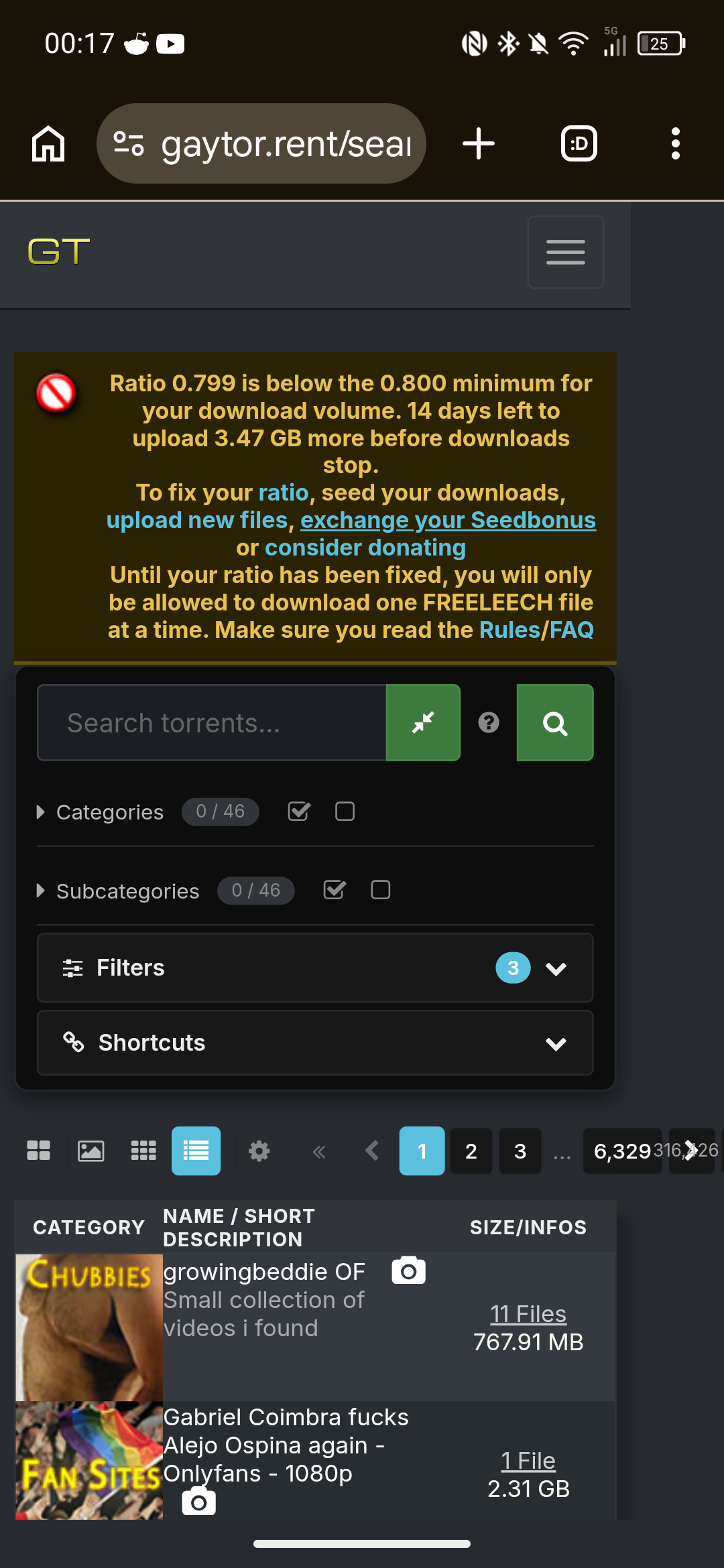
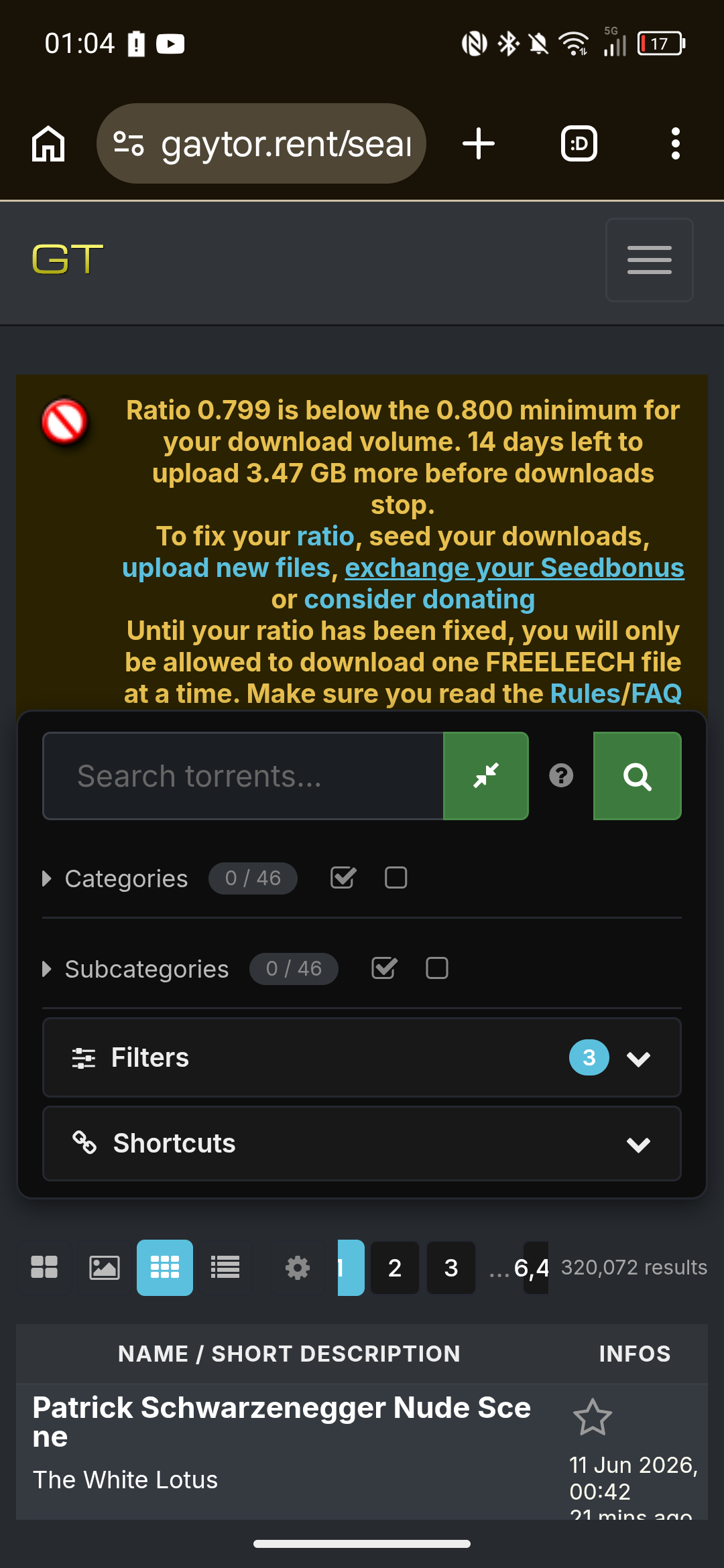
The new design have some issue, for instance now I have to click twice to reach the search/browse page instead of just one click before.
Also the new UI for grid/browse feels like a mess tbh -
One typical internet behavior that we are all familiar with: when things work nicely, you don't get to hear a word from anyone. As soon as something changes, the same people come out of nowhere screaming "wow this shit sucks, who agrees with me?"
While testing the new site, many were the times when I opened the page and rolled my eyes thinking oh no, yet another thing that was working just fine is broken. The same time it would take me to complain in the forum I used to write the admin, explain what's happening, explain why something is not ideal or could be improved further.
I've never seen a website take user feedback so seriously and so quickly. For someone who's seen the new site being built practically in real time, we have come so far in such a small time frame. Here I was thinking it was practically done, that this new site was the gift, only to learn it's just the beginning? I just jizzed a little while I typed that!
A year ago I was posting in the forum that this site was abandoned, not a change in a decade, and then out of the blue a completely new site is here ready for us to try and help improve it.
Also, I am writing a change log for people to have a more comprehensive view of how much was added or improved, how much liberty we have to make the site look exactly how each user finds best.
Thank you mr Joker, and all the people who are taking their time to help improve it by tracking bugs, suggesting changes and new features.
-
Whilst I appreciate the hard work that you've put in, especially as it's all done by yourself, I'm glad you're cognisant of the many issues and concerns being raised. I hope to see them resolved soon so that it stops feeling like a colossal step backwards and I too can benefit from the changes you've hoped to instill.

-
@ianfontinell A thank-you that is overdue at this point: without you I would not have made it. Period.
You tested the new site practically in real time — and instead of complaining in the forum, you wrote to me: what's broken, why it gets in the way, how it could be done better. Countless times, over months, often with screenshots and retests. That's exactly how feedback turned into improvements, often the very same day. And the fact that you're now writing a changelog for everyone says it all — I'm looking forward to it.
And to the many others who have written to me over the past weeks — reporting bugs, sending suggestions, patiently testing again: thank you. You have contributed more to this site than you probably realise.
That's exactly how this works here, by the way: tell me specifically what's wrong — and it gets handled. Promised, see above.
-
@joeythomas91 Promised: I won't stop — not until this no longer feels like a step backwards to you.
But I need your help for that. I'm not Microsoft — I don't have 100,000 people who can test everything before it rolls out. You are my testers. And honestly: even the companies with the 100,000 testers get torn apart by their users after every update.
So: tell me specifically what feels like a step backwards to you — point by point. Lists like that are being worked through faster here than ever before.
-
@WillReyesDan Happy to address the double click head-on, because it was a deliberate decision: there are four views for the results (Grid, Browse, Modern, Compact) — and I wanted you to actually find them, instead of landing in one view and never learning the others exist. Your choice is saved.
Honestly: I'd prefer to have just one search button. But I was worried people would freak out even more because they couldn't find "their" view anymore. If a majority here wants the direct one-click path: tell me — that's exactly what this thread is for.
About the grid: "feels like a mess" doesn't give me much to work with yet — what exactly bothers you? Spacing, image sizes, information density? Write it up point by point and it gets handled.
-
I'm still getting aclimatised to the new UI, but depsite initial trepidation it's growing on me, and I can definitely see many areas that have improved tremendously.
Please don't let put off by the negative comments. I wouldn't expect everyone to like the changes, at least not at first glance, but while criticism is always expected it only carries any meaning when it's expressed politely, constructively and, above all, qualified. If "garbage" is all the feedback someone can give then it should be ignored. That's not feedback, just moaning.
-
So: tell me specifically what feels like a step backwards to you — point by point. Lists like that are being worked through faster here than ever before.
@joker
My biggest blocker is here, this is site-breaking for me:
https://community.gaytor.rent/post/341229 -
@joeythomas91 how did you even manage to run compact view on mobile? notice that even in your own screenshot there are only grid and browse view avaiable. if you're on mobile you should be using grid view. but in case you really want to use the table mode, that issue you mentioned have already been fixed yesterday, the table will not expand beyond your screen size anymore.
the problem is, table mode will only work if you enable desktop mode.
-
how did you even manage to run compact view on mobile? notice that even in your own screenshot there are only grid and browse view avaiable.
It appears as an option when adjusting browser zoom level, which I've had to do numerous times to make the site navigable on my mobile phone.
if you're on mobile you should be using grid view.
The table from the old site is much more convenient on a mobile device. I'd only see the thumbnails I want to see, and torrent name and description was neatly listed.
in case you really want to use the table mode, that issue you mentioned have already been fixed yesterday, the table will not expand beyond your screen size anymore.
Thank you for pointing this out, I appreciate it. However, the UI doesn't have the same restriction; the page navigation buttons extend off-frame and the text overlaps each other.
Also, the view is now only showing one category image per torrent, whereas the old site showed all/top categories per torrent. And, the ability to scroll through a description is not working.
-
@joeythomas91 said:
Also, the view is now only showing one category image per torrent, whereas the old site showed all/top categories per torrent. And, the ability to scroll through a description is not working.those features you are describing never existed in the Legacy view, they are from Modern view (the 3rd button in your screenshot), there all subcategories are visible and you can scroll through the descriptions.
-
@joeythomas91 Update: this is now fixed properly. Two things were wrong — the table really could grow wider than a phone screen (that part went out the evening after your screenshots), and on phones the Compact/Modern views were hidden from the view switcher entirely. That was the wrong kind of fix. As of today all four views are selectable on every screen size, and the tables fit (and fill) the width cleanly from small phones up to desktop. Please reload once — and if anything still pushes the page sideways on your device, tell me right away.
-
@ianfontinell @Joker
Thank you both. I appreciate the support with this.@ianfontinell said:
they are from Modern view (the 3rd button in your screenshot), there all subcategories are visible and you can scroll through the descriptions.Can you point me towards the subcategories? They don't seem to be showing in Modern view:
@Joker said:
all four views are selectable on every screen size, and the tables fit (and fill) the width cleanly from small phones up to desktop. Please reload once — and if anything still pushes the page sideways on your device, tell me right away.Everything lines up now, thank you.
Perhaps it would be better to move the page-arrow buttons to the next line? As you can see in the screenshot, the page numbers are now truncated. Adding a line break and moving that to the next row would give more room for the buttons to display cleanly. -
@joeythomas91 said:
Can you point me towards the subcategories? They don't seem to be showing in Modern view:actually my bad, it's categories aren't showing in modern view on mobile
-
@joeythomas91 Both done — and you called the pager fix yourself: the page arrows and numbers now sit on their own row under the view icons, so nothing gets truncated anymore. The category and subcategory icons are also back in Modern view on phones (compact, so the table still stays inside your screen width). Please reload once. Thanks for the precise reports and the screenshots — that's exactly what makes these quick to fix.
-
@WillReyesDan Good news on the double-click: the direct one-click path to search/browse is in now — no more landing in a view and then clicking again. As for the grid still "feeling like a mess": I genuinely want to fix whatever bugs you there, but I need specifics to work with — is it the spacing, the image sizes, the amount of info per card? Point it out and it gets handled.
-
@ianfontinell And you caught the mobile category gap yourself while walking joey through the views — that one's handled now too: the category and subcategory icons are back in Modern on phones, and I trimmed the wasted padding around that first column so the description gets the room it deserves. Looking forward to that changelog of yours.

-
I appreciate the work you've put into this. I do but....
The visual hierarchy of it is just all over the place right now. I feel like it prioritizes showcasing features instead of usage.
I think one the primary example of this is the sizable section relegated to tags right after the title section instead of the torrent description and size.
There's also this overload of buttons, For example there are three "Add a comment" button. Also there's the gift bonus points being individual buttons instead of being a drop-down.
To end this with a positive note, I really like tags and the "more like this". That must've been a hell to implement, algorithmically.
Anyway, Cheers for the hard work and looking forward for further developments to this fresh exciting direction.
Hello! It looks like you're interested in this conversation, but you don't have an account yet.
Getting fed up of having to scroll through the same posts each visit? When you register for an account, you'll always come back to exactly where you were before, and choose to be notified of new replies (either via email, or push notification). You'll also be able to save bookmarks and upvote posts to show your appreciation to other community members.
With your input, this post could be even better 💗
Register Login