New Design
-
I like the new layout but what i don't care for is on the browse screen when someone attaches a long picture it all shows up and you have to scroll a bunch to get past it, also can't see the info easily
I agree. It makes it hard to see the new posts that are a single image. I'm using the site much less as a consequence. Please revert to the original design where each post only shows a single image in browse mode and the additional images show when you mouse over.
-
I still maintain I like the new format, but agree that it needs a few tweaks:
- I liked it better with the separate search button at the top - maybe have that default to the new search, but ALSO have a drop-down for the older view and/or the browse option…
- I might suggest limiting the number of preview pics (and their sizes) displayed in the search window. Let them all fly in their original glory in the torrent view, but it'd clean-up the search screen if the SIZE of each entry were to be limited.
- Another suggestion: when you pop-up the picture previews, set the TOP to be UNDER the banner at the top. As-is, the first picture gets its top cropped off by the banner.
- Final wish-for: when you browse over a pic, popup preview JUST that ONE pic... as-is, you browse over the torrent name to see the pics popup, but sometimes you just want to see that one pic (see a detail, etc)... hope that wouldn't be hard
")
Beyond that, MANY KUDOS for the redesign! I appreciate it, but more importantly, I appreciate THE EFFORT!!! :crazy2: :love:
-
I'm a fan of the "old" layout. I don't use this on my iPhone or iPad. I use it on my laptop.
-
I like the new layout but what i don't care for is on the browse screen when someone attaches a long picture it all shows up and you have to scroll a bunch to get past it, also can't see the info easily
I agree. It makes it hard to see the new posts that are a single image. I'm using the site much less as a consequence. Please revert to the original design where each post only shows a single image in browse mode and the additional images show when you mouse over.
Click on "Search (old)" instead of "Search"
-
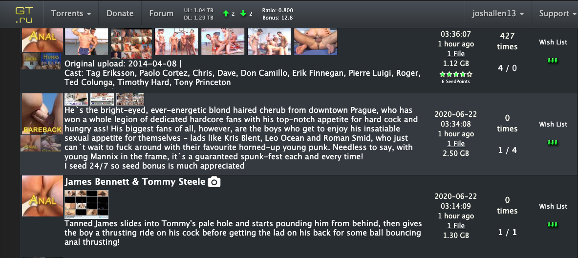
the thing with the new design is that it seems too cluttered , a look at the screen and it seems to be filled with text, text and texts . especially with the ' Short Description ' when it is in full mode. it does not give an easy sense to the eyes that hey this is already another torrent name that you're looking at and not a part of the Short Description
also , when your mouse hovers onto the Short Description part ( which with the new design comes with its own scroll down bar ) , instead of having the ease of scrolling over the entire page , now you have to be disturbed by the Short Description scroll bar because instead of scrolling over the entire page , what scrolls is the Short Description scroll bar . that is a big hassle because you have to be constantly mindful of your mouse position . that is a big hassle . i prefer the old design when it comes to Short Description .
with the screengrabs , it would be better to position the pictures after the Short Description and not after the torrent name . because when you put them after the torrent name which makes the Short Description and the name of the next torrent close to each other . it does not make an easy sense to the eyes that hey this is already another torrent name that you are looking at and not part of a description . it gives a better distinction to the torrent names when you place the pics just before the next torrent name ( just as with the old design that you place the classification thumbnails just before the next torrent name )
with the new design , the 'Infos' part is just too packed . it's not easy to differentiate 'Date Added Size Info Comments ' . it is just too much to have in only one column all these information . it is just not easy to make sense of all of them . it is still far better to separate them just like with the old one . it is a lot easier to find the specific information that you need. maybe you can just delete the 'Functions' column to make room in order to separate the new 'Infos' column . and to make up for the Functions column , just add a download icon after 'Snatched/S/L'
hoping that you'd consider these suggestions and comments because the aim here is to make things easier to the eyes and make things and information more distinguishable from each other . make it less hassle to browse through the site and have a good user experience . thanks and more power to gaytor.rent
-
I might have missed it, but is there a way to use the browse, but also use the freeleech search criteria? I enjoy the browse window, but would like to check out the freeleech torrents through that format…
thanks in advance for hearing it out, the new layout is really easy to work with!
-
I just wanted to say I LOVE the new layout!! Awesome improvement!
Thank you!!
-
in the new search, font size should be a bit smaller, and thumbnails should be bigger, or they can become bigger when u move mouse over them…thanks!!
-
in the new search, font size should be a bit smaller, and thumbnails should be bigger, or they can become bigger when u move mouse over them…thanks!!
i need a little bit more time until the next upgrade. be patient please
This is what I get on a Samsung Galaxy A50 running Google Chrome and Android 10.
It does the same thing on my Alcatel tablet, but interestingly, on my tablet, when I rotate the screen 90° then rotate it back, the pictures don't overlap anymore.
this should be fixed by now…
-
I would appreciate your feedback on today's design update. Some of you have already reported about fonts that are too small. It is always very important to know where exactly on which page you see a problem. Then we save ourselves unnecessary questions back and forth. Of course I am also happy about every positive feedback, without any change wishes. :cheers:
I agree that the new design is a much cleaner look, as well as very functional. One request tho… When choosing the categories ("Amateur", "Anal", etc.) I've noticed that the Search results (Search page) indicate these categories are "OR"; "Amateur" OR "Anal". It would be nice to be able to "AND" these categories also.
-Thanks! -
New layout is good. Thought font was too big at first but didn't take long too adjust. I thought you had reverted back to old version but then realised it was my bookmark was pointing to the browse.php (old search) instead of search.php (new version) which might account for a few others seeming to go back to the old version. I guess with auto logins and password managers not everyone goes through home page.
If you are still taking suggestions just two minor ones,
Change the ratio and bonus stats to yellow to make them stand out and
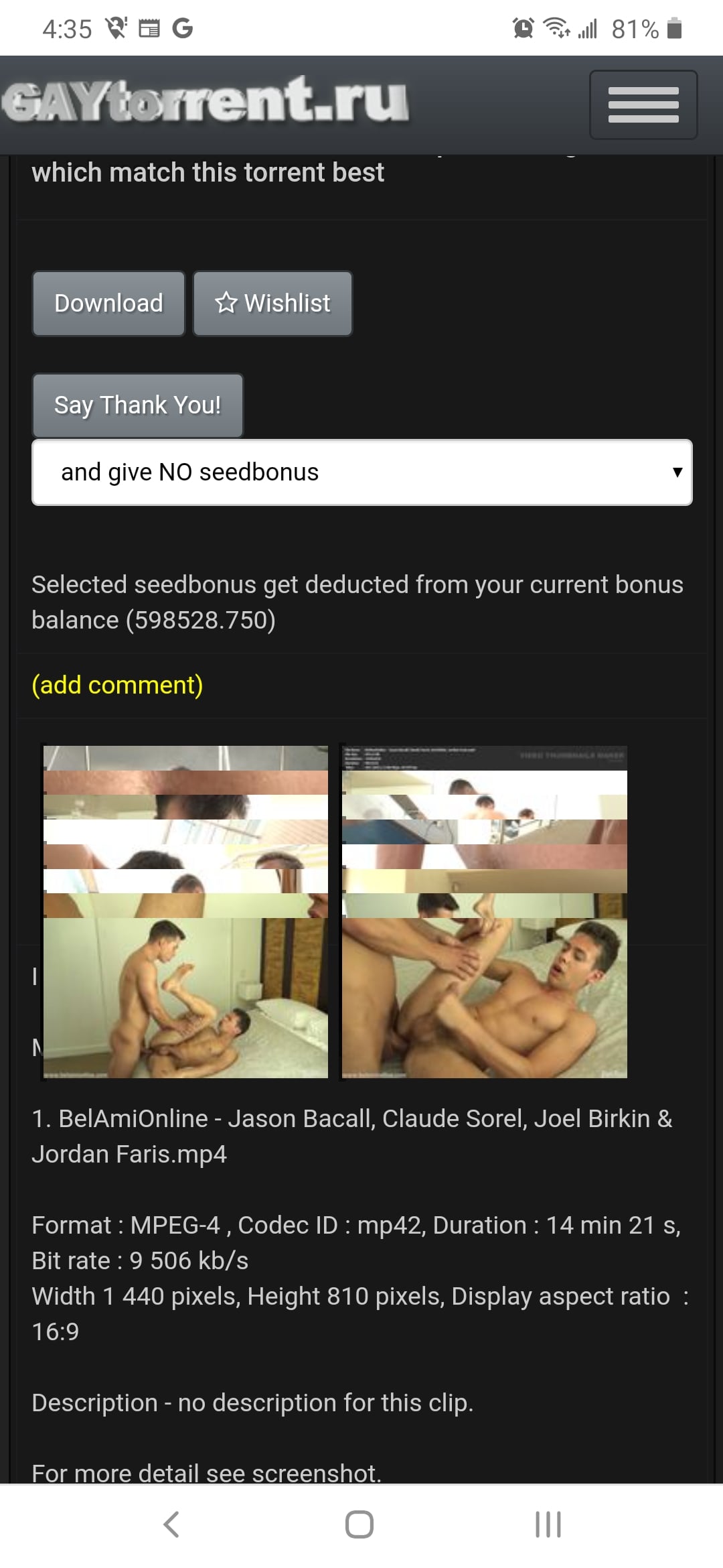
Please see if there is anything you can do with the pics which are 10 pics by 1 vertically and just are unviewable when zoomed. I know it is to do with the original pic resolution and can't offer a solution myself but thought I would ask.
Basically - great work.
-
A huge THANK YOU for the improvements to the site, both aesthetically and under the hood. A large complaint I have is when scrolling through the Search page, if I'm scrolling down to view more and I hovered over a title to Quick View the photoset, my mouse gets caught in the description field. NOrmally, it wouldn't be an issue, but some of these descriptions can go on FOREVERRRRRR…. Some people are just overly verbose in the descriptors, and not saying to cut it off, but it'd be helpful if it was collapsed into something that resembled a [see more] hyperlink that expanded the description into the full text. It would save me and I'm sure others a ton of frustrations when scrolling.
The only solution I have found for this so far is to move the mouse to the far side of the page where the categories are before scrolling the page. This forces the main page to remain under the mouse cursor. As well, in the top right corner of the search page, you'll find a button that will toggle between the short description and the long description. The short description option will also solve this problem.
-
The only solution I have found for this so far is to move the mouse to the far side of the page where the categories are before scrolling the page. This forces the main page to remain under the mouse cursor. As well, in the top right corner of the search page, you'll find a button that will toggle between the short description and the long description. The short description option will also solve this problem.
Oh well now I look stupid, LOL… I don't recall the option toggle being there when the design change first happened. I'm just now getting around to putting my feedback on here. That makes a huge difference and doesn't annoy me as I like to hover over the title and basically I had to move cursor over to the edge after every hover before scrolling if I didn't want to get caught scrolling thru a description that was an epic novel.
Thanks for that tip!
-
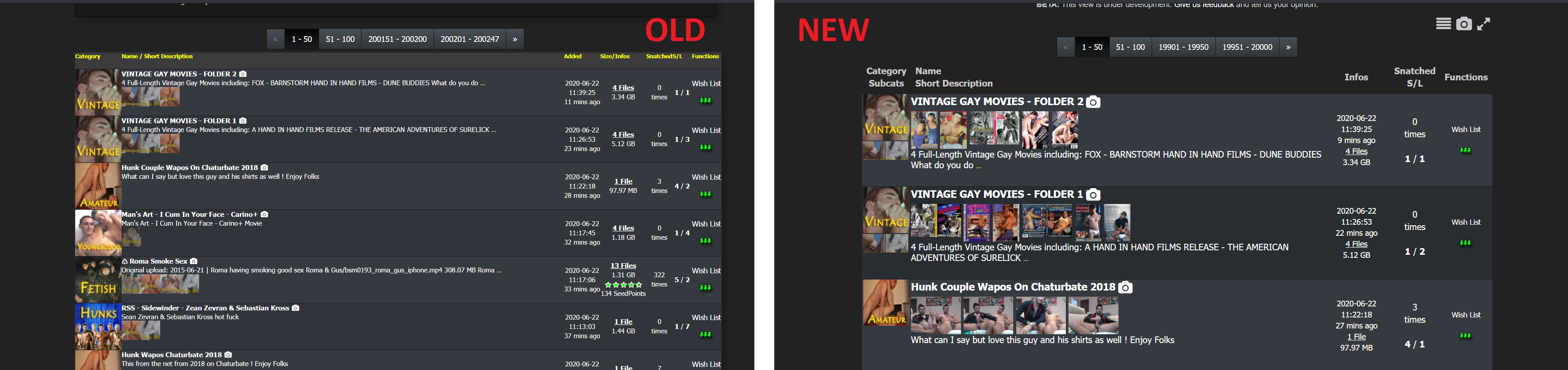
Hi, the new design has horribly large fonts and rows that make one search result take a third of the screen. This is very impratical, all I do is scroll and important info is lost among tons of unnecessarily large objects.
See screenshot for comparison. There are 6-7 result rows in the old design in comparison to just 3 in the new design.
Please note that turning off the snapshots won't compress the rows. When the snapshots are turnet off, the rows remain the same heigth but with there's just more unused blank space where the snapshots used to be.
Overall I can imagine this working nice on a touch screen but it is very badly designed for a desktop browser UX. Please turn it back or at least make the change optional indefinitely

-
Hi, the new design has horribly large fonts and rows that make one search result take a third of the screen. This is very impratical, all I do is scroll and important info is lost among tons of unnecessarily large objects.
See screenshot for comparison. There are 6-7 result rows in the old design in comparison to just 3 in the new design.
Please note that turning off the snapshots won't compress the rows. When the snapshots are turnet off, the rows remain the same heigth but with there's just more unused blank space where the snapshots used to be.
Overall I can imagine this working nice on a touch screen but it is very badly designed for a desktop browser UX. Please turn it back or at least make the change optional indefinitely
Im not finished !
Wait for the next update - this will cover this and other things as well
-
The new search text box is unusable on my iPhone. It shows up as maybe 50 pixels wide (maybe not even that), so the text you are typing can’t even be seen.
If I turn the screen to landscape, it’s okay, but still not great. My suggestion would be to get rid of the Search text on the left side, change the Search/Refresh text to an icon (magnifying glass), and move the dropdown filter to the next line.
P.S. sorry if somebody else has mentioned this…I’ll admit I didn’t scroll through the 16 pages of previous posts!
-
Appreciate the work you do on the layout, but I switched to old layout as I am interested in Desktop only, and the new version was less usable than the older version (which is excellent).
I understand mobile users will prefer the new layout, but it would be nice to preserve the option of the old layout (Desktop version). Would be interesting to see how much site traffic is mobile vs desktop.
Thank you!
-
It would be nice having a yellow background for items in the wishlist (like the green hue for snatched ones) in the search page.
-
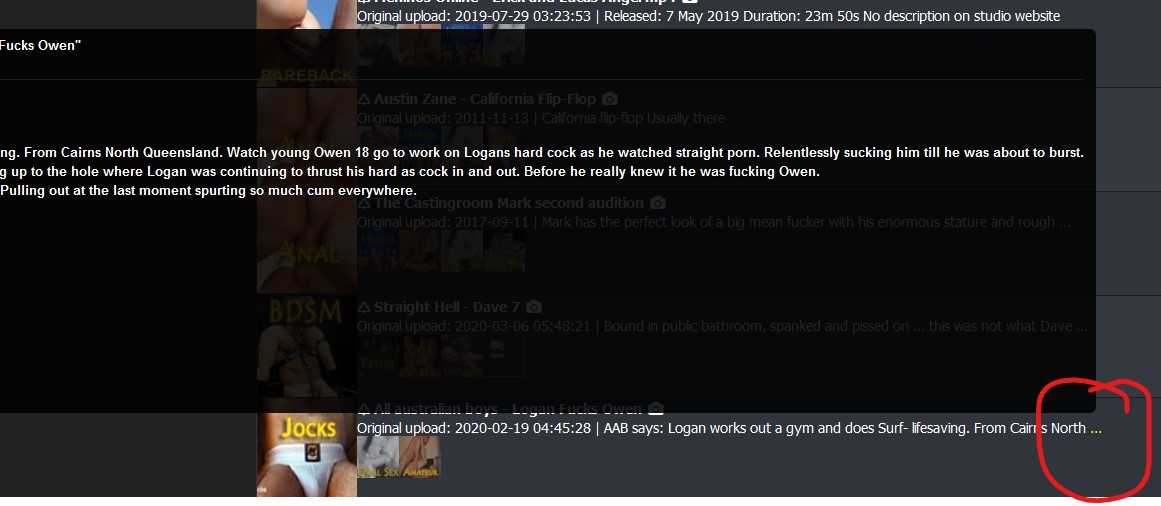
… in Browse view ... the popup box sometimes is very wide and goes off the left side of the page. This is only happening in Safari ...
Same thing happens in Firefox when hovering over the elipse ::)
….. Actually hold that. I just realised the bookmark I use (https://www.gaytor.rent/browse.php) is actually the OLD layout :blind:
Now that I'm using the new layout, am instantly in love with the optiions to show images, view compact/wide, and :love: :love: :love: the toggle for long description.
THANKS :cheers: :cheesy2:
Hello! It looks like you're interested in this conversation, but you don't have an account yet.
Getting fed up of having to scroll through the same posts each visit? When you register for an account, you'll always come back to exactly where you were before, and choose to be notified of new replies (either via email, or push notification). You'll also be able to save bookmarks and upvote posts to show your appreciation to other community members.
With your input, this post could be even better 💗
Register Login