ITS A HOT MESS
-
I CANT FIGURE OUT WHAT TO DO AND ADMIN HASENT ONCE HELPED ME SORRY I HATE IT.
-
@Evanlee There's a really good changelog to help navigate / familiarise yourself at https://community.gaytor.rent/post/341758
Many / most settings are now configurable for each member if you don't like how things are set up by default. Take a look at what's now under your profile to see what settings you can tweak.
If there's stuff you can't figure out - it's not always totally intuitive - ask here. Lots of members are getting lots of help here, rather than shoving it all onto one or two helpdesk guys.
Be specific though. Where appropriate include what view you're using - e.g. Grid, Legacy - what area you're in - Search,Wishlist, Home page, Forum - etc. That helps get specific advise, not generalisations, or long answers saying "If you mean A, then B, but if you mean, C then D", etc.
-
Admin has been all over the forums helping people right, left and center. You've made 2 shouty posts complaining without even saying what's wrong.
-
i want to go back to previous version, this is awfull! i dont care i you want delete my account.
I want the old style back
if you cant... delete my account. -
@boldo https://www.gaytor.rent/my.php#sec-account
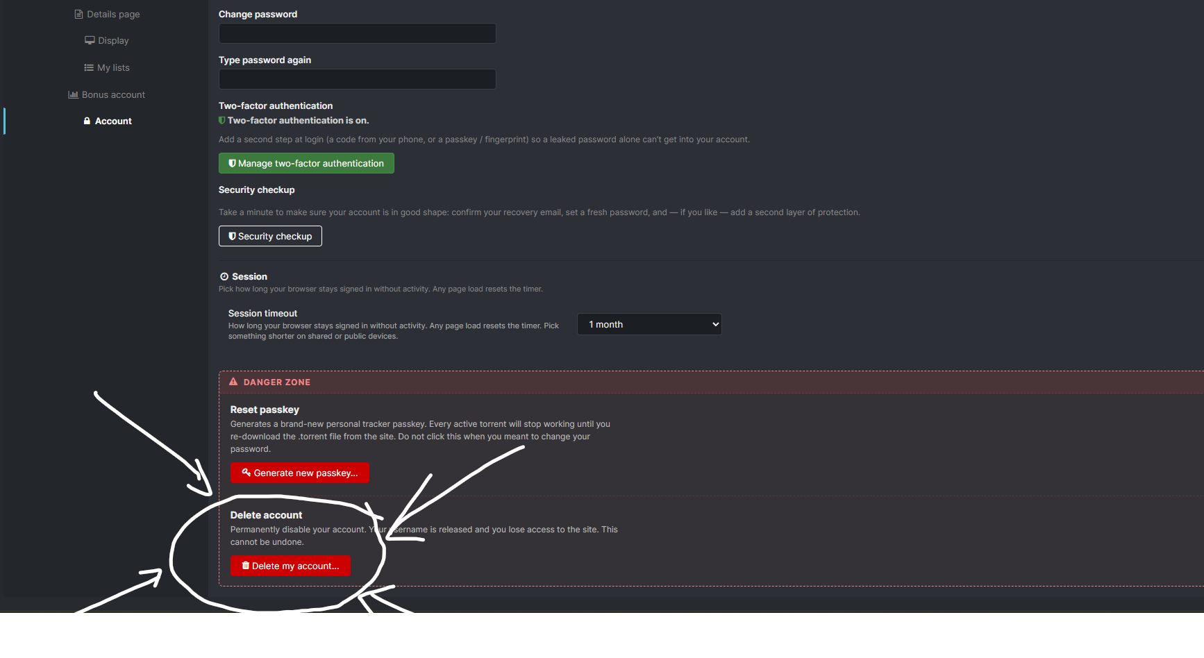
Sorry if that's blunt, but if that's the first and only thing you have to say in the forums after Joker and the staff have bent over backwards to try to improve the site AND are actively making changes based on constructive feedback surely you can go the effort of deleting your own account.
...or you could act like an adult and hang around to see how things turn out.
-
i want to go back to previous version, this is awfull! i dont care i you want delete my account.
I want the old style back
if you cant... delete my account.Literally nobody cares if you have an account here or not
-
@ianfontinell I do have a question though: How do you think his seed bonus points will be shared out? Can I call dibs on his upload credit?
-
@Kevin4fm Well their forum account is only 6 weeks old. If the same goes for the toal time on the site then there probably isn't much to go around.

-
I CANT FIGURE OUT WHAT TO DO AND ADMIN HASENT ONCE HELPED ME SORRY I HATE IT.
Can you be specific as to what the problem is that you're having? I would be more than happy to assist you with navigating the new site, including showing you ways that you can customize the site to better suit your preferences. What you have said here is not specific enough to be able to assist you, or at the very least, point you in the right direction.
-
i want to go back to previous version, this is awfull! i dont care i you want delete my account.
I want the old style back
if you cant... delete my account.There is no way to roll back to the old site. There are however a number of ways you can customize the new site to have an eerily similar look and feel to the old site if that better suits you.
Is there something in particular that you're having a hard time with? I'd be more than happy to assist you with getting things setup to your liking. I just need a little more information on where to start with this in order to do so.
The only difference between martyrdom and suicide is press coverage! -
@MrMazda hi ,I just wondering could you build a auto-select sort function? I really need the seedpoints sort in my sort list,thank you in advance,and appreciate if there will be a auto-select model of showing what I had downloaded ,I prefer the old version shows dark green when I had finished it rather than just show a have with a pale green,and I am
very grateful what you guys have done and hope our site could be better,thank you all. -
-
@frostycab I just think that should save all functions of searching and the character of when I finished downloading is a great function,get back the dark green when user has downloaded the full file, add all sorts from the old version,and make the UI interface more simple or add a interface of old version,most of us just want to use a simple way to find what we want, please easier like the old version,and save all useful functions,just keep easy and useful.
-
@tuling666 I've addressed one of your concerns in the other thread you posted this exact same comment to.
-
@tuling666 There is an option to do just this very thing in your profile settings.
Click your username in the top right corner of the page, then click "Profile"
Down the left side, click "Search", then on the tabs that go across the top of the options, click "Details Page"
The bottom option is a toggle switch that will do the very thing you're looking for.
The only thing I would like to see though is that the green that it tints the row with is a little more pronounced. Currently, it's more like just a splash of green, but the option is there. Perhaps @Joker could tweek this a little?
-
The only thing I would like to see though is that the green that it tints the row with is a little more pronounced. Currently, it's more like just a splash of green, but the option is there. Perhaps @Joker could tweek this a little?
Agreed. A lighter, brighter green would be easier to differentiate.
-
@Evanlee Haven't been able to upload since the update.
-
@Evanlee Haven't been able to upload since the update.
What seems to be the issue when trying to upload? I'd be happy to walk you through the process.
I know that QTM is a hit or miss right now, but a new version is being made that will fix all the issues it has.
-
@Evanlee I agree that the site is a bit of a maze to navigate. And there’s so much wasted space and not as neat as before.
Why are the categories squares that take half the page as a drop down menu instead of just a checklist like before?
And the detailed view is so hideous with images not aligning properly. Images of different aspect ratio being clunkily grouped together. They fixed it somewhat recently but still the site is so off. I think it’s how everything is spaced. And having images to the left like that feel so weird. Get it to the right side and the description left.
Compact view is also disgusting. With description being cut off each row. The font size is huge for no reason. It looks confusing and unappealing.
The old look is way more neat and has a better way of doing things. For example, if the description is too long it would just turn into … three dots. That’s so much better than having huge fonts and it being cut off each row like that.
-
@Lanamariah2 Could I suggest taking a look at the Change Log here?
It doesn't go into details but covers a lot of what can now be changed and points you to where. For instance, your last point - about the length of titles - can be easily changed to suit your personal preference.
Previously, there was pretty much a single way of viewing stuff. Take it or leave it. Now, there is a great deal of personalisation you cn do to get things looking however best suits you. Not everything, I'm sure, but a great deal. This is a considerable improvement for those members who DIDN'T like some aspects of the previous view.
So go take a look and understand what you can and can't change. Play around with it a bit.
If there are still areas that present in a way that you think is not as good as it could be, come back and be specific about those and, wherever possible, include images. It's far easier to understand exactly what and where you're talking about something from a single image than it is to try to interpret a line or two of vague text that may, or may not, fully explain what's frustrating you.
@Joker has single-handedly(?) delivered all these changes and has gone out of his way to address, and amend where possible, any specific issues that have been brought to his attention. Often, almost before the ink is dry on the original post!





Hello! It looks like you're interested in this conversation, but you don't have an account yet.
Getting fed up of having to scroll through the same posts each visit? When you register for an account, you'll always come back to exactly where you were before, and choose to be notified of new replies (either via email, or push notification). You'll also be able to save bookmarks and upvote posts to show your appreciation to other community members.
With your input, this post could be even better 💗
Register Login