New Design
-
I am a relatively new member - active for 3 months or so.
I have reverted to the old layout. The new layout looks "cleaner" but I dislike not being able to see my "ratio" clearly in the top right hand corner. When I tab on my profile name to look at my ratio it is is in a dark blue which I find very hard to read.
This is the only reason I have reverted to the old layout. Your ratio is no longer displayed clearly in the right hand corner.
-
All good but I agree that the fonts of the columns on the right are too small (date, data, weight …)
Now everything perfect. Thanks
-
new cleaner look very good! i use normal PC with forefox … very impressed. :cheers:
-
In Safari, from Browse, clicking on camera icon to bring up picture viewer, the categories button/search bar stays at the top of the window and covers the controls for magnification and slideshow. This is actually not a new issue but has always been annoying but I didn't say anything. So… since you asked.... lol.
I'm liking the clean new design. I'm glad you put the ratio back up in the header. I wouldn't mind having bonus points up there too, but not at the risk of cluttering up your design.
Cheers! -
Looks good! A couple things I think would be good (personal preference perhaps):
1. Putting the Bonus count at the top of the page, perhaps next to Ratio. I like to be able to see my Bonus amount right at the top of the screen without having to use the dropdown menu.
2. I would like to see the rainbow flag back back behind part of the GAYtorrent.ru logo.Of course both are personal preference, just my two cents
")
-
I would appreciate your feedback on today's design update. Some of you have already reported about fonts that are too small. It is always very important to know where exactly on which page you see a problem. Then we save ourselves unnecessary questions back and forth. Of course I am also happy about every positive feedback, without any change wishes. :cheers:
The old design is better to me. It allows me to see the photos of the torrents more accurately, without having to visit each page individually. The screen of the new layout is very "closed", but it seems more simple too.
-
As with any design change, this new one takes a bit to get used to, but not much. It is pretty intuitive and (best of all) doesn't break things
 Also the site is noticably faster, a huge plus.
 -
In Safari, from Browse, clicking on camera icon to bring up picture viewer, the categories button/search bar stays at the top of the window and covers the controls for magnification and slideshow. This is actually not a new issue but has always been annoying but I didn't say anything. So… since you asked.... lol.
I'm liking the clean new design. I'm glad you put the ratio back up in the header. I wouldn't mind having bonus points up there too, but not at the risk of cluttering up your design.
Cheers!Thank you for addressing that - and so quickly! You just changed my world. I love you :cheesy2: :love: :hug2:
-
New layout looks good, compliments! Although 2 items that are not displaying correctly.
-
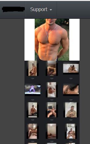
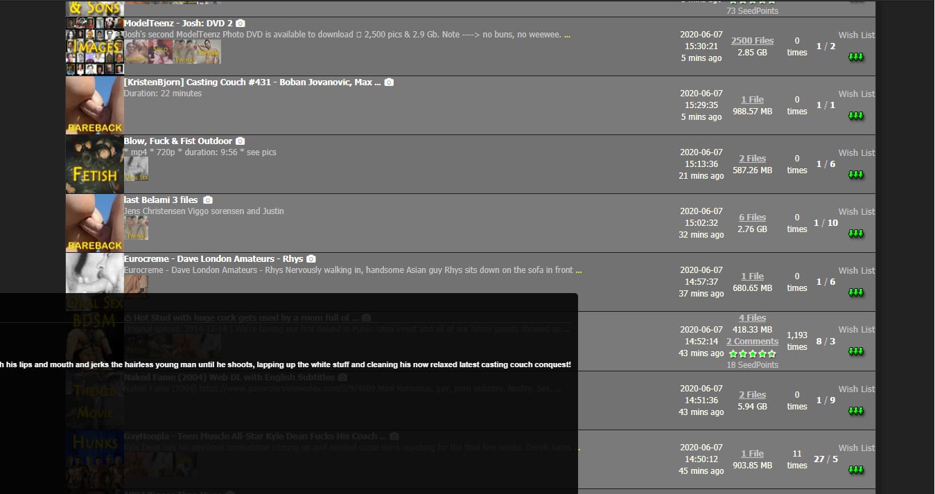
I saw this one mentioned by someone else, photograph in review from "Browse Torrents" option is cut off by menubar on top of screen (see screenshot attached).
-
The ratio displayed in top bar is very dark of color and very hard to read. Can it be a lighter color or does the color change when ratio improves? ;D
BTW: using Chrome.
-
-
I have switched back to the old interface due to font and format choices that make the new screen harder to read.
The old interface had both the torrent name line AND the description line using the same font. The new interface has the description line in a paler font that does not contrast well with the grey background.I do like that the new interface has the thin black line between torrent entries.
I believe that increased font size and layout of the paging selector area (1-50 51-100 and so on) is a bit too big. Something between the new larger and the old tiny font is suggested.BUT ultimately it is the readability issue with the description line that pulls me back to the old interface.
-
Nice job. It would be nice if in the pages you can see further along the pages like 1-50, 51-100, 101-150, 151-200. Just so you have more option to browse.
Other than that it is great!
-
It does look cleaner.
But the Bright yellow font is still hard on the eyes.
How about a more soft gold color?
And the ratio red font color is too dark - very hard to read.
How about an update of the category icons. Always look to busy to me and difficult to see when they are the small ones…
I am willing to contribute icon designs as per attached to help.
-
As with others I found the text in the individual torrent description fields to be too small, when I enlarged it using the PC's setting (yes I'm that old) the whole page started to look weird. I was struggling (even with my glasses on) to see the text in any useful manner.
I found the other changed to be OK, I could navigate OK and found what I was looking for.
Cheers
-
I agree that it is much more mobile friendly, but…
(A) More clicks to get around the site, and
(B) Can we get seed bonus info in the header (maybe under ratio?). I like to keep an eye on it and not let it build up too much.
-
It would be good if you would stop the afddition of :
onto images of some posts.
It is useful to be able to download covers and art for use in media players but this ruins the image.
-
Thanks for the new font size. All looks great now. Great Job.
-
Hey! Thanks for the hard work and the possibility to give you a feedback!
I have a problem in the browse section. Some torrents have enormous images that make it difficult to immediatly see the description i have attached a pictore to show you the problem, the red square show you that the image presented is a very long "collage" of several pictures an it makes it difficult because you have to scroll down sometimes far down to be able to highlight the information button Thanks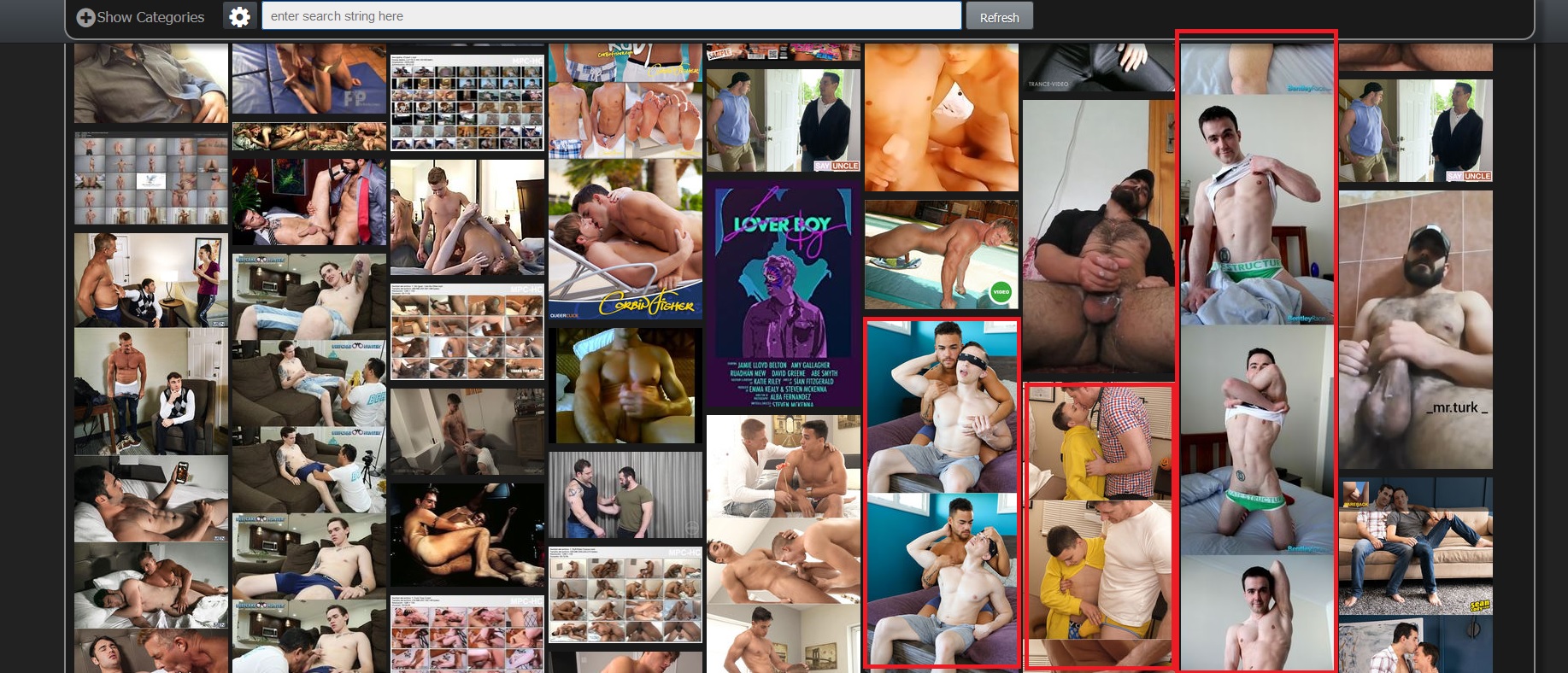
-
I keep getting 'plugin blocked' in chrome. what's with that?
-
Hello!
Congratulations on your work as a designer on the site, it looks amazing!
There are some points that I think can be improved:
-
Category icons need to be more modern to match the new site;
-
The number of characters that appear in the torrent name could be increased;

- The description of the torrent, when I place the mouse over the "…", the window that appears, it is out of alignment:
I would suggest doing this: remove the description from the list of torrents and place it in the window that appears in the preview of images, the images would be below the description and side by side, the result would be something like this:

And again, congratulations for all work!
-
-
Overall, I like the look and feel of it. My one suggestion is to include the user's bonus points on the dashboard. I never look at my ratio or even think about it, but I'm constantly checking my bonus points. Thanks for letting us give feedback.
Hello! It looks like you're interested in this conversation, but you don't have an account yet.
Getting fed up of having to scroll through the same posts each visit? When you register for an account, you'll always come back to exactly where you were before, and choose to be notified of new replies (either via email, or push notification). You'll also be able to save bookmarks and upvote posts to show your appreciation to other community members.
With your input, this post could be even better 💗
Register Login