New Design
-
Hi,
I like the new look very much, but I switched back to the old layout because there is no switch to logout.The logout link is the last item in the dropdown menu accessed from your user name at the top of the page. It might be more obvious if it were above the stats section instead of below it.
-
The new design is great on mobile. On my 4K desktop it's a bit too small. When I use the browser zoom function it gets very jumbled. If it could handle zooming better it would be perfect! Screenshots attached.
-
Seems
Seems quite similar to me. Presents quite cleanly on the mobile phone though.
1. Are you reactivating the bonus facility ? I need to use it .
2. I really need you to implement a 'select all' option on messages . I'm fed up of having to delete each message one by one and wait for the page to reload after each delete. Not cool.
3. But I here you've been waiting a while to re-jig the site so hopefully lockdown will give you time to address some changes…..
Cheers
Twzz
-
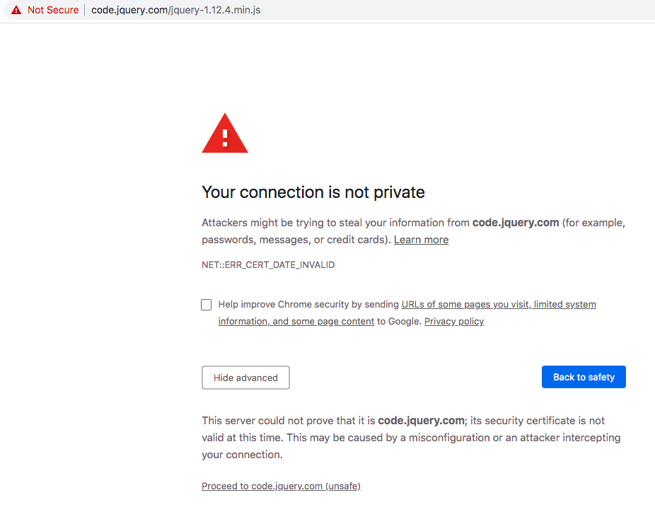
I have use a browser extension that blocks web content from third parties and I highly dislike having to whitelist (It's just this item https://code.jquery.com/jquery-1.12.4.min.js) for this website now to use the menus and show the thumbnails. The old design didn't make me do this. Please make the old design permanently accessible.
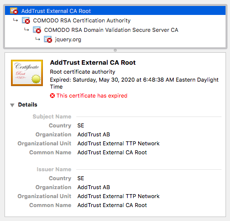
I'm using Chrome (current version) which indicates the SSL certificate from jquery.com has expired and may not be secure. So, none of the dropdown menus for Torrents/User/Support are working because jquery-1.12.4.min.js is prevented from loading.
Looks pretty good otherwise. The only thing I would recommend is to add some padding (on the right) between the Categories and the Torrent Name/ Description columns as well as some padding (top and bottom) between each torrent. I think that might help make it easier to skim when browsing the latest torrents.
-
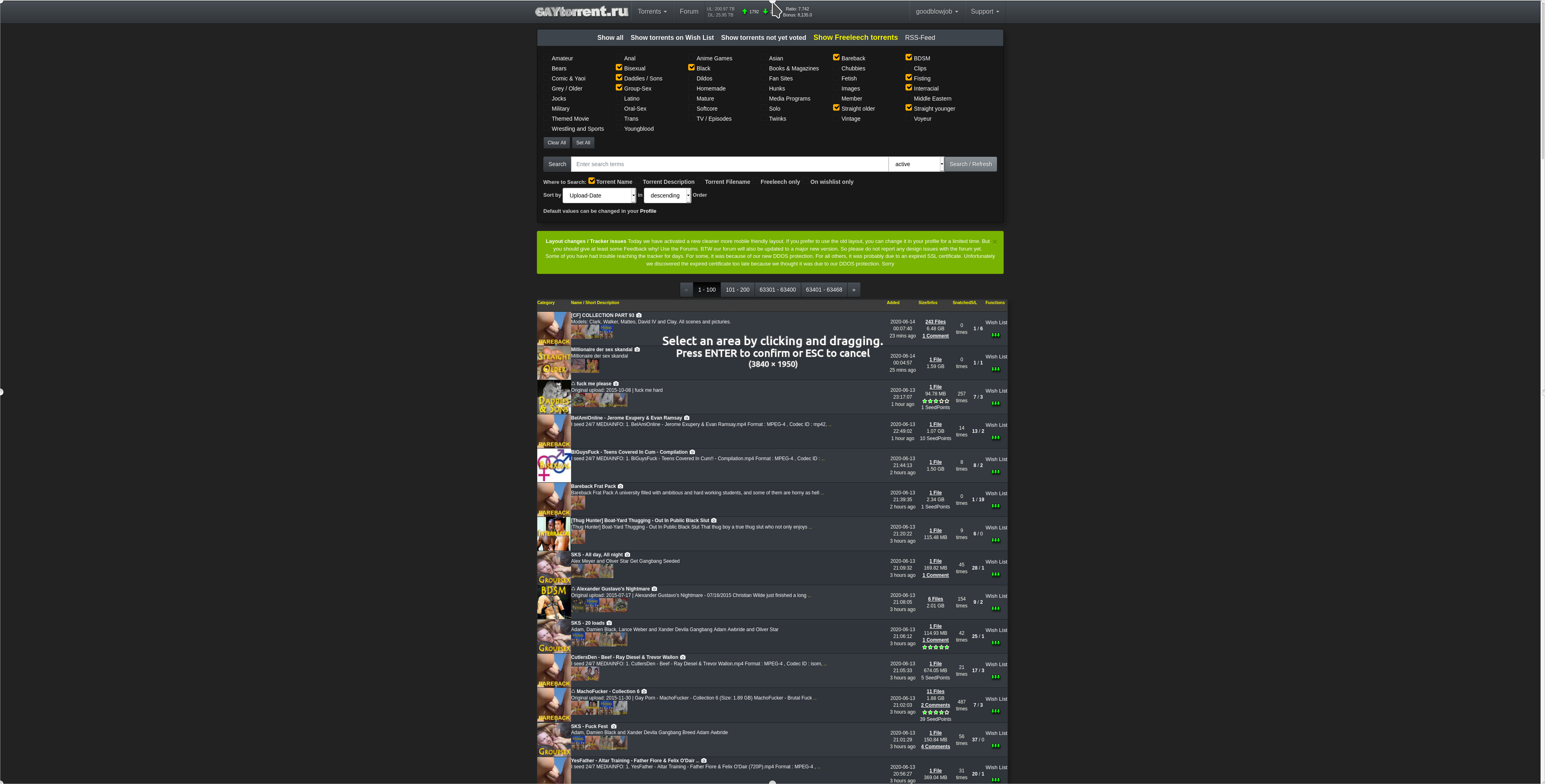
I would appreciate your feedback on today's design update. Some of you have already reported about fonts that are too small. It is always very important to know where exactly on which page you see a problem. Then we save ourselves unnecessary questions back and forth. Of course I am also happy about every positive feedback, without any change wishes. :cheers:
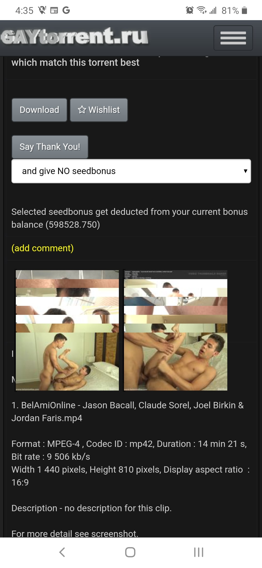
I love the new design but I don't like preview pictures opening in the same window when selecting from a torrents page. Large previews are compressed to fit the page instead of opening in original size in a new window. Can you add an option for this to be like the old preview setting?
-
I have use a browser extension that blocks web content from third parties and I highly dislike having to whitelist (It's just this item https://code.jquery.com/jquery-1.12.4.min.js) for this website now to use the menus and show the thumbnails. The old design didn't make me do this. Please make the old design permanently accessible.
Sorry guys… forgot to put the file local on live mode....
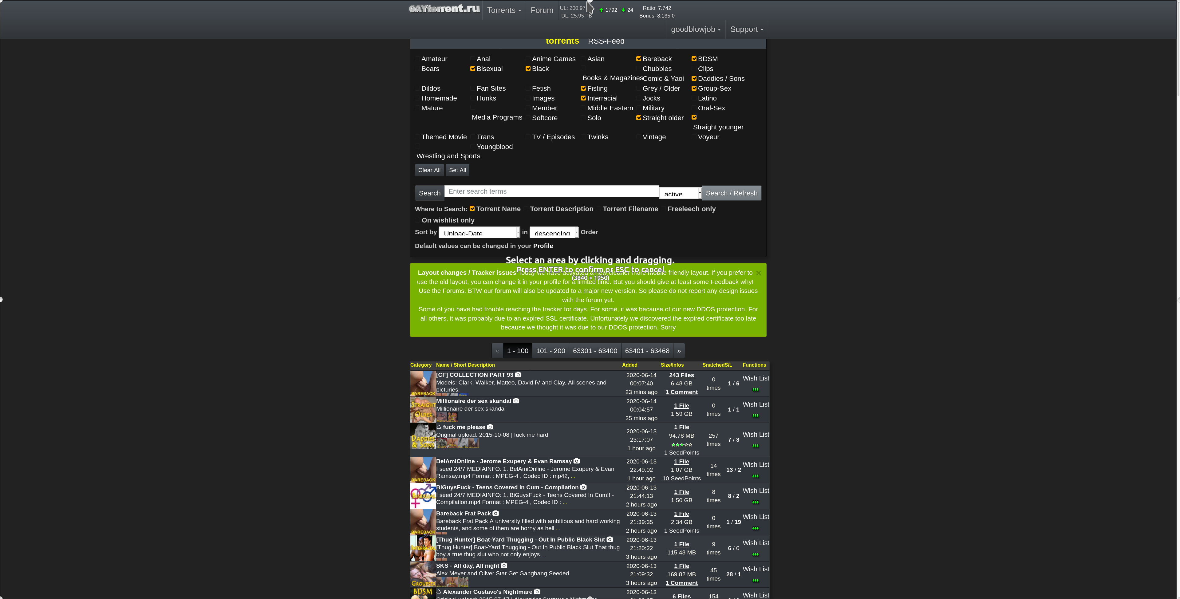
Can some Android user check the torrent details page for me? are the thumbnails correctly displayed now OR are they still overlapping? On IOS this works fine.The new design is great on mobile. On my 4K desktop it's a bit too small. When I use the browser zoom function it gets very jumbled. If it could handle zooming better it would be perfect! Screenshots attached.
thanks, for your screenshot. This really help me fixing this !
Seems
Seems quite similar to me. Presents quite cleanly on the mobile phone though.
1. Are you reactivating the bonus facility ? I need to use it .
2. I really need you to implement a 'select all' option on messages . I'm fed up of having to delete each message one by one and wait for the page to reload after each delete. Not cool.
3. But I here you've been waiting a while to re-jig the site so hopefully lockdown will give you time to address some changes…..
Cheers
Twzz1. bonus fcility? what are you talkin about? i did not deactivate anything. maybe it is just not visible for you (your screen size) not sure
2. you are talking about our pm inbox/outbox system right? It might get some nices updates as well. But first things first: Everything about the torrents…
3. I stop when it's done. Regardless of Corona.
I love the new design but I don't like preview pictures opening in the same window when selecting from a torrents page. Large previews are compressed to fit the page instead of opening in original size in a new window. Can you add an option for this to be like the old preview setting?
How about just using the zoom feature in the viewer ? Btw still can do just right-click->open in a new tab on those pictures you really like to see in a seperate Tab
-
I do too, shame it's gone soon, just love it, but I am on a desktop, so I guess for mobile users, the new might be better, but are mobile downloads more than desktop/notebook downloads? Why change something that's so good, for something that looks way less? But of course you put so much wrk in it, I better not complain. The site has always been amazing!!!!!!!
-
Full honesty? It was better than way it was. Now the site is bug on mobile and even when put on PC mode the pictures on torrent page are off. Thank God when searching something there's no bug.
-
I like the new layout but what i don't care for is on the browse screen when someone attaches a long picture it all shows up and you have to scroll a bunch to get past it, also can't see the info easily
-
This is what I get on a Samsung Galaxy A50 running Google Chrome and Android 10.
It does the same thing on my Alcatel tablet, but interestingly, on my tablet, when I rotate the screen 90° then rotate it back, the pictures don't overlap anymore.
-
Think its a great improvement :cheers:
-
Thank You for having the old search function (please let it stay ;D). I think this way it satisfies everyone.
") :cool2:
:cool2: -
2 cons and a like.
When we hover over the title we get a popup sidebar on the right side.
1) The top picture is cut off by the header bar. This often leads to decapitation, and not being able to see the first face.
2) I would like to see larger images on this popup. I realize there are lots of problems with this; monitor ratio, zoom level, and other things you can't control for (I think). Plus since the sidebar won't scroll, it cuts down on the number of pictures shown. I want these pictures as a quick-look at the preview pictures, so quite a bit larger, triple the size or so.Clicking a preview picture opens up the camera page, and goes directly to that image. Perfect! I really like this feature and am using it a lot.
Don't get discouraged. I'm having a learning curve and having to break habits ingrained by your previous version. I understand this and am working through it.
Ignore the whiners who can't use a bit of effort to learn something new. This is a good set of changes to your interface and I use your site a lot more than [another site] that doesn't have as much information (or content) and doesn't present it as well. -
As a general comment, I this US President Abraham Lincoln once said,
You can please all of the people some of the time, and some of the people all of the time, but you can't please all of the people all of the time.
I think there's some wisdom in there. I tend to like the changes.
-
love it
-
Great job!! Not a big fan of the logo, but awesome!
-
Larger fonts on the search page make it even more difficult to comprehend and navigate. It doesn't address the fundamental flaw in the design which is TOO MUCH INFORMATION. It makes for very unpleasant and confusing browsing. It feels like an assault on the senses. The old search design works and works well. The new one does not.
-
Great work … At least it works for me. Congratulations.
-
please, increase number of page to skip (1-50 51-100 101-150 151-200)
-
The drop down menus are very unintuitive. I don't like having to click "torrents" then what I was going to do, I don't used everything in the torrents menu way too often
Hello! It looks like you're interested in this conversation, but you don't have an account yet.
Getting fed up of having to scroll through the same posts each visit? When you register for an account, you'll always come back to exactly where you were before, and choose to be notified of new replies (either via email, or push notification). You'll also be able to save bookmarks and upvote posts to show your appreciation to other community members.
With your input, this post could be even better 💗
Register Login