New Design
-
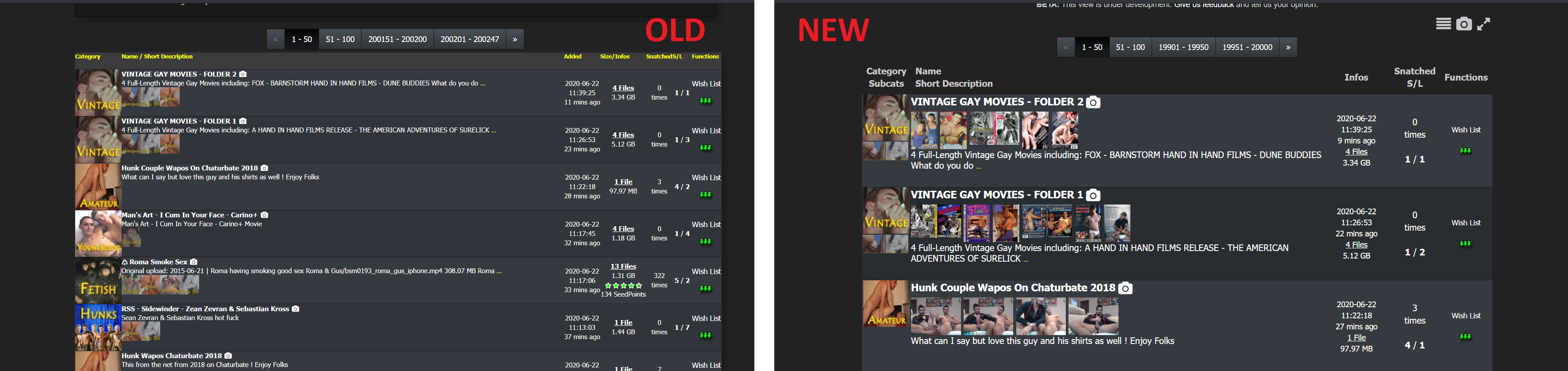
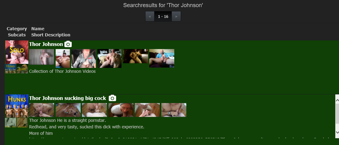
Hi, the new design has horribly large fonts and rows that make one search result take a third of the screen. This is very impratical, all I do is scroll and important info is lost among tons of unnecessarily large objects.
See screenshot for comparison. There are 6-7 result rows in the old design in comparison to just 3 in the new design.
Please note that turning off the snapshots won't compress the rows. When the snapshots are turnet off, the rows remain the same heigth but with there's just more unused blank space where the snapshots used to be.
Overall I can imagine this working nice on a touch screen but it is very badly designed for a desktop browser UX. Please turn it back or at least make the change optional indefinitely

-
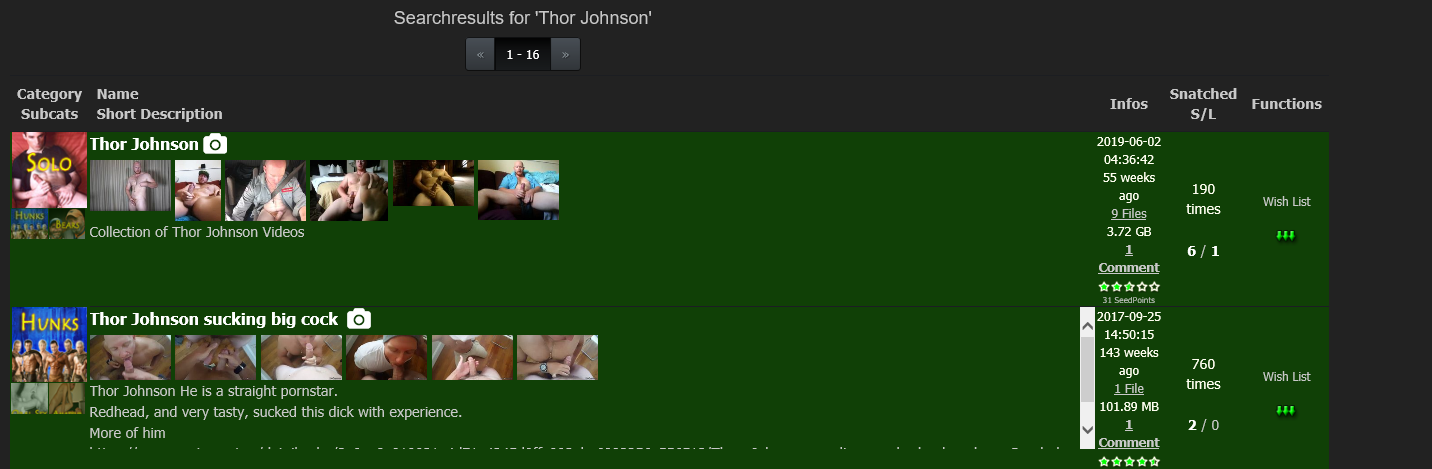
Hi, the new design has horribly large fonts and rows that make one search result take a third of the screen. This is very impratical, all I do is scroll and important info is lost among tons of unnecessarily large objects.
See screenshot for comparison. There are 6-7 result rows in the old design in comparison to just 3 in the new design.
Please note that turning off the snapshots won't compress the rows. When the snapshots are turnet off, the rows remain the same heigth but with there's just more unused blank space where the snapshots used to be.
Overall I can imagine this working nice on a touch screen but it is very badly designed for a desktop browser UX. Please turn it back or at least make the change optional indefinitely
Im not finished !
Wait for the next update - this will cover this and other things as well
-
The new search text box is unusable on my iPhone. It shows up as maybe 50 pixels wide (maybe not even that), so the text you are typing can’t even be seen.
If I turn the screen to landscape, it’s okay, but still not great. My suggestion would be to get rid of the Search text on the left side, change the Search/Refresh text to an icon (magnifying glass), and move the dropdown filter to the next line.
P.S. sorry if somebody else has mentioned this…I’ll admit I didn’t scroll through the 16 pages of previous posts!
-
Appreciate the work you do on the layout, but I switched to old layout as I am interested in Desktop only, and the new version was less usable than the older version (which is excellent).
I understand mobile users will prefer the new layout, but it would be nice to preserve the option of the old layout (Desktop version). Would be interesting to see how much site traffic is mobile vs desktop.
Thank you!
-
It would be nice having a yellow background for items in the wishlist (like the green hue for snatched ones) in the search page.
-
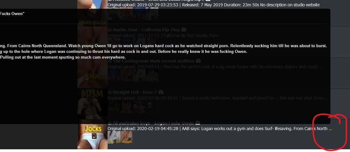
… in Browse view ... the popup box sometimes is very wide and goes off the left side of the page. This is only happening in Safari ...
Same thing happens in Firefox when hovering over the elipse ::)
….. Actually hold that. I just realised the bookmark I use (https://www.gaytor.rent/browse.php) is actually the OLD layout :blind:
Now that I'm using the new layout, am instantly in love with the optiions to show images, view compact/wide, and :love: :love: :love: the toggle for long description.
THANKS :cheers: :cheesy2:
-
it's a nice look, but the font is way too big for title and description. the description box ends up with a scroll bar. completely messes up trying to scroll whole page if the pointer is hovering over one of these boxes. ugh. screen shot previews are too tiny to be of much use. hovering over screen shots should enlarge them, not sure why it's the title that is the hover zone. camera glyph is redundant, since clicking on photos also zooms.
personally i prefer the old layout. it's more compact and presents more information quickly. especially if i'm on a phone or tablet. i do like the new color scheme, the grey/white is easy to read. the green and dark green quickly let me know what i've downloaded before and can scroll past. top menu bar is better organized and displays important information and links easily.
-
Please
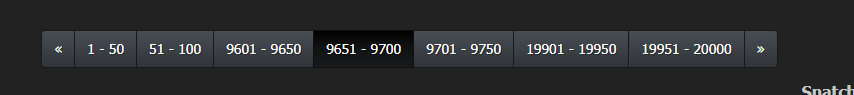
Improve the search function so that
searches on multiple words are possible
searches can go back or forward more than one page at a time ( I hope the screen grab makes that clearer)Thanks
PS Hated it at first but would not go back for quids
-
Great work so far….would it be possible to anchor the title line. As it is now when you scroll the individual item feed to see the description the title disappears behind the item directly above it, which in turn makes reading the description either difficult. It also gives the sight itself a appearance of unpolluted. Cheers!
-
Using the large fixed image preview from the search screen - the floating menu bar at the top covers it (possibly drop the float down by that many pixels or make it float on top of the menu).
Also the image previews are in a single vertical column on the left only. Very hard to 'inspect' but maybe class mythumb was intended to be 'floating' so that the images would fill the space? Or reusing the case in the Browse section please! Throwing in a 'float' is instantly better but with gaps
Edit: the Browse page doesn't respect the mover image setting. But the hover images are stacked correctly - so there is definitely something funky with the fixed size image hover!
-
Thank you for the update. I'm loving the new cleaner mobile layout, especially the torrent image browser.
I'm using Samsung Internet Browser v12.0.1.36 on my Essential Phone and I'm having problem clicking on the torrent's title. Everytime I do it, the screen flashes a preview of the first three images of the torrent for a nano second but it does not load the torrent page. It does not matter if I zoom in to enlarge the torrent's title text. It happens with most torrent links. Please try multiple links on the page when trying to reproduce the bug. I was able to reproduce the problem on my Mi Pad 4 as well.
I had similar problem with the previous version of the site, but I was able to get around the problem by clicking near the beginning of the torrent's title.
I stumbled across the cause of this bug last night. The torrent page will load when there is no more than one image on the torrent page. Torrent page with multiple images just flashes the preview images and not load.
With the Description toggled to Short and Compressed mode, I can open torrent page with three or less images.
Solution : In Profile, when I switch Thumb Style on Browse to Thumbs appear at mouse position, all torrent page loads as expected.
For the phone layout, could you please bring back the quick download torrent file on the torrent listing page. Maybe as an icon after the camera icon in the torrent's title. Alternatively, move these two icons to the beginning of the torrent tag row and replace the current image tags with text links. This could free up space for additional torrent description texts.
-
too dense, small pics ; on my screen on both sides, 2 x 4 cm empty !!!????
-
I did a bit of double checking. The problem below appears to be associated with the old IE 11 browser. I did the same commands under Chrome (Version 83.0.4103.116 (Official Build) (64-bit)) and the issue DOES NOT appear.
I am leaving info below in Just In Case it helps someone else.(and yes, I am using the antiquated IE but only with GTRU. I separate everything else to the modern chrome or firefox :-))
Just saw a change occur in search that I'm not sure was intentional. The change may have been intended to help phones maybe but from accessing via a PC, it's not a good thing for me.
Example 1
this is the search page from earlier that I had not closed. it shows all the info stats and links on the right of the screen.
Example 2
This what I just got when I did another search
There are no stats - links at the right
BUT then I change to Full Screen and the info and links are there. It appears that the main left column is now a fixed width..NOTE I Really am getting to like the NEW style especially when casually seeing what the latest posts are. I will just deal with description results screen when I am doing a specific search by going to full screen as needed.
-
Hello,
Good work !")
but I just have a small problem: the number of thumbnails giving the subcategories is limited (apparently) to 2, while in the old design they are all displayed! -
Joker, the tweaks and improvements over the last couple of weeks have really been helpful. It's looking great and the new site is much easier to use than the old site at this point. I especially like the dropdown menus at the top of the page.
There are a lot of comments and suggestions in the "Suggestions & Site Feature Requests" subforum that you might want to read:
-
1. The look of the website in the mobile version is ugly, it always crashes and the browser says 'gaytor.rent is not matching'
2. the page names of the torrents are too long, the images incorporate taking longer to load and are cut as below.

3. The search box in the mobile version is so small that I can't even find it and the 'search' button is out of alignment
-
At your service. I was cool with the compact version of the new design, but with scroll text on the torrent roster, no can do.
-
The new layout is terrible and borderline unusable. I appreciate the effort that went into a revision, but a basic principle of UI design should be ease of navigation and the ability to scan large numbers of items in a list. Everything here is now blocky and huge, and you can only see 2-3 torrents per screen, as opposed to the 15-20 I could previously view.
Accommodations should of course be available for people with visual difficulties, but it's entirely possible to provide those without destroying ease of use for those of us who have our browsers set properly for our level of eyesight. Forcing all of us to view a page with large, clunky pictures and enormous fonts isn't the way to provide this.
The new UI is awkward and works against easily seeing which torrents are available. I'm sorry to say that I've honestly stopped using the site because of it. I'll check back on occasion to see if these issues have been improved, but until then, I wish you all well.
-
Looks good, at least so far. A lot of redesigns seem to cause more problems then before but this looks to be fairly clean.
an incredible 279 users have switched back to the old version. probably because the font was too small in the beginning? It's a pity that they don't get in touch here why. In a future version (where also this forum will get a huge version jump forward) there will be no way to activate the old design. i can't please everybody, but i'll try my best. So give me your feedback, and as exactly as possible what is not as good as before in the new version, so i can work on it.
Any eta on forum redesign?
-
The placement of the forum threads are odd too so when the redesign happens, consider changing the placement.
The rules section is placed all the way the bottom of the page but description says:
"We will post extremely important information and rules here."Seems like that should be at the very top?
Also non-english board section is above request section (even though request section is used the most). So, would think that should be reversed?
Hello! It looks like you're interested in this conversation, but you don't have an account yet.
Getting fed up of having to scroll through the same posts each visit? When you register for an account, you'll always come back to exactly where you were before, and choose to be notified of new replies (either via email, or push notification). You'll also be able to save bookmarks and upvote posts to show your appreciation to other community members.
With your input, this post could be even better 💗
Register Login