New Design
-
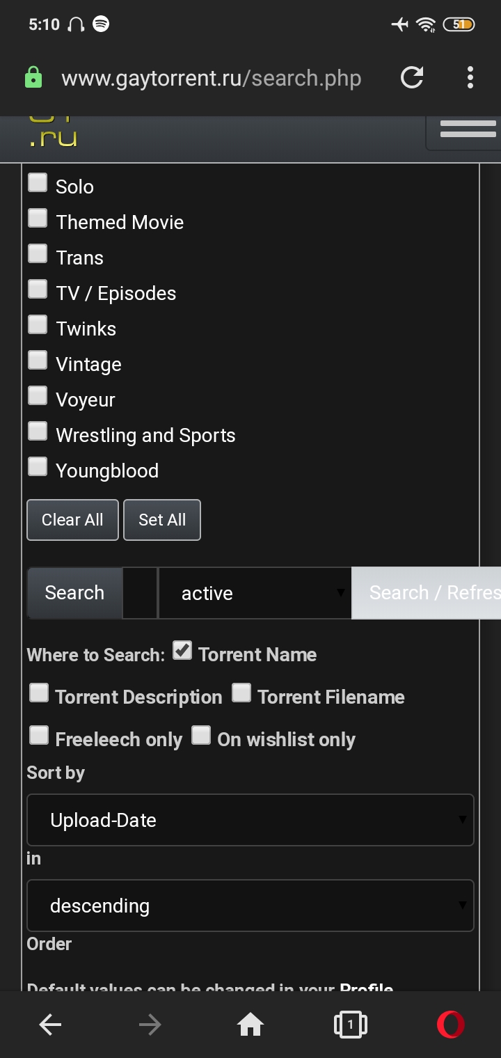
In mobile, search torrent, the box is so tiny I can't see what I typed to search
-
Το λατρεύω!
I love the new design, because of the images. saves time of the browsing.
Keep it up!Σας αγαπώ τσούλες!
-
My main concern, as a colourbind person, is the printing of colours on a black backgroud, as in the main page list of online members, for example. I make many typos. Sorry to those that get wound up! But I do have to be able to read the original text, if I can't that's your problem, not mine. For me, and it won't be the same for everyone, I can read white on black, and (best for me, black on white), but almost any other colour on black, forget it! White background is better, but not text in green or blue, and some shades of yellow!
We are not all the same, as our community should be the first to acknowledge, and catering for everyone is very difficult.
Just my persnal perspective.Thanks for listening
-
You need to put the number range (1-50, 51-100, etc) at the BOTTOM of the page, or both the BOTTOM and TOP, because as it is now, it is necessary to return to the top of the page to go to the next page.
-
The new design is complicated, I really prefer the old design, it much easier to find stuff and I can see everything on the web page without searching for stuff
-
I prefer old design. I need to be able to browse in "Boss" mode so I need this to be as unobtrusive as poss.
-
I like the new design a lot.
I just notice that the gallery viewer (still) does not work properly in Chrome (its fine in other browsers)
Also I was thinking, that maybe an additional options to let preview images expand on mouseover instead of click?appreciate the effort to keep it fresh :cheers:
-
I have noticed my fonts (only on this page are out of sync with fonds on other pages. Even if I try to adjust. Working on a new MAC desktop.
-
The image preview in the new search is way better!

-
Kind of like it but there is still something that bugs me and i don't know exactly what it is! but good work all around…
-
The only thing I don't like is that going to Search or Browse is now two clicks (Torrents, Search) instead of one.
-
6 fine-tuning suggestions:
1. The font is uneven as a read across the page from left to right Over you need to fine tune / smooth out the over-varying muddled-looking proportions created by altering sizes of icons, fonts and column widths - so they hold the eye and enable swift visual consumption by use of elegant streamlined proportions.
At the moment it looks like you've cut the old proportions and pasted them together imagining that such a rehash will retain a good layout but it doesn't and it needs you to relax and enjoy evolving the whole further away from the old design by introducing new design directions to solve the remaining page's visual layout-proportion issues. Elements you could tweak and adjust:
a. Taking the scroll bar colour away from a white colour to a shade of grey which doesn't compete with the white colour fonts used
b. The catagory sub-cats image icons column look small and fuzzy/blurry in proportion to all the laoyout to it's right side - there's nothing wrong with making them slightly bigger, bolder, sharper.
c. The scroll bar and info-snatched-functions columns seems dis-proportionately too large compared to the torrent description column
d. You could place the description column more centrally by moving the infos column into 2nd place on the left - ie after the catagory column
e. Open the old search page and compare it to the new one. The varied size fonts in the old search retain an even streamlined proportion accross the page where the new search page fails to achieve that and it's font sizings have an uneven sizing issue. You might be able to start finding solutions to this problem by allowing browser page sizings to display the old/new searches at equal magnification where at the moment the new search page displays at a larger magnification that the old. Once you equalise browser page size magnification you will see that the old search displays added-info-snatched-function columns fonts at a larger size than they are displayed in the new search page. At the moment these columns fonts in the new search page start to shrink to unreadable sizes when the browser page magnification size is adjusted, revealing the fact that the font size used in the new search page in these columns are actually much smaller than the font used in the old search page for these columns and this may be part of the heart of the problem. With the old search page, playing around with browser page size magnification actually retains both readability and layout proportion to quite a small size But playing around with this aspect with the new search page sees fonts reduced to unreadable sizes whilst displaying both over/under sized and inelegant/muddled sized fonts. Have a play around and see if you can replicate what i am describing.2 I'm wondering about the whole ** design of torrent description column**: scroll vs pop up box : Some issues and options:
a. Why does the initial bulk image view-window for each torrent open on the title rather than the image thumbs bar which would be quicker / less hassle to select with a cursor and in terms of GUI - simply act as a logical 'image magnification' function ?
b. At the moment i don't really understand the use of the inactive camera icon - it's replicating the same message as the image thumb bar - ie 'this torrent has images'. But it's also noted the image thumb bar isn't displaying usefully readable images too and additionally confusing, as stated in 2a above, the enlarged image function is activated by the title not either of the camera icon/thumb bar icons. This is all in-elegant GUI logic.3. I would appreciate the torrent title bar and image activation remaining accessible when i view torrent description details as i often re-activate images when reading detail and i also often forget the title when diving into multiple series of detailed passage of description.
Solutions might be to:
a) Separate the title bar from a scrolling torrent description box , so the title bar and image activation is always available as one scrolls through text of the torrent description.
OR
b) Let a part of the torrent description area activate a torrent story description text and another part activate enlarged images - in this instance it might also be helpful to separate out element details of a torrent (ie year, country, size, language, format etc) so they are always initially readable and put story description in the pop up box - so maybe the title activates the story description pop up box and either a camera icon or image thumb bar activates enlarged images but the page always displays torrent title, image thumb bar/camera icon and torrent element details.4. I would appreciate a disable description scrolling option in the controls menu - so there are 3 options of none-short-long - with the none option simply preserving the basic torrent element details ie size country year format langauge etc as i seem to always end up repeatedly trying to scroll down the page and constantly ending up scrolling down an individual torrent description as i navigate down a page. I tend to send torrents i want to examine into a new tab anyway.
5. Could we have a disable comment box option too ? I just find all this box info activation makes speed reading slow as it cloggs visual space - i rarely read comments too.
6. And….how about sorting out the batch-delete user messages while your about it - i'm sick of having to hand delete each and every message i get from the system up to 700 times a year !!!
cheers
") twzz
twzz -
The search field in the mobile version is very small and you cannot see what you are typing, every time I need to switch to the desktop version on the cell phone. Could they adjust?
-
The search field in the mobile version is very small and you cannot see what you are typing, every time I need to switch to the desktop version on the cell phone. Could they adjust?
Turn your phone sideways?
-
….
I just notice that the gallery viewer (still) does not work properly in Chrome (its fine in other browsers)
....I really like the continued refinements to the site design - thanks for all your hard work! :love:
I thought I had encountered the above issue just now in Firefox, but it seems like an exception/error with the specific torrent page for Nacho Vidal's Dark Tales From Europe - The Bathroom
In the search results screen I can click on an image and the gallery scroller launches as expected, but when I click on the Torrent Name and navigate through to the torrent details page, clicking any of the images navigates to a page with just that single image.
I also notice there is a warning about insecure content - see attachment.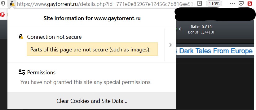
-
The Search page 'select torrent category to search' facility - the categories are listed in no logical manner - there are now so many categories listed in random columns it takes time to search for the ones you want. Maybe you could rationalise the way the category listings are displayed. EG Vanilla themed - Alt themed - Non porn and other media themed - Body type themed
cheers -
The new search engine is GREAT!! Keep up the good work!
Cheers
keydom
-
I like the ability to quickly and instantly adjust how the content is displayed. Depending on which device I am using, the different view options make the viewing and searching experience far more effective and straightforward. I appreciate the fact that the toggles aren't buried in the account settings area and are accessible every time I search.
-
I like the new design.
-
I like it!
Hello! It looks like you're interested in this conversation, but you don't have an account yet.
Getting fed up of having to scroll through the same posts each visit? When you register for an account, you'll always come back to exactly where you were before, and choose to be notified of new replies (either via email, or push notification). You'll also be able to save bookmarks and upvote posts to show your appreciation to other community members.
With your input, this post could be even better 💗
Register Login