New Design
-
I would appreciate your feedback on today's design update. Some of you have already reported about fonts that are too small. It is always very important to know where exactly on which page you see a problem. Then we save ourselves unnecessary questions back and forth. Of course I am also happy about every positive feedback, without any change wishes. :cheers:
-
Good Work Dear, nice to the old eyes
")
-
-
It is clean. I think I Like it, I'll give it a go. One thing is bothersome: in Browse view, when I mouseover "i" to see info, the popup box sometimes is very wide and goes off the left side of the page. This is only happening in Safari (which I prefer to use). It looks fine in Chrome. Also, under my profile I do not see an option to choose the old layout, although like I said I think I'll get used to the new layout. Nice work
")
-
It is clean. I think I Like it, I'll give it a go. One thing is bothersome: in Browse view, when I mouseover "i" to see info, the popup box sometimes is very wide and goes off the left side of the page. This is only happening in Safari (which I prefer to use). It looks fine in Chrome. Also, under my profile I do not see an option to choose the old layout, although like I said I think I'll get used to the new layout. Nice work
This issue should now be fixed.
-
I like it, especially the main index pane (strip) that stays frozen at the top of the page, even when one scrolls down.
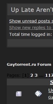
One might take a look at font colour vs. its background: For example, at the Forum page for "all unread topics," I get what's pasted in below. The text below "Gaytorrent.ru Forum" wants to read, "Pages: [1] 2 3 … 117" but note how "Pages: [1]] and "…" fade almost completely into the background. This should be just a minor tweak.
As for font size, I commend you for not following the current web design trend of enormous fonts. My bank, for example, tells me my balance in a font that is 6 cm high! I think the current font sizes on the site are just fine. Members can be reminded that pages can grow (or shrink) with browser controls (e.g., "Cntrl" & mouse wheel).
Thank you to all admins and moderators for their hard work!
-
I really like the new cleaner look and larger fonts. Thanks for the hard work.
What I do miss, is seeing my ratio and seed points on the top of the page. I do not think it would be too much clutter if those important stats were added back onto the top for easy viewing.
-
don't take to much attention to the forums and how it looks actually. This will get a seperate major update. I will have to take down the forums for maybe more than a day todo this.
-
I really like the new cleaner look and larger fonts. Thanks for the hard work.
What I do miss, is seeing my ratio and seed points on the top of the page. I do not think it would be too much clutter if those important stats were added back onto the top for easy viewing.
well, you just need to click on your name in the menu to drop it down and reveal this information.
-
All good but I agree that the fonts of the columns on the right are too small (date, data, weight …)
-
I like it, the only issue I've noticed is on the search pages, when hovering over the title of the torrent to get the picture preview popup, the top of the first image is hidden underneath the new page header.
-
All good but I agree that the fonts of the columns on the right are too small (date, data, weight …)
how about now?
-
Thanks for the update, although I miss being able to scroll between multiple screenshots in a post. Pictures seem now to open in a window that you have to then close and then click on another picture, in Safari at least.
-
Thanks for the update, although I miss being able to scroll between multiple screenshots in a post. Pictures seem now to open in a window that you have to then close and then click on another picture, in Safari at least.
hmm.. .just tried safari.. but i cannot reproduce your issue… if i click on a pic, the pic-selector pops up but not a single pic
-
Looks good, at least so far. A lot of redesigns seem to cause more problems then before but this looks to be fairly clean.
-
Looks good, at least so far. A lot of redesigns seem to cause more problems then before but this looks to be fairly clean.
an incredible 279 users have switched back to the old version. probably because the font was too small in the beginning? It's a pity that they don't get in touch here why. In a future version (where also this forum will get a huge version jump forward) there will be no way to activate the old design. i can't please everybody, but i'll try my best. So give me your feedback, and as exactly as possible what is not as good as before in the new version, so i can work on it.
-
It is clean. I think I Like it, I'll give it a go. One thing is bothersome: in Browse view, when I mouseover "i" to see info, the popup box sometimes is very wide and goes off the left side of the page. This is only happening in Safari (which I prefer to use). It looks fine in Chrome. Also, under my profile I do not see an option to choose the old layout, although like I said I think I'll get used to the new layout. Nice work
This issue should now be fixed.
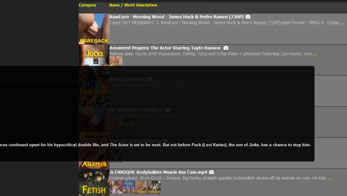
I still get this phenomenon. If I mouse over the description ellipsis on the torrent "Answered Prayers: The Actor Starring Tayte Hanson," the expanded description bleeds off the left side of the screen (see screenshot below). This doesn't happen on all torrent listings, which is odd. It's not a serious issue.
-
It is clean. I think I Like it, I'll give it a go. One thing is bothersome: in Browse view, when I mouseover "i" to see info, the popup box sometimes is very wide and goes off the left side of the page. This is only happening in Safari (which I prefer to use). It looks fine in Chrome. Also, under my profile I do not see an option to choose the old layout, although like I said I think I'll get used to the new layout. Nice work
This issue should now be fixed.
I still get this phenomenon. If I mouse over the description ellipsis on the torrent "Answered Prayers: The Actor Starring Tayte Hanson," the expanded description bleeds off the left side of the screen (see screenshot below). This doesn't happen on all torrent listings, which is odd. It's not a serious issue.
tooltips driving me crazy !!! :crazy2:
i will go into this ASAP.. but first, i need a nap. keep reporting anoying stuff here! -
It's a pity that they don't get in touch here why.
It's worth noting that you didn't actually ask for that. This is the message people see:
"2020-06-06 - Layout changes Today we have activated a new cleaner layout. If you prefer to use the old layout, you can change it in your profile. Feedback? Use the Forums."
If you feedback as to why people switch back, you need to be clearer. After all, why would anyone take the time to provide feedback if they can simply switch back to the former version.
In a future version (where also this forum will get a huge version jump forward) there will be no way to activate the old design. i can't please everybody, but i'll try my best. So give me your feedback, and as exactly as possible what is not as good as before in the new version, so i can work on it.
This is the message you need to give everyone because it gives them a concrete reason (the old design is going away) why they should provide the feedback.
It's also probably a good idea to tell users why you are changing the site. Personally, I'm a "if it ain't broke, don't fix it" person. I respond better to changes if I'm told why the changes are made.
-
sincerely, i prefer the old design. this is to basic and the menus are in topics, the old one the menus are all in bars
Hello! It looks like you're interested in this conversation, but you don't have an account yet.
Getting fed up of having to scroll through the same posts each visit? When you register for an account, you'll always come back to exactly where you were before, and choose to be notified of new replies (either via email, or push notification). You'll also be able to save bookmarks and upvote posts to show your appreciation to other community members.
With your input, this post could be even better 💗
Register Login