New Design
-
The new layout and especially bigger font sizes for some elements (e.g. navigation) are mostly fine, but having the thumbnails visible for all torrents is very disorienting for me. Even more so because the category pictures kind of get drowned out by that as well.
-
I am honestly not a fan of the new look.
The old version 'search' was so much cleaner looking. This new version is too cluttered with thumbnail pics that don't even enlarge when you hover over them, and the scroll bars mean that when i scroll down the page and the curser stops on a torrent which has its own scrollbar, it stalls the overall scrolling process.
Also, i don't wanna see some of the pics as i find some things too vulgar, its not so pleasant as before when pics only appeared if you hovered over a particular torrent.
Lastly, the ratio colour is dark red making it impossible to actually read without sticking my face to the screen. Why isn't it white like the bonus figure?
Those are my reasons for disliking new design. I was one of the ones that reverted back to the old design, but since its gonna be scrapped….
These are just my thoughts. I do like the idea of having that background colour with theme name in the corner of the icons. And i love that the top of the page looks sleek. -
Hi. I also reverted to the old design, I just don't like the new design, too many thumbnails. I reverted immediately. I hope it is possible to leave "old design" function (as xda developers forum have).
Thank you for your work
")
-
Hello
I find the new design of the search page quite inconvinient because the table is too wide on the desktop.
Thanks
Nir -
But people must also understand that after such a long time with a design from 2006, it is time to make some changes.
I would respectfully disagree. Many commercial webmasters like to make periodic changes to give a new "look and feel," but there's no need to fix something if it isn't broken. The new frozen pane at the top of the windows is a welcome feature, but I don't see much advantage to many of the other changes. I suggest an approach of, "What do we need to fix?" and then fix it…not "What can I change for the sake of change?"
That said, I again appreciate the hard work of the many people in operating this website. I'm a little disappointed that there isn't more of that appreciation shown in this topic thread.
-
The neew design may grow on me, I'm currently eh on it. The biggest issue I have is that the search pagee is way too wide on PC, it lookeed a lot better when there were borders seperating the main content from the edge (like in the forums).
-
I use the site through the Search view. I like the new update… looks very clean, but I don't like all the thumbnails on the page. I also have issues when I scroll going into another scroll bar. If we can keep those off, or make it an option, I'm great with the update
-
I find new design much harder on my eyes. I'm having to really concentrate to focus on the links that will take me to torrent info page. I'll go back for as long as I can
-
Hiya, thanks for the good work! However… the extended search view is quite crowded with all the screen caps, and it's difficult for the eye to grasp the file name/title, screen caps and other information such as file size, statistics etc quickly. Some may like it, but sorry: I don't. In the condensed search view, it would be nice to have a slightly larger font size, please?
-
When using the Browse feature, it doesn't scroll infinitely for me now. It loads about 3 1/2 screen height's worth and stops. Reloading doesn't help.
-
I like the new design - and I'm especially impressed that you've clearly tweaked the layout based on on user feedback!
WELL DONE!One thing I noticed today on the Search page: in the first column, where it appears you're trying to show the list of categories/sub-categories, they're not always showing the full list. I see up to 5 (1 big, 4 small) on some torrents, but there are missing ones on some. In particular, it looks like when there are only 4 total, only 3 show. (Sorry if my naming doesn't match yours).
Also, I use a DARK layout, and my ratio is under 1 (I don't know, I think I get penalized by the fact that I use a VPN proxy) - still, the text is supposed to be RED – but the font color is too dark to read. I have to highlight it to read it. (And, I'm creating new torrents with some of my older stuff that I've re-coded to be smaller to try to improve my ratio!)
Otherwise, I love that you're working to make things better!
-
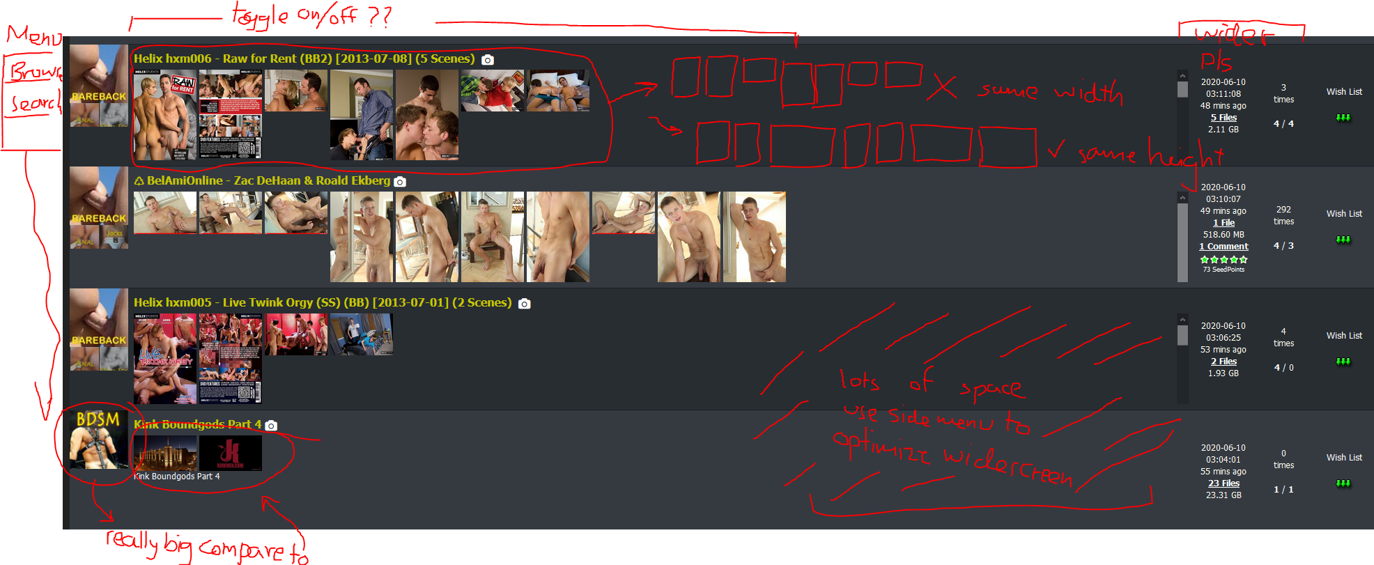
It's probably already mentioned but I do have a few suggestions.
1. The column on the right (info, DL, wishlisht add) should be bigger.
2. When we're on the monitor everything is really wide and not compact like the old design, in this case, moving the menu to the left side (vertical menu) might help
3. I would suggest an option to toggle screenshot/thumbnails.
4. Please tweak the size of thumbnails and the category. Now, the category is bigger than the thumbnails. It should be the other way around. Also, I notice that the thumbnails are equal width, it should be equal height for better and more organized looks.I attached a screen shot for you maybe it's better to represent some points.

-
i prefer the old design as well.
it works better on a standard laptop screen.
is it possible to give a choice permanently ? old vs newon the new - what bothers me most is the mix of font sizes. i struggle to read some of the really smalle fonts.
for example… on the main header, you have 'Torrents' , 'Search' 'Form' ...in one size... and then the UL / DL / Ration / Bonus details in a much smaller font. that i find very frustrating, because my eyes don't adjust that well to the size difference.
-
I like the grey look. But for me the search results are too busy in the new way. I don't need to see the thumbnails at the search results. It takes too much browsing.
-
the new design is nice. my only gripe is that the thumbnails are shown without question. the previous layout, we could hover over the title and see thumbnails if we're interested in the torrent.
could we have an option to NOT show thumbnails by default?
-
I’ve read this entire thread so far, so I hope to avoid any unnecessary repetition. It seems that Joker is doing this work almost completely by himself. I can’t imagine the amount of work he’s put in so far, so I want to say to Joker:
Joker - thank you for all the great work.
I use a laptop for the site, and I always go to Search, so I can’t comment on Browse.
First, I appreciate the larger font size and color used for the upload names; my eyesight isn’t what it used to be.
I personally like having more of thumbnails to see, and in fact have looked at/downloaded some torrents that I might not have noticed before because the some of the extra thumbnails caught my eye.
Yes, it does seem redundant that you can see the thumbnails and also hoover over the title and see the same pics pop up, but what I’ve found is that while glancing down the list, a thumbnail will catch my eye, and I’ll say to myself “Hmmm… that could be interesting, but I can’t really tell.” Then I will hoover over the title to see the picture pop-up (which is usually a bit bigger) and then decide if I want to open the torrent page. Perhaps the way to get rid of this redundancy is to drop the “picture pop-up when hoovering” function, and make it so that if we hoover over a thumbnail it will pop-up individually? I hope I explained that clearly. Not sure if it’s feasible with your software, but it’s an idea.
One person made a comment that having the thumbnails displayed as they are make it easier and more obvious when you have a lazy uploader who posts no pics, or one pic that has nothing to do with the torrent. This is one of my pet peeves. I see this new “obviousness” as an indirect way to shame such uploaders, and pressure them into following the upload rules and doing a better job.
I have to second what some previous commentators have said about descriptions and the mini-scroll bar. Accidentally scrolling those, instead of the page as a whole, seems to be happening a lot, and is frustrating. I would suggest getting rid of those mini-scroll bars and if a description is longer than the space allocated on the page, well, then cut it there; someone who is interested in the torrent can open that page and read the full description. The idea of the Search page is to offer a teaser, so that the viewer will become interested and open the torrent page. Joker, you have mentioned a toggle to make the view extended or not; this would also be a good solution.
I also find the search page bulky because I can’t see many entries in one glance. But on the other hand, I do like some of the changes that make each entry clearer and more readable. I’m not sure how to reconcile these two opposite things.
Two very minor things, and I only bring them up because I’m an editor by profession:
-
On the search page the “number of files” is not grammatically correct when there is only one file. It reads: “1 Files.” Should be, of course, “1 File.” This has no effect on functionality, but I thought I’d mention. It.
-
When finishing a report on a duplicate torrent, the last line says something along the lines of “If this is true, you will get 50 seed bonus points.” Using the word “true” implies that it’s opposite is “a lie” and that if the report is not the truth, it is a lie which then makes the reporter a liar. Might I suggest using the word “accurate” instead? There is no judgement if something is inaccurate, but there is if it is a lie. Small thing, I know, and completely unimportant, but like I said, I’m an editor…
Lastly, Joker, I want to say that I don’t hold much truck with folks who complain about how great the suffering it is to have to make one more click and angrily threaten to revert to the old layout or stop using the site entirely. A learning curve can be a little frustrating at first, especially in software (Microsoft anyone?), but it is exactly that: A LEARNING CURVE. Once people get used to it, they won’t even think about the changes anymore. So keep on making the changes that you feel will help modernize the site and make it a better place. Ignore the bitchy comments, consider all the good feedback, and carry on. You won’t be able to please everybody all the time. You’re doing great.
-
-
Large vertical images should be constrained to some max size
-
@ben351500 - I also have been accidentally scrolling the picture/description box, instead of the whole page. I've started to get used to moving the mouse to the right edge of the page before scrolling, which fixes that problem.
I really like the new extended view with the large fonts and full descriptions. Completely understand that the scrolling boxes won't work for everyone, perhaps we will have individual options to turn them on or off…
Thanks, Joker! The site is much better now.
One tiny thing, that might help a lot of people: we have been getting a lot of malware uploaded as .scr files. Would it be possible to color torrents that include .scr files with dark red, and add a "PROBABLE MALWARE" to the torrent title?
-
I had a play and I think with a few changes I can start to love it!
-
make the search page the same width and look as the torrent details page when on desktop
-
photos should be a max height - perhaps make them display only the first 5 images of 180x100 thumbnail
-
having photos is nice for mobile, where the hover preview just doesn't work
-
i think you're using the torrent description frame to pull the photos and description, so the pictures thing might be tricky. Making the page narrower will also make each torrent row taller, which isn't great - they're a bit tall already.
-
ideally, all text would be white - there are some shades of grey currently (column titles for ex)
-
feature request - can we also have a dark mode (all black) style sometime in the future please
-
-
Hi!
You did a great job for sure.
Unfortunately I am not a complete fan of this new layout. Especially because of the thumbnails that disturb me in the search (they take up a lot of space and bring me nothing, I prefer the popups on the titles).
Thank you for planning to "view less information".
Best regards
Hello! It looks like you're interested in this conversation, but you don't have an account yet.
Getting fed up of having to scroll through the same posts each visit? When you register for an account, you'll always come back to exactly where you were before, and choose to be notified of new replies (either via email, or push notification). You'll also be able to save bookmarks and upvote posts to show your appreciation to other community members.
With your input, this post could be even better 💗
Register Login