What is with the hideous category icons?
-
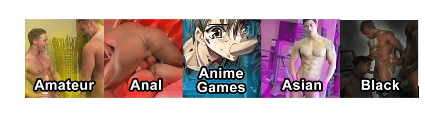
No hate here- just honest criticism. The category icons all basically look the same and the name is very hard to distinguish from the image.thhe also seem very badly compressed.
I will volunteer to create alternatives and if they are well recieved maybe we can switch them out?
-
The reason why they look almost alike is that most uploader uses same category icon over and over…
like anal, bareback, hunks, twinks etc... w/c fits what is being post...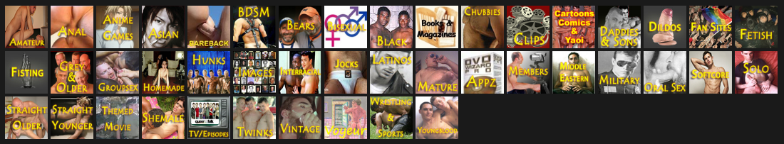
-
No hate here- just honest criticism. The category icons all basically look the same and the name is very hard to distinguish from the image.thhe also seem very badly compressed.
I will volunteer to create alternatives and if they are well recieved maybe we can switch them out?
If you make a couple, post them and see if the board mods/owners will use them, if they like them you can complete the set. I think a refresh on the icons would be good personally…
-
Well, we are looking for an icon for "Gay Art".
It will need to be 400x400 with a final compression down to 80x80.
-
Would you be open to suggestions / concepts tor the others? Even if they get rejected might be fine just making them haha.
-
Just make what you think is best and I'll show the site owner.
-
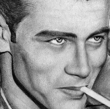
What about a category for celebrities. I have upload this picture of James Dean.
-
I created a sample of a few beside each other. Original size of each is 400 x 400. If you guys are interested in this look for the categories I can create it for all of them. Let me know.
")
-
i would not say "no" if you supply a new set of category images...
one thing: could you also supply a .psd file? so i can create new ones with the same style myself...
-
@joker said in What is with the hideous category icons?:
i would not say "no" if you supply a new set of category images...
one thing: could you also supply a .psd file? so i can create new ones with the same style myself...
Ok here are the PNGs and the PSDs to download:
PNG
https://1drv.ms/u/s!AviS2Y6wG9iggqwEYVdIj3kZFbZ_bg?e=TUlKkbPSD
https://1drv.ms/u/s!AviS2Y6wG9iggqwFxoSaoCbT5o-MNQ?e=m6h4ZKSummary Sheet
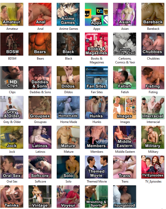
Enjoy!
-
@cuppednoodle I appreciate the effort it took to locate new imagery and assemble this full panel of proposed icons. As well, the B&W type effect is highly legible.
Many of these icons give me an immediate Aha! feeling, because the image clearly aligns with the category. With respect, a few of the icon images felt less connected, or had possible issues like "too dark" or "not quite a match."
For me, these would include BDSM, Black and Jock (dim lighting), Bears (needs hair), and "not quite a match" for Amateur (looks pro), Hunks (look like Jocks), and Youngblood (could be Daddies & Sons).
Again, these are one person's observations, overall it is very impressive work.
-
@cuppednoodle those are way better than what is used now (no hate, just a remark). Nice work !
-
@flozen Thanks I appreciate the feedback! I wouldn't mind updating some of these the ones you pointed out I definitely agree with.
-
@macburn Thanks I appreciate it!
-
@cuppednoodle I'm not certain the Bear and Twinks image directly relate to the categories they represent?
For some categories I would prefer illustrations than photographs as it's easier to understand universally, eg. a generic book illustration rather than a GT cover since it's not a globally accessible publication. Same idea with images for TV/Episodes and Themed Movies. Using these, we're assuming everyone who accesses the site worldwide intuitively knows what the publication/show is. In addition to the site not having multi-language functionality for these icons, having as universally understood images would be simplest to assist as many users as possible who do not read/speak English fluently.
-
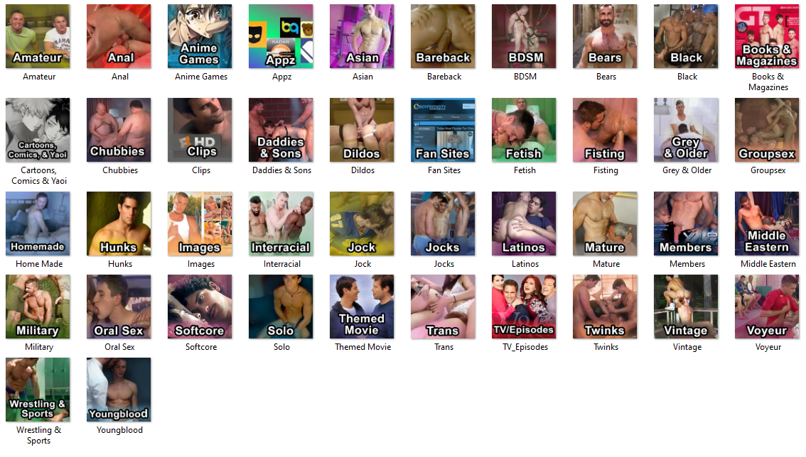
Adjusted the icons based on your feedback, thanks!
PSD
https://1drv.ms/u/s!AviS2Y6wG9iggqwfeXP-5ZQBUILCTA?e=Ue7nuvPNG
https://1drv.ms/u/s!AviS2Y6wG9iggqwgzkbafwvlLvh2kA?e=tw1JUgSummary Sheet
-
@cuppednoodle Wasn't sure how to edit my post sorry for multi posting. I updated all except Youngblood. Wasn't sure what else might work more I looked at some of the videos in that category and it seemed to align. Anyways thanks for the feedback I agreed with your points so figured I'd adjust the icons.
-
@erich214 said in What is with the hideous category icons?:
@cuppednoodle I'm not certain the Bear and Twinks image directly relate to the categories they represent?
For some categories I would prefer illustrations than photographs as it's easier to understand universally, eg. a generic book illustration rather than a GT cover since it's not a globally accessible publication. Same idea with images for TV/Episodes and Themed Movies. Using these, we're assuming everyone who accesses the site worldwide intuitively knows what the publication/show is. In addition to the site not having multi-language functionality for these icons, having as universally understood images would be simplest to assist as many users as possible who do not read/speak English fluently.
Hey, those were some of the trickier categories IMO. I just went with what I thought might work for those but wasn't too fussed about them since they seem more like novelty categories anyways haha. I have posted my working files here so if the powers that be deem any unfit they should be able to swap the images easily. Thanks for the feedback though!
-
Just a thought:
In PRACTICE on this site:
- Anal = Condom
- Bareback = No Condom
- BOTH = Anal sex
Hello! It looks like you're interested in this conversation, but you don't have an account yet.
Getting fed up of having to scroll through the same posts each visit? When you register for an account, you'll always come back to exactly where you were before, and choose to be notified of new replies (either via email, or push notification). You'll also be able to save bookmarks and upvote posts to show your appreciation to other community members.
With your input, this post could be even better 💗
Register Login