• Categories
    • Recent
    • Tags
    • Popular
    • Users
    • Groups
    • Torrents
    • Login

    The New Picture Browser - Feedback

    Scheduled Pinned Locked Moved GayTorrent.ru Discussions
    116 Posts 59 Posters 5.8k Views 1 Watching
    Loading More Posts
    • Oldest to Newest
    • Newest to Oldest
    • Most Votes
    Reply
    • Reply as topic
    Log in to reply
    This topic has been deleted. Only users with topic management privileges can see it.
    • JokerJ Offline
      Joker
      last edited by

      @bjk1961:

      Some of the descriptions fall off the side of the page.  Specifically, if you hover over an image in the second or third column on the left-hand side.

      I've attached an image.  Hope it helps.

      seems like it is fixed now
      thx for reporting

      1 Reply Last reply Reply Quote 0
      • P Offline
        Popper Global Moderator
        last edited by

        @Joker:

        @bjk1961:

        Some of the descriptions fall off the side of the page.  Specifically, if you hover over an image in the second or third column on the left-hand side.

        I've attached an image.  Hope it helps.

        seems like it is fixed now
        thx for reporting

        For me, yes  🙂 and I see the torrent title is displayed in the tooltip as well, now.

        1 Reply Last reply Reply Quote 0
        • P Offline
          pepecub
          last edited by

          Hate it, I won't be using it.  Takes forever to load.  Good idea though, love that the site keeps getting upgrades.

          1 Reply Last reply Reply Quote 0
          • M Offline
            MrE
            last edited by

            I like it Joker. Obviously not perfect but once fine tuned its a good system

            My request would be is there a way to have two different views like a toggle between grid and list for example where list would have the cover photo for each torrent and the title and maybe size beside it? Sort of the old list but with the cover photo displayed and blown up and with less but more important information. I know its more work for you but I think it could be useful.

            Just a thought anyway. Otherwise I like the change 🙂

            1 Reply Last reply Reply Quote 0
            • I Offline
              iniq
              last edited by

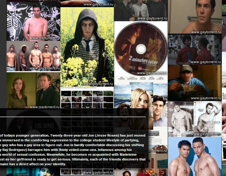
              Okay, after some thought, I do like the idea of the change but I'm not a fan of the new browse page as it currently stands. I have 2 complaints about  it.

              first: I hate hovering over a torrent and seeing something that just doesn't turn me on or that I find unsettling, like open areses. I then instantly unhover. At least with the normal "browse/search", there are sub category thumbs or descriptions which might give you some warning about the content you might see. And then it's my fault for taking the risk. With this new browse, everything is instantly dumped right in your face, big dicks, small dicks, daddies and sons, fisting, interracial etc… Having what you don't like unchecked in your profile doesn't always mean you won't see it. I'm not talking about the recent bug fix, but the fact that videos still appear under wrong categories or are hard to place under just one category and so have their "main" category set as say.. "hunks" or "bareback" but that contains "twinks" and "interracial". Whilst I understand that it's hard to decide which category something should belong in, the browse page forces you to view it all.

              second: forcing a user to download so many images is never a good idea, it's bad internet etiquette and some users may have slow connections, download limits etc...

              I understand where the changes are coming from but I think this first draft needs some work, if you want some sort of "recent upload" thumbnail preview, I think it might work better with fewer images, i.e the last 10 uploaded torrents (excluding ones from categories that are unchecked), and in some sort of carousel rather than a screen dump (it just looks like a bunch of random images). That way it could also be contained in a small "banner" like module and it would be easier on the eyes and the bandwidth. However the problem still remains of seeing things someone might not like. Is there a way to take into account the "sub categories" for each torrent, and filter the torrent if any of these also match anything unchecked in the profile. For example, I have "daddies and sons" unchecked but I'm still seeing torrents that have this as a sub category. It might also help to rename it from "browse" to something like "browse images" or "browse thumbnails" or "browse torrent images".

              Apologies if any of this has been addressed, as it took a while to write!

              1 Reply Last reply Reply Quote 0
              • R Offline
                rid123
                last edited by

                @Joker:

                @rid123:

                even i got accused of being in c64 era…not that im complaining, c64 is still the best thing.

                nothing to say against this. i started programming on a c64

                but please do not expect me to make the site work on it or on a win2k with 256mb memory  :blownose:

                Not expecting rocket science from you. Just expect you to keep providing me with these great torrents.

                @Joker:

                btw. popper was asking.. not me

                My Bad, My bad, I'll go sit in the corner.

                1 Reply Last reply Reply Quote 0
                • O Offline
                  OnlyMe
                  last edited by

                  I can understand certain people liking the new pic-browser, but I'm not really a fan.  It's just an unorganised stream of pics which makes the screen waay to busy for my taste.  I like the old browser better, it's more organised and clear.  More to the point.

                  If the pic-browser stays, I hope that there will be an option to turn it off or on in our personal profile.

                  Just my 0,02  🙂

                  1 Reply Last reply Reply Quote 0
                  • P Offline
                    Popper Global Moderator
                    last edited by

                    There is something in these comments I don't get: Why to switch the new picture browser off in the Profile?

                    Just don't use it and continue to use the "Search" which got the usual presentation.

                    The picture browser is not meant to replace the torrent list, but as an alternative way to discover torrents.

                    1 Reply Last reply Reply Quote 0
                    • O Offline
                      OnlyMe
                      last edited by

                      @Popper:

                      Just don't use it and continue to use the "Search" which got the usual presentation.

                      If that option stays in, it's good enough for me  🙂

                      Furthermore I was just voicing my opinion as requested in the first post.  No need to get snappy.
                      Have a nice weekend!

                      1 Reply Last reply Reply Quote 0
                      • I Offline
                        icadhari
                        last edited by

                        Hmmm….I think it´s not good idea to browse by image...frankly speaking it´s horrible...seeing titles is better.

                        1 Reply Last reply Reply Quote 0
                        • P Offline
                          phonebud
                          last edited by

                          I'm terribly sorry to have to give what must have been a lot of work a "thumbs down," but I'm afraid I find the new "photo interface" clumsy, slow, a waste of bandwidth, and not terribly helpful.

                          I think part of the problem is that all of the images lose impact when they're all crowded in together in a mosaic:  you cannot see the individual trees for the forest, as it were!  It's very overwhelming to be blasted with that many images all at once.

                          I must also confess that I dislike interfaces that rely heavily on Adobe flash and javascript other such extenders of simple HTML form controls–I think they're terribly wasteful, when they aren't really necessary, and that they slow things down, interfere with interoperability and automatic search engines, and don't really deliver, in most cases, enough to justify the overhead at run-time (let alone development cost).

                          The "old" interface which is still available under Search was very satisfactory, and I'm not sure what motivated the change.  The one suggestion for improvement which I made recently was to add a control in the individual torrent display to include a particular torrent in ones wish list–presently, that control is only available in the listing and is not there if one leaves the listing to inspect the full page of the torrent.

                          I will try to play with it a few more times.  Mostly, I'm having difficulty trying to think of a situation in which such a picture display might be helpful.  The only thing I can think of would be if one were, say, attempting to find one particular model by his face, when all one knows is a word from the title or the name of a studio:  Perhaps one can use your new Browse to show pictures only matching what one did know, and then scan for the face of the model one is after.

                          I'm not sure what actually motivated all this work.  Perhaps you can add a comment to this thread explaining what the goals of the project were, and then we can comment on whether we think those goals were met.

                          1 Reply Last reply Reply Quote 0
                          • P Offline
                            phonebud
                            last edited by

                            I'm also sorry to report that, probably as part of the recent change, there has been a change to the "pop-up comments" in the "old" Search page which has broken it in my browser.

                            The comments often do not pop up at all, and when they do, they vanish again quickly, sometimes, before one has a chance to read them.

                            It was flaky, but working, heretofore.  I notice also that the font and display of these comments has changed to one which is a little harder to read.

                            Incidentally, I said in my last feedback comment that perhaps the picture-browser would be useful to identify a particular face from a studio, but I see now that there's no option to filter the pictures by a keyword–one can only filter by the broad fixed categories (assuming that works).

                            I wish I had something more complimentary to say, but it really looks to me that this was more an exercise or etude for someone seeing if he could make an interface than an effort to make a gaytor.rent visitor's experience, looking for entertainment, any better.  As an exercise or school assignment, I think it's deserving of praise, but I really don't think it's useful or helpful or even comfortable enough to use from time to time for a change of pace.

                            1 Reply Last reply Reply Quote 0
                            • P Offline
                              Popper Global Moderator
                              last edited by

                              Your earlier request to have the wishlist function on the torrent page had well been noted and likely to be implemented when the next time the torrent page is touched. That wishlist function on the torrent page becomes useful when finding a torrent via the picture browsing, too.

                              –---

                              @OnlyMe:

                              ….
                              Furthermore I was just voicing my opinion as requested in the first post.  No need to get snappy.
                              Have a nice weekend!

                              I don't think to have been snappy, but just like to understand why many members ask to have the possibility to disable an additional function offered, rather than just not using it. You haven't answered that question in your reply. 😞

                              1 Reply Last reply Reply Quote 0
                              • T Offline
                                ThisIsOnlyme
                                last edited by

                                I like it as an additional feature.
                                I prefer the original, but I can see myself check out this new one periodically.
                                It does work well with my large monitor. I can quickly peruse the images to see if I may have missed something of interest.

                                ;D

                                1 Reply Last reply Reply Quote 0
                                • M Offline
                                  mclovin
                                  last edited by

                                  saw it last night. wasn't really a fan. First the search bar was missing in picture browser so that threw me off. but then i saw that we can switch to the regular browser look. the picture browser is cool but I'm just used to searching for adult performers names and I would like to get a better idea of the recent uploads featuring them. Also some of the content with photos like fisting, water sports or scat are gross so I am NOT interested to gettig glimpses of those images. Still love the site! Hope you input is helpful.

                                  1 Reply Last reply Reply Quote 0
                                  • JokerJ Offline
                                    Joker
                                    last edited by

                                    anybody else experience problems on the "search" page since the changes?

                                    would it be helpful to have also a "search field" ? i guess yes

                                    we find better ways for categorizing our pictures with the kind help of our users soon to have pics like "scat" set on "explicit?!?"

                                    1 Reply Last reply Reply Quote 0
                                    • N Offline
                                      neredesin34
                                      last edited by

                                      new picture browser is horrible (at least for me)
                                      It makes it very difficult to find what one is looking for.

                                      Old browsing system is much better for me.
                                      It would be nice if you provide a choice in the profile settings t choose old or new one
                                      thank you for your efforts

                                      1 Reply Last reply Reply Quote 0
                                      • JokerJ Offline
                                        Joker
                                        last edited by

                                        @neredesin34:

                                        new picture browser is horrible (at least for me)
                                        It makes it very difficult to find what one is looking for.

                                        Old browsing system is much better for me.
                                        It would be nice if you provide a choice in the profile settings t choose old or new one
                                        thank you for your efforts

                                        ? you did not read this topic well right ?

                                        1 Reply Last reply Reply Quote 0
                                        • shdwrulrS Offline
                                          shdwrulr
                                          last edited by

                                          @Joker:

                                          @neredesin34:

                                          new picture browser is horrible (at least for me)
                                          It makes it very difficult to find what one is looking for.

                                          Old browsing system is much better for me.
                                          It would be nice if you provide a choice in the profile settings t choose old or new one
                                          thank you for your efforts

                                          ? you did not read this topic well right ?

                                          This is the internet, easier to spend a minute to drop a complaint than to read a page or 2 of responses.

                                          Anyways, the new images layout is interesting however.

                                          1. Would like to make thumbnails bigger, currently they are a bit too small. ***
                                          2. Delineation between torrents
                                          3. Ability for the torrent maker to select primary image. Community can also pick/vote a primary image. ***
                                          4. Ability to see multiple images in a torrent on hover (such as how search does for mousing over title) ***
                                          5. Show file name/title with image

                                          An idea would be to have various boxes with small margins/borders setup, each with the truncated title across a single line and an image under it. When moused over, it shows the other images (like current system).
                                          Also image size options, such as small (current thumbnail size), medium and large. These thumbnails would be based on the image width as to keep the flow of things.

                                          *** Items would make the largest impact of usability for me.

                                          "The box said 'Requires Windows XP or better'. So I installed LINUX…"

                                          1 Reply Last reply Reply Quote 0
                                          • B Offline
                                            bnalls
                                            last edited by

                                            I really, really like the idea. I am one of those that depend more on the pics to make my decisions.  I just think if there were less pics per page it would really help.  While it does take a bit longer to load, that wasn't my concern.  It was the fact that there were soooooo many pics that just looked like they were piled on top of each other.  If there was more of a distinction between them, I would probably use it as a permanent search tool.

                                            1 Reply Last reply Reply Quote 0

                                            Hello! It looks like you're interested in this conversation, but you don't have an account yet.

                                            Getting fed up of having to scroll through the same posts each visit? When you register for an account, you'll always come back to exactly where you were before, and choose to be notified of new replies (either via email, or push notification). You'll also be able to save bookmarks and upvote posts to show your appreciation to other community members.

                                            With your input, this post could be even better 💗

                                            Register Login
                                            • 1
                                            • 2
                                            • 3
                                            • 4
                                            • 5
                                            • 6
                                            • 2 / 6
                                            • First post
                                              Last post