New Icons
-
I suppose we could use a world map for ethnicities…
That would be better than the ridiculous and offensive caricatures, especially the Asian and Middle Eastern ones.
-
Cartoon icon update
-
That would be better than the ridiculous and offensive caricatures, especially the Asian and Middle Eastern ones.
I agree; let's try to stay away from racial or cultural caricatures.
As a map lover, I would say go for some sort of map, but remember that these icons are going to be small, so the more details you add the more cluttered the icon will be. I would again like to stress the maxim:
Less is more.
There's no need to fancy stuff up when it is neither necessary nor functional.
-
Less in a icon becomes more of a caricature.
For races might be best to just have text.
map seems to work at small scales
Especialy if some color is added.Now does Latino include USA or not?
-
Have adjusted balance in these icons
-
while those icons still under discussion, can i kindly ask the author to create SVG images ?
If we use this very Modern Vector Format we can scale those images to all sizes without having any quality loss.Could you please check this one here: https://www.gaytor.rent/2.0/gtlogo.svg
this is already SVG
-
Less in a icon becomes more of a caricature.
For races might be best to just have text.
map seems to work at small scales
Especialy if some color is added.Now does Latino include USA or not?
I agree with you, I believe that ethnicities should be represented only by words.
-
while those icons still under discussion, can i kindly ask the author to create SVG images ?
If we use this very Modern Vector Format we can scale those images to all sizes without having any quality loss.Could you please check this one here: https://www.gaytor.rent/2.0/gtlogo.svg
this is already SVG
What font did you use? It would be interesting to use the same font in the images of the categories
-
Nice to see a couple of changes!
Just realized why the 'file' popup lingers so long - the DIV for files is as wide as the column not the text (extra cm each side). I get a browser Loading cursor, and by the time the popup has loaded the mouse is outside the element and not triggering events.
I assume the images popup using FileListTip is quite different to file's NewTipOut as images doesn't have any issue vanishing if you aren't near the popup zone anymore.
Looking good!
-
I was thinking and if we were to consider the hypothesis of the categories being represented only by text, we could do it as follows:
Starting from the idea that this is a gay site and the LGBT flag has 6 colors, which are: Red, orange, yellow, green, blue and violet.
We could create 6 Main Categories: Physical, Age, Entertainment, Ethnicity, Sex and Fetish, for example. Each Main Category would be represented by one of the colors mentioned above.
After defining which color would represent each category, we would transform the existing categories into subcategories and distribute them among the main ones:
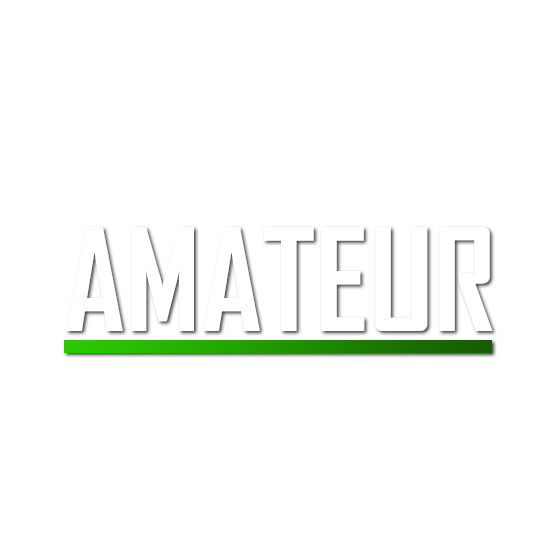
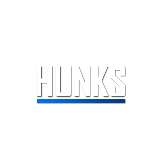
Physical: Hunks, Bear, Twinks …
Age: Mature, Old and Gray, Youngblood ...
Entertainment: TV, Books, Magazine, Comic, Games ...
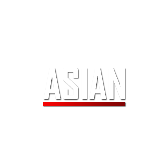
Ethnicities: Asian, Latino, Black ...
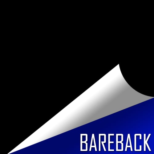
Sex: Anal, Bareback, Oral, Orgy, Solo, Straight ...
Fetish: Uniforms, BDSM ...The icon would be very discreet: It would have a transparent background, the name of the subcategory with a font in white and an underline of the color defined for the category. I put some models that I made attached, but it's just the basics, it would be interesting to define a cool font later.
And there is also the possibility to rename, unify and create new categories as mentioned earlier, to be able to better represent or cover more things with a single category
-
I was thinking and if we were to consider the hypothesis of the categories being represented only by text, we could do it as follows:
Starting from the idea that this is a gay site and the LGBT flag has 6 colors, which are: Red, orange, yellow, green, blue and violet.
We could create 6 Main Categories: Physical, Age, Entertainment, Ethnicity, Sex and Fetish, for example. Each Main Category would be represented by one of the colors mentioned above.
After defining which color would represent each category, we would transform the existing categories into subcategories and distribute them among the main ones:
Physical: Hunks, Bear, Twinks …
Age: Mature, Old and Gray, Youngblood ...
Entertainment: TV, Books, Magazine, Comic, Games ...
Ethnicities: Asian, Latino, Black ...
Sex: Anal, Bareback, Oral, Orgy, Solo, Straight ...
Fetish: Uniforms, BDSM ...The icon would be very discreet: It would have a transparent background, the name of the subcategory with a font in white and an underline of the color defined for the category. I put some models that I made attached, but it's just the basics, it would be interesting to define a cool font later.
And there is also the possibility to rename, unify and create new categories as mentioned earlier, to be able to better represent or cover more things with a single category
I agree with the use of text and color only. I hate to say that after all of the work that obviously went into the icons with the illustrations, but the whole point of a pictogram or ideogram is that text is not needed. However, the meaning of most of the icons would be difficult to figure out if they didn't also have text. That makes the illustrations more of a distraction than helpful.
-
Ok
Here are the text only icons with an underline of color as would look on smartphones.I would say the underline of colour needs to be fatter to be able to be seen. Especially on phones.
It looks as if one could use smaller hieght tiles but the square tile is better to touck on on phones.
NOTE
The off center of the list is how it is displaying at present.
I would say centering them would look better.Also note:
Category icon tile size in this category list appears at 60 x 60 pixels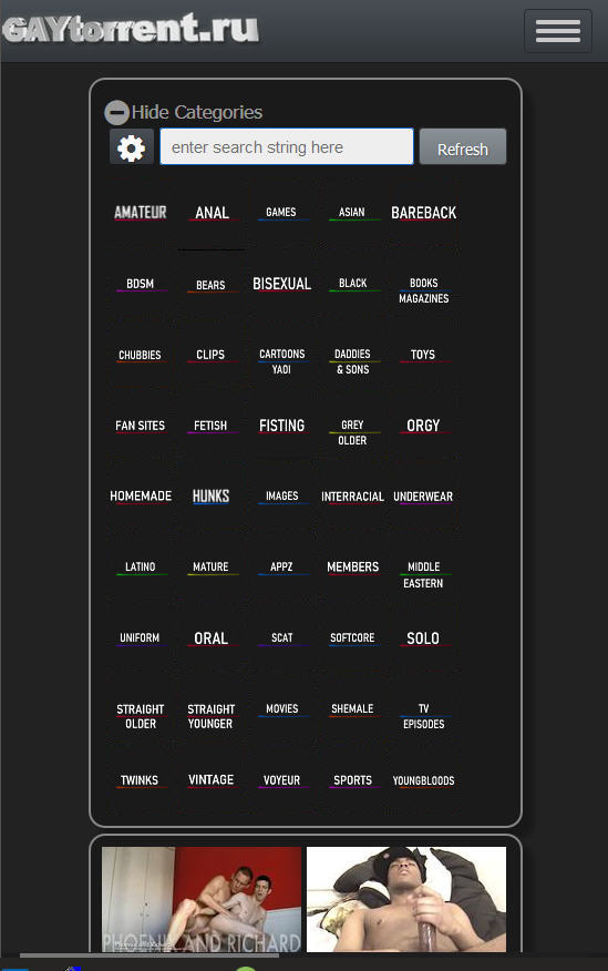
-
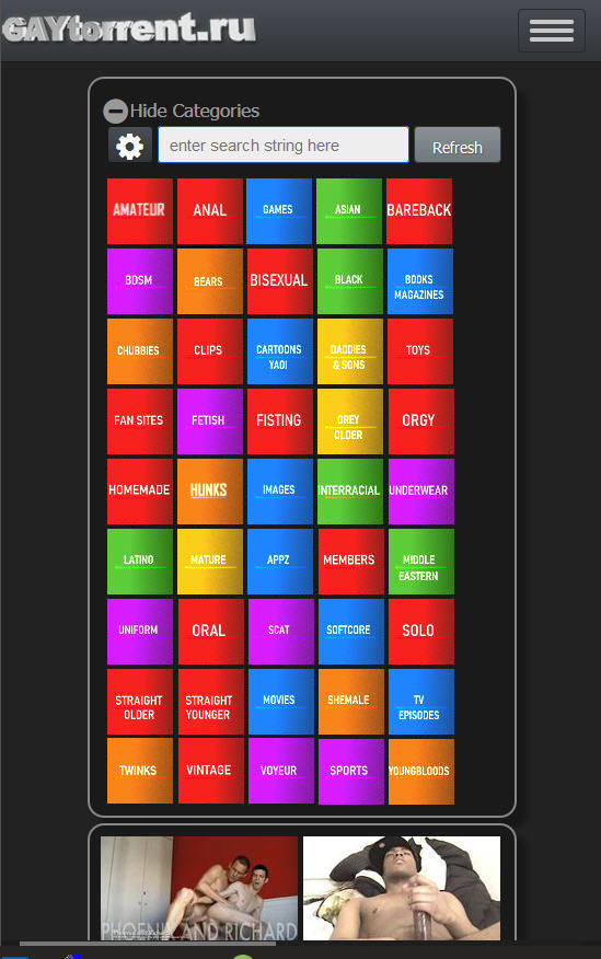
And if colored tiles were used it would look like this
-
Ok
Here are the text only icons with an underline of color as would look on smartphones.I would say the underline of colour needs to be fatter to be able to be seen. Especially on phones.
It looks as if one could use smaller hieght tiles but the square tile is better to touck on on phones.
NOTE
The off center of the list is how it is displaying at present.
I would say centering them would look better.Also note:
Category icon tile size in this category list appears at 60 x 60 pixelsI particularly liked their result with the transparent background and I agree when you say that underlining needs to be fatter. I think that if you make the underline a little fatter and without any color degradation effect, it should be much better.
As for the colors, I found the colors very vivid, very prominent, looking at them on a website where the background is predominantly dark, it doesn't look very nice.
-
Some comments from the peanut gallery:
They are looking great and seeing them all together confirms that not using illustrations is the right direction, especially on a phone-sized screen.
The font should be the same size for all of the icons. Otherwise, unintended emphasis is given to the icons with the larger font and it's more difficult to scan or browse the entire list because the brain has to adjust and readjust over and over again.
I agree that centered would look better and might be easier to read.
The icons with the same grey background and the colored underlines look best and are much easier to browse compared to the ones with the colored backgrounds.
I don't think the colors are actually helpful in navigating and finding a category. That goes for both sets, grey with colored underlines and colored backgrounds. The color is decorative and a bit of distraction, especially with colored backgrounds, not so much with the colored underlines.
Since there are so many categories, alphabetical order makes sense and is helpful even for long-time users. Currently, I search for themed films more than anything else, and having the icons in browse mode and the list in search mode placed in alphabetical order is very helpful when I go to check that box or select that icon.
-
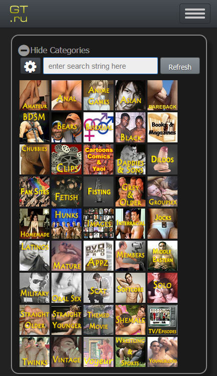
Existing Icons
Comared with possible new icons
-
Existing Icons
Comared with possible new icons
The new ones that are easiest to read and quickly understand the meaning of are the ones without the pictograms, on the third row from the bottom.
-
Existing Icons
Comared with possible new icons
The new ones that are easiest to read and quickly understand the meaning of are the ones without the pictograms, on the third row from the bottom.
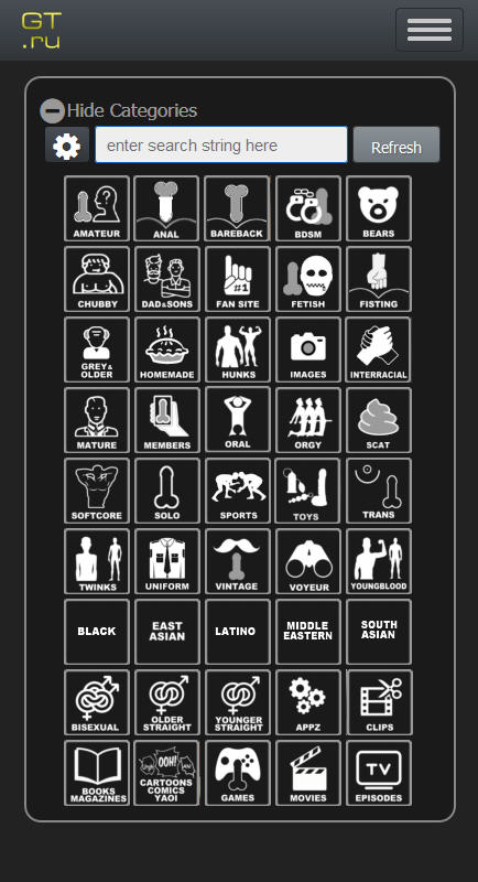
Made a mistake in using a bigger font on those in third row from the bottom so they are easier to read than the others.
Font size needs to be smaller to accomdate longest category title. -
Made a mistake in using a bigger font on those in third row from the bottom so they are easier to read than the others.
Font size needs to be smaller to accomdate longest category title.That may be part of it but primarily they are easier to read because they have no pictogram, just text.
-
I agree with Bearbearbear. The text-only version is the easiest to read, particularly at a glance. The icons created are a lot of fun, but still… As I have said before:
Less is more
Hello! It looks like you're interested in this conversation, but you don't have an account yet.
Getting fed up of having to scroll through the same posts each visit? When you register for an account, you'll always come back to exactly where you were before, and choose to be notified of new replies (either via email, or push notification). You'll also be able to save bookmarks and upvote posts to show your appreciation to other community members.
With your input, this post could be even better 💗
Register Login