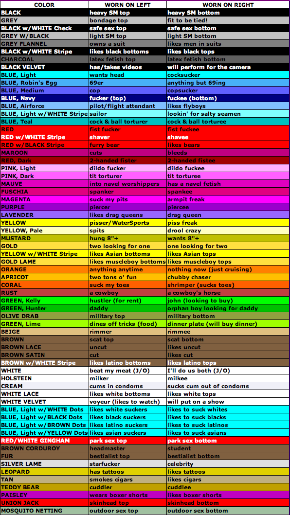
New Icons

-
If using text only then could also use diagonal of square to increase size of text..
Also could match font style to categor
Here using a military stencil font.
Also can have background to match category (Could use gay handkerchief color code)
But not so good when in small icon size…

-
Use the Handkerchief Color Code?
-
If using text only then could also use diagonal of square to increase size of text..
Also could match font style to categor
Here using a military stencil font.
Also can have background to match category (Could use gay handkerchief color code)
But not so good when in small icon size…
I did the test with a background image and saw that it wouldn't work very well on small images, so I thought of something that would look good:
The image of the main category would have 80x80 and the images of the subcaterogies would have 80x40 and would be aligned below the main.
Attached an example in which I just left different colors to illustrate, but it can be all the same color or whatever.

-
High contrast icon opossibilities
-
Can only attach 10 at a time…
-
Can only attach 10 at a time…
Congratulations on your icons! I really liked him.
I think the only difficulty with the icons would be to represent the ethnicities
-
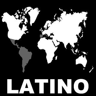
I suppose we could use a world map for ethnicities…
-
I agree text only icons would be a lot easier…
But not as much fun... -
So how is Youngbloods different from Twinks??? :cheesy2:
-
So how is Youngbloods different from Twinks??? :cheesy2:
This topic thread may help
-
a few more categories
-
Last 3 icons
Now should be a full set…
-
A test of black & white icons in website.
Also with added grey backgroundSome adjustments to icons would be good to get tonal balance between icons better.
-
I have a few suggestions:
Could you make the icon for Black and Asian in the style of Latino and Middle Eastern? Showing some of the shirt, I mean.
And the Mature seems to have a slightly deformed head, not well rounded …
Could you try to make these adjustments ??
-
the icons should have no black background.. it should be transparent.
but the colors, you might use could be vary.. not only white or grey..
at least my opinion -
Icon updates…
-
the icons should have no black background.. it should be transparent.
but the colors, you might use could be vary.. not only white or grey..
at least my opinionI am not sure if transparent backgrounds to icons will work / look good? As the backround will then be the grey used on the website.
Could easily have different colors, something I will test. But it might make it more messy…
-
I suppose we could use a world map for ethnicities…
That would be better than the ridiculous and offensive caricatures, especially the Asian and Middle Eastern ones.
-
Cartoon icon update
-
That would be better than the ridiculous and offensive caricatures, especially the Asian and Middle Eastern ones.
I agree; let's try to stay away from racial or cultural caricatures.
As a map lover, I would say go for some sort of map, but remember that these icons are going to be small, so the more details you add the more cluttered the icon will be. I would again like to stress the maxim:
Less is more.
There's no need to fancy stuff up when it is neither necessary nor functional.
Hello! It looks like you're interested in this conversation, but you don't have an account yet.
Getting fed up of having to scroll through the same posts each visit? When you register for an account, you'll always come back to exactly where you were before, and choose to be notified of new replies (either via email, or push notification). You'll also be able to save bookmarks and upvote posts to show your appreciation to other community members.
With your input, this post could be even better 💗
Register Login