New Design
-
Looks clean, however, the light grey font on the main page (search) is nearly unreadable for me…. maybe just a bit less shadowed font / background combination? Thank you
-
I'm very good with photoshop and I can even prepare a file to be used as a base for future categories, so if a new category comes up, it would be easy to create a new icon to match the others.
It would be a little difficult for me to select images to use, but if there was a small group or a specific forum for suggestions of these images, it would be very nice and I would offer to help in editing.
Thank you for the offer. Maybe You put up a new Topic for this to discuss. Maybe those icons should not even use pictures. Instead those icons like metioned earlier in this topic.
-
I switched back to the old design as it's just way nicer to have one bar with all the information instead of all the different tabs with all the information.
-
I switched back to the old design as it's just way nicer to have one bar with all the information instead of all the different tabs with all the information.
you got a point.. i try to put those infos back into the menu. im not sure how - yet. be patient and give it another try
and to the rest of you, what do you think of my recent color tweak in the search results ? now you should be able to read it good. nice constrast
-
I want to respond to this positive message on behalf of all the other positive comments:THANK YOU :love: :love: :love: !! I am glad that you like it so much. Your feedback motivates me to go through code that is more than 10 years old. Its a mess. No search and destructed design. Not everything will be the same as before. I ask for your understanding in advance. But after that I can finally unleash my creativity.
No doubt: you gonna freak out !
Happy to be the spark that further propels your creative process. I know it's tedious work. Plan carefully, then go wild! I look forward to freaking out!
-
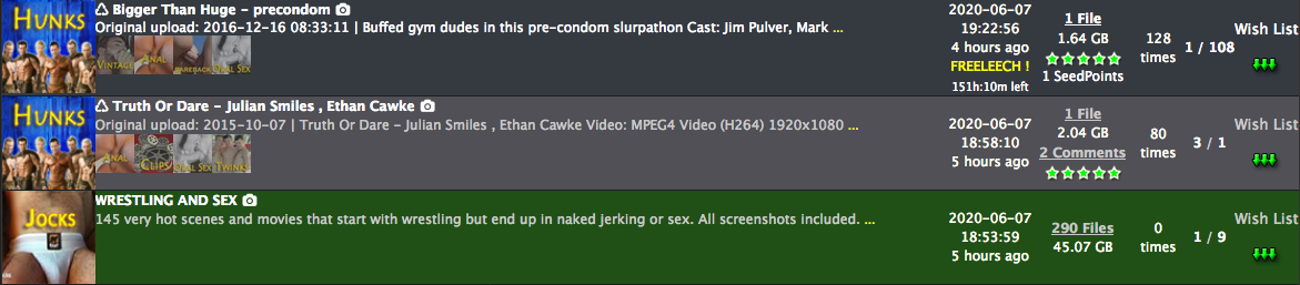
Hi, the colors of a non-downloaded and completed torrent need to be changed. It is very difficult to ascertain what is which with the new color scheme.
For the old layout, it was:
Non-downloaded: Grey
Downloaded, but not completed: Light green
Completed: Dark GreenFor the new layout it is
Non-downloaded: Dark Grey
Downloaded, but not completed: Green
Completed: Light GreyPlease can you change the light grey to something easier on the eyes and easy to identify.
-
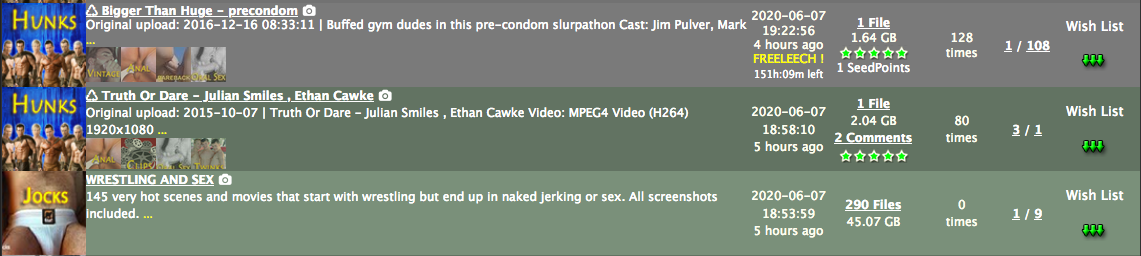
Hi, the colors of a non-downloaded and a downloaded but not completed torrent need to be changed. It is very difficult to ascertain what is which with the new color scheme.
For the old layout, it was:
Non-downloaded: Grey
Downloaded, but not completed: Light green
Completed: Dark GreenFor the new layout it is
Non-downloaded: Dark Grey
Downloaded, but not completed: Light Grey
Completed: GreenPlease can you change the light grey to something easier on the eyes and easy to identify.
i agree
well im color blind and would like to get some help here.. could you please supply 2 color codes you think are the best here?edit: now we have "light green" for "downloaded"
"dark green" for "completed"hope this is better..
but i still dont like the green tone … so if someone please supply 2 better greens, i would highly appreciate it. -
Hi, the colors of a non-downloaded and a downloaded but not completed torrent need to be changed. It is very difficult to ascertain what is which with the new color scheme.
For the old layout, it was:
Non-downloaded: Grey
Downloaded, but not completed: Light green
Completed: Dark GreenFor the new layout it is
Non-downloaded: Dark Grey
Downloaded, but not completed: Light Grey
Completed: GreenPlease can you change the light grey to something easier on the eyes and easy to identify.
i agree
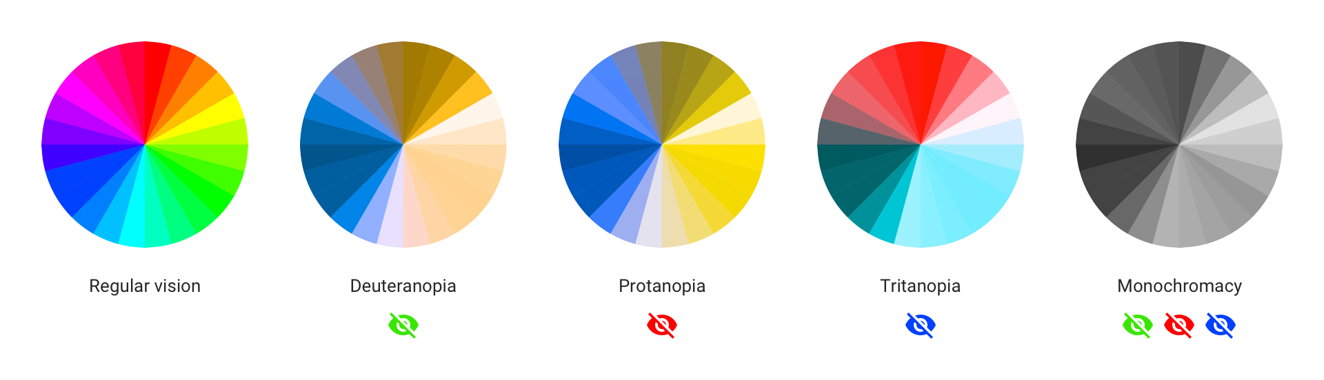
well im color blind and would like to get some help here.. could you please supply 2 color codes you think are the best here?Hi, which colors would you find most comfortable? If you're color blind that shouldn't exclude you either - colorblindness and visual fidelity loss with age mainly affects the red/green tones (i've attached a picture). Maybe it would be best to go with blue for complete (0A84FF) and teal for downloaded but not complete (64D2FF)? I'm not 100% sure since I haven't looked into UX design for a while, but there's a reason why most websites are blue (Facebook, Twitter, etc). Or we can go with another color set of your liking?
-
i dont like this colors together with the existing rest.. this would need a complete redesign of all colors.
for that, someone would need to edit the CSS and supply a complete new skin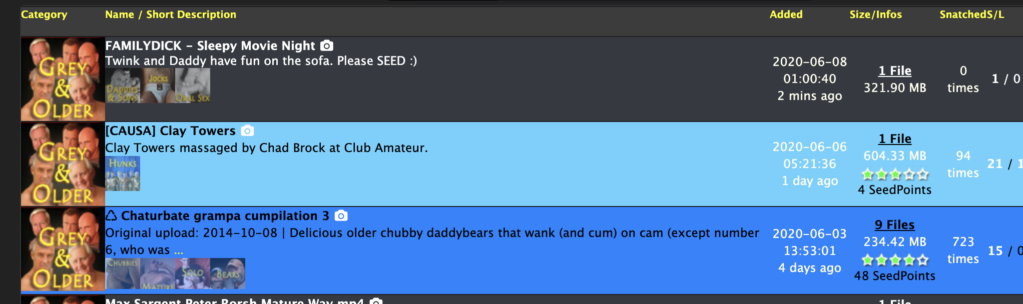
-
It isn't so easy to make a side-by-side comparison of the look of the site in the old and new format, but I think it's the darker background (on the search page) that gives the impression that fonts are smaller now.
-
The search results no longer show the date that the file was posted. It was also easier to get to the search and browse button before. Now I have to make extra clicks to find them in a drop down menu. Sure the new colors look nice but the functionality went down. For those reasons I will try to stick with the old design.
-
The new design is inefficient to use and difficult to read.
Instead of clicking on one thing to see the Search page, I have to click on a menu then click on another. Same with messages – I get 10 reseed requests per hour and multiple clicks to clear the stupid pop-up warning message make this much more inconvenient than it already is. In general, everything that used to take one click now takes two clicks. it really adds up.
On the search page, when I mouse over a title, the images appear, but they are confined to a very small box, so I only see two or three images even if the torrent description has dozens. Also, the text is tiny. I understand how to use the browser zoom function, but every other site I use has readable text, without needing to zoom.
I turned off the new page as soon as I had tried it for a few minutes and realized it was basically unusable for the way I browse this site. A few minutes ago, it turned itself back on. This is really poor UI design. I chose the older interface because it is much more efficient and easier to use. Please do not automatically revert me.
If you really want to improve the site, turn off the reseed button for any torrent that has at least four seeders, then offer 2x upload bonuses for the last two seeders of a torrent. That would tremendously improve retention. We have torrents that die after just a few weeks, despite being snatched by dozens of people. This torrent site has the worst retention of any I've used. Plab has fixed this problem by offering bonuses for the last seeders, so people are motivated not to delete torrents from their clients if there are just one or two seeders.
I appreciate the effort, but UI is not this site's problem. Poor torrent retention, overly rapid deletion of popular torrents, and overly slow deletion of torrents containing malware are all much, much more serious problems.
Some very popular sites have interfaces that look like they were designed twenty years ago. The older UI is not a problem.
-
i dont like this colors together with the existing rest.. this would need a complete redesign of all colors.
for that, someone would need to edit the CSS and supply a complete new skinOK, let's see how it would look:
#FFD700 - "Show Freeleech torrents", "Freeleech!", The search header (Category, Name/Short, Description, Added, Size/Infos, Snatched S/L and Functions) and the Stars of Rating.
Non-downloaded: Okay, keep it up!
Downloaded, but not completed: #99FF99
Completed: #00b300I will make an icon for Replaces "Wish List", it will be colorless and when clicking, it will be colored and I will make an icon for the Download shortcut too.
-
I like the new fonts. However, I am a bit disappointed that there doesn't seem to be a way to find the new torrents. I used to be able to change the font color of the torrent I looked at last during the previous session, but I can no longer do that.
-
I like the new design! Very clean and tight, and about time for some vaginal rejuvenation around here!

HOWEVER … I really, really miss being able to see how many torrents I'm uploading and downloading (and ratio, and bonus balance) at the top of every page, rather than having to click and drag every time I want to check. So I will be using the old version (which is still quite good!) until it is snatched from my grasp. If there is any way to add this info to the new version, that would be just fantastic!
Thanks for the lovely new design, either way! -
Good point:
It is the first time ever in many years that I notice a green color for Torrents I already downloaded. It did not exist for me previously.Bad point:
When browsing a page, let's say freeleech for page, it takes around 30s to 1min to load the page. Am I the only one? I am using Firefox, and I'm having some addons like "Close Tab by Double Right Click", or "visitedlinkenabler" or "Snap Links". I don't know if they are responsible for this very slow loading.
I don't have any issues with any other forum-like website. This slow down appeared maybe two or three weeks ago already. And never ever before since years. -
i dont like this colors together with the existing rest.. this would need a complete redesign of all colors.
for that, someone would need to edit the CSS and supply a complete new skinOK, let's see how it would look:
#FFD700 - "Show Freeleech torrents", "Freeleech!", The search header (Category, Name/Short, Description, Added, Size/Infos, Snatched S/L and Functions) and the Stars of Rating.
Non-downloaded: Okay, keep it up!
Downloaded, but not completed: #99FF99
Completed: #00b300I will make an icon for Replaces "Wish List", it will be colorless and when clicking, it will be colored and I will make an icon for the Download shortcut too.
im not a fan of this either.. but judge yourself. those colors bite me if they would maybe 0.5 alpha… ?
The new design is inefficient to use and difficult to read.
This is really poor UI design. I chose the older interface because it is much more efficient and easier to use. Please do not automatically revert me.
I appreciate the effort, but UI is not this site's problem. Poor torrent retention, overly rapid deletion of popular torrents, and overly slow deletion of torrents containing malware are all much, much more serious problems.
Some very popular sites have interfaces that look like they were designed twenty years ago. The older UI is not a problem.Thanks for your detailed feedback. You've been heard.
you will get reverted some more times the next days or weeks until there is no way back to the "old" and "more efficient" or "not so poorly made" layout. If you don't like that, i suggest leaving (for at least some weeks) and get used to it, what you gonna find after it. :blind:
don't get me wrong, but the future gonna happen. And some of it you might not like !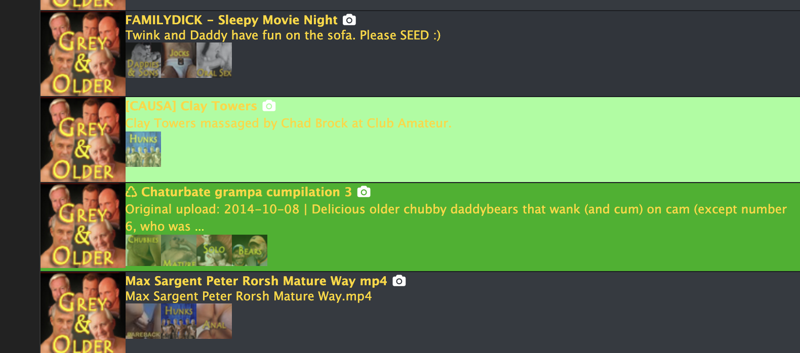
-
i dont like this colors together with the existing rest.. this would need a complete redesign of all colors.
for that, someone would need to edit the CSS and supply a complete new skinOK, let's see how it would look:
#FFD700 - "Show Freeleech torrents", "Freeleech!", The search header (Category, Name/Short, Description, Added, Size/Infos, Snatched S/L and Functions) and the Stars of Rating.
Non-downloaded: Okay, keep it up!
Downloaded, but not completed: #99FF99
Completed: #00b300I will make an icon for Replaces "Wish List", it will be colorless and when clicking, it will be colored and I will make an icon for the Download shortcut too.
im not a fan of this either.. but judge yourself. those colors bite me if they would maybe 0.5 alpha… ?
In your preview, looking together it was very light, try this:
Not complete: #407934
Complete: #0b3502The letters in the file name and description should be white, only the header should change to yellow (#FFD700)
-
I spend most of my viewing time on the site using the search pages, my comments are focused there. I looked back over the forum responses for the design work and decided to open up a 2nd window and reverted so I could have side by side look at old and latest revisions in layout.
I appreciate the change in the description font from the paler shade it had been. Also, the 2 darker shades for the alternating background strips really helps to make the lettering pop out with very good contrast. Much easier to read now. Thank you!!
Looking side by side at the old and new design of the search page I do strongly prefer the revised layout. I also really like the new brighter bolder choices for completed torrents. That color grabs my attention, as I try to reload or activate those recycled from the past.
I really appreciate your tweaks and fine tunning of the design. Thanks,
- Youngla
-
Since my last post was all complaints, let me apologize, and try to offer positive suggestions.
I mostly use this site by opening the Search page, then opening additional previous Search pages in tabs, until I reach the last time I looked through the results.
I then look at the torrents, in the order that they were uploaded. I read the titles, and if they are interesting (or difficult to understand) I read the description by mousing over the … (ellipses) and look at the images by mousing over the title. If the pictures appear in some random place with 50% cut off, I usually click on the camera icon to see them better. After all this, if the torrent looks good, I open it in a new tab and move on to look at the next most recent torrent description.
Not everybody uses the site this way, but many of us do. That's why there were so many complaints last time the site tried to require Captcha after every five page loads -- it broke tabbed browsing.
There are a few things that would make this easier, faster, and more efficient:
-
If more of the torrent title was included before being cut off and replaced with ellipses. There is a BIG difference between torrents that end with 480P and torrents that end with 1080P, but this often gets cut off. There is no reason to truncate the torrent title. Simply wrap to a second line, if necessary.
-
The torrent title and description should be in readable fonts with high contrast to background.
-
If more of the description was shown without having to mouse over the ellipses, that would be helpful. When we do mouse over, we should see as much of the description as will fit on the screen. It doesn't matter if it takes up most of the screen, because it will disappear when we mouse away.
-
When we mouse over the torrent title, the pictures should be shown in as large a box as possible. As above, it's OK if the pictures are so large they cover most of the screen, because they will disappear when we mouse away.
-
The "gtru :: 1 Message" notification in the page title MUST GO AWAY. Because the site alters and obscures ALL of the tabbed page titles every time some !@#$-%^&* sends yet another reseed request, it makes it impossible to find the tab you were looking for... unless you open your Inbox and then wait minutes for all the stupid warnings to disappear.
Finally, when we click on "File List" we should see the EXACT FILE SIZE in BYTES. That is the precise size of the file, with no conversion or truncation -- exactly as it is shown in the torrent file itself. Converting to base 10, then truncating and adding KB/MB/GB makes it IMPOSSIBLE to detect duplicates based on file size. I can still do it if there is only one file in the torrent -- the main page shows the exact size in bytes (THANK YOU!!!) but if it has two or more files, I can't see the exact sizes of the individual files unless I download the torrent.
If the UI redesign effort was to make it easier for mobile phone users, why not just allow users to choose the interface based on how they access it? Most of this site's users don't access it via phones. The screens are too small, and the keyboards suck.
-
Hello! It looks like you're interested in this conversation, but you don't have an account yet.
Getting fed up of having to scroll through the same posts each visit? When you register for an account, you'll always come back to exactly where you were before, and choose to be notified of new replies (either via email, or push notification). You'll also be able to save bookmarks and upvote posts to show your appreciation to other community members.
With your input, this post could be even better 💗
Register Login