New Design
-
I spend most of my viewing time on the site using the search pages, my comments are focused there. I looked back over the forum responses for the design work and decided to open up a 2nd window and reverted so I could have side by side look at old and latest revisions in layout.
I appreciate the change in the description font from the paler shade it had been. Also, the 2 darker shades for the alternating background strips really helps to make the lettering pop out with very good contrast. Much easier to read now. Thank you!!
Looking side by side at the old and new design of the search page I do strongly prefer the revised layout. I also really like the new brighter bolder choices for completed torrents. That color grabs my attention, as I try to reload or activate those recycled from the past.
I really appreciate your tweaks and fine tunning of the design. Thanks,
- Youngla
-
Since my last post was all complaints, let me apologize, and try to offer positive suggestions.
I mostly use this site by opening the Search page, then opening additional previous Search pages in tabs, until I reach the last time I looked through the results.
I then look at the torrents, in the order that they were uploaded. I read the titles, and if they are interesting (or difficult to understand) I read the description by mousing over the … (ellipses) and look at the images by mousing over the title. If the pictures appear in some random place with 50% cut off, I usually click on the camera icon to see them better. After all this, if the torrent looks good, I open it in a new tab and move on to look at the next most recent torrent description.
Not everybody uses the site this way, but many of us do. That's why there were so many complaints last time the site tried to require Captcha after every five page loads -- it broke tabbed browsing.
There are a few things that would make this easier, faster, and more efficient:
-
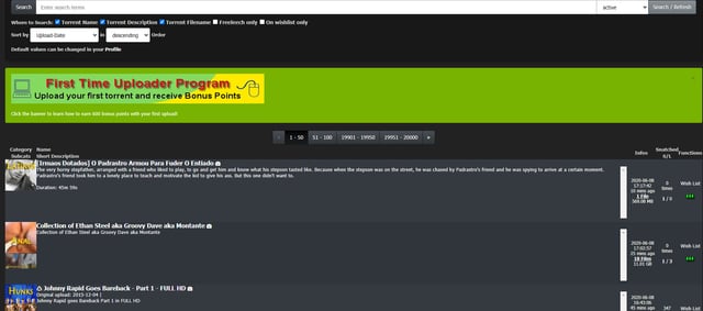
If more of the torrent title was included before being cut off and replaced with ellipses. There is a BIG difference between torrents that end with 480P and torrents that end with 1080P, but this often gets cut off. There is no reason to truncate the torrent title. Simply wrap to a second line, if necessary.
-
The torrent title and description should be in readable fonts with high contrast to background.
-
If more of the description was shown without having to mouse over the ellipses, that would be helpful. When we do mouse over, we should see as much of the description as will fit on the screen. It doesn't matter if it takes up most of the screen, because it will disappear when we mouse away.
-
When we mouse over the torrent title, the pictures should be shown in as large a box as possible. As above, it's OK if the pictures are so large they cover most of the screen, because they will disappear when we mouse away.
-
The "gtru :: 1 Message" notification in the page title MUST GO AWAY. Because the site alters and obscures ALL of the tabbed page titles every time some !@#$-%^&* sends yet another reseed request, it makes it impossible to find the tab you were looking for... unless you open your Inbox and then wait minutes for all the stupid warnings to disappear.
Finally, when we click on "File List" we should see the EXACT FILE SIZE in BYTES. That is the precise size of the file, with no conversion or truncation -- exactly as it is shown in the torrent file itself. Converting to base 10, then truncating and adding KB/MB/GB makes it IMPOSSIBLE to detect duplicates based on file size. I can still do it if there is only one file in the torrent -- the main page shows the exact size in bytes (THANK YOU!!!) but if it has two or more files, I can't see the exact sizes of the individual files unless I download the torrent.
If the UI redesign effort was to make it easier for mobile phone users, why not just allow users to choose the interface based on how they access it? Most of this site's users don't access it via phones. The screens are too small, and the keyboards suck.
-
-
If you really want to improve the site, turn off the reseed button for any torrent that has at least four seeders, then offer 2x upload bonuses for the last two seeders of a torrent. That would tremendously improve retention. We have torrents that die after just a few weeks, despite being snatched by dozens of people. This torrent site has the worst retention of any I've used. Plab has fixed this problem by offering bonuses for the last seeders, so people are motivated not to delete torrents from their clients if there are just one or two seeders.
I spend my bonus points to make a torrent freeleech to attract downloaders before deleting a torrent if I'm the only one seeding it. I don't usually even get enough traffic back to pay for making it freeleech. But at least then I can delete it without feeling like it's my fault it goes dead.
Most people don't have a lot of bonus points to use that way, so it would be nice if torrents with only one seeder for more than a week went into freeleech automatically. The mods do a good job recycling many of the torrents with one seeder but I don't know if it is having only one seeder that triggers the recycle.
-
Good point:
It is the first time ever in many years that I notice a green color for Torrents I already downloaded. It did not exist for me previously.Bad point:
When browsing a page, let's say freeleech for page, it takes around 30s to 1min to load the page. Am I the only one? I am using Firefox, and I'm having some addons like "Close Tab by Double Right Click", or "visitedlinkenabler" or "Snap Links". I don't know if they are responsible for this very slow loading.
I don't have any issues with any other forum-like website. This slow down appeared maybe two or three weeks ago already. And never ever before since years.There has been a DoS attack on the site recently. Sometimes pages loaded slowly or not at all. Browser extensions could also slow you down, especially if they do something with links on a page with a lot of links.
-
I switched back to the old design. The new design seems darker and less colorful than the old design. I liked the blue banner and buttons, but that's a personal choice. These were the issues I had:
The "Added" and "Size/Infos" columns are too close together.
The page skip "1 - 50 | 51 - 100" is missing some ranges.
The "Search" button at the top is now a two click (Click Torrents then click Search) process, but that's the button I click on most often.
No message counter displayed on header, requires two clicks also.
I'm sure the new design will come along eventually. :clap2:
-
I would appreciate your feedback on today's design update. Some of you have already reported about fonts that are too small. It is always very important to know where exactly on which page you see a problem. Then we save ourselves unnecessary questions back and forth. Of course I am also happy about every positive feedback, without any change wishes. :cheers:
It doesn't work for me. I can't search for anything and the whole site is really slow.
-
I can't search for anything and the whole site is really slow.
we had some network issues the past hours… i just fixes that
-
The new interface is kinda inconvenient. As when I am on the SEARCH pages and I want to go to pages 251-300, in the new interface, I have to click through 1-50, then 51-100 and so on. Kinda inconvenient though.
-
I like the new look, but I really do miss the rainbow flag at the top of the site. It added some personality and some pride to the site.
-
I like the new look, but I really do miss the rainbow flag at the top of the site. It added some personality and some pride to the site.
wow, i did not expect this reactions. That people even get feelings for a design from the year 2006.
It is not finished yet. First i would like to have the functionality. People miss some direct accessible functions in the Menu.
When the menu is final, we might consider adding some pride to it. maybe with a new logo. i did not have one, so i re-used the old one.The new interface is kinda inconvenient. As when I am on the SEARCH pages and I want to go to pages 251-300, in the new interface, I have to click through 1-50, then 51-100 and so on. Kinda inconvenient though.
In a future version there will not even be a pager. Just like in the Browse page, the contents will be loaded while scrolling. In the meantime I'll see what I can do with the pager.
The "Added" and "Size/Infos" columns are too close together.
The page skip "1 - 50 | 51 - 100" is missing some ranges.
The "Search" button at the top is now a two click (Click Torrents then click Search) process, but that's the button I click on most often.
No message counter displayed on header, requires two clicks also.
I'm sure the new design will come along eventually. :clap2:Thanks for your comments. I will tweak the Menu. Most people miss the "search" button i guess. Also, the "new message" from the title of the page will get removed - as requested elsewhere.
@urx585: apologize accepted.
- If more of the torrent title was included before being cut off and replaced with ellipses. There is a BIG difference between torrents that end with 480P and torrents that end with 1080P, but this often gets cut off. There is no reason to truncate the torrent title. Simply wrap to a second line, if necessary.
i need to break the design for this.
On the left side you can see the picture of the main category. It has always been the goal to never need more space than this picture takes. 80px in height. Meanwhile I think this is too little. What would you think if I would show the 4 subcategories under the main category picture? Then you would have twice as much space on the right side for information. This would solve your issue as well.- The torrent title and description should be in readable fonts with high contrast to background.
look how it is now: dark background with white text.. this should be readable enough
- If more of the description was shown without having to mouse over the ellipses, that would be helpful. When we do mouse over, we should see as much of the description as will fit on the screen. It doesn't matter if it takes up most of the screen, because it will disappear when we mouse away.
i will take care of it. be patient
- When we mouse over the torrent title, the pictures should be shown in as large a box as possible. As above, it's OK if the pictures are so large they cover most of the screen, because they will disappear when we mouse away.
depending on the different screen sizes, this make a lot problems. this has to be completly rewritten as well.
- The "gtru :: 1 Message" notification in the page title MUST GO AWAY. Because the site alters and obscures ALL of the tabbed page titles every time some !@#$-%^&* sends yet another reseed request, it makes it impossible to find the tab you were looking for… unless you open your Inbox and then wait minutes for all the stupid warnings to disappear.
i turned this off. nobody told me, that this can be annoying. maybe we need a switch like "notification settings" were you can turn this on/off
Finally, when we click on "File List" we should see the EXACT FILE SIZE in BYTES. That is the precise size of the file, with no conversion or truncation – exactly as it is shown in the torrent file itself. Converting to base 10, then truncating and adding KB/MB/GB makes it IMPOSSIBLE to detect duplicates based on file size. I can still do it if there is only one file in the torrent -- the main page shows the exact size in bytes (THANK YOU!!!) but if it has two or more files, I can't see the exact sizes of the individual files unless I download the torrent.
If the UI redesign effort was to make it easier for mobile phone users, why not just allow users to choose the interface based on how they access it? Most of this site's users don't access it via phones. The screens are too small, and the keyboards suck.
i tweaked this as you might already noticed. and here we have a problem. i cannot tweak this jusr for the "new" version. so i had to change this sidewide. i dont want to mess around with more than 1 code base. Im working as a single individual on it. I am not Microsoft with 1000 developers onboard. hope you understand, why i will put the old layout offline sooner or later and try to make you guys happy with the new design. Just complaining and then turning it off is just mean and not helpful. I hope you realize that now.
those changes need to be done. it is not just about a new look. it is the possibility to continue developing new features for the site.
-
I miss having the upload date in the search results.
Also, this is old feedback, but before the query optimizations a year ago or so, I could do a wildcard search. For example, if I wanted hypnosis videos, I could search "hypn" and it would bring back results for hypnosis, hypnotist, hypnotizing, hypnotize, hypnotized, hypno, etc… Now I have to search each of these separately and I'm still probably missing some. Any way we could get a wildcard search operator like "hypn*" ?
the upload date is visible: the column "added" !?!
just tried the wildcard search for 'hypn*' without a problem. got more than 700 results -
So I have been using the new design the past 24 hours. It took a while but I do think it is a real improvement over the old design. One small issue I had with the new design was the Search button buried under the Torrents button. What I found after using the new design is that by having the top bar frozen at the top of the page, instead of needing to scroll to the top of the page to click on Search, I now use only two clicks from anywhere I happen to be on the page: Torrents>Search. An overall better design. Thanks again for your hard work.
-
i don't like to do double click fore serach or inbox etc…
-
I love the new design for the most part. My only issue, is that now torrents with a large horizontal preview image get the entire image loaded in browse… The old layout didn't do that. And now I sometimes have to scroll quite a ways to load the next batch. I fiddled with it and couldn't seem to find a toggle to affect that specifically. Am I missing something? Otherwise...great stuff!
you are talking about the pic browser. Yes… this module needs some rewrites. the popups dont work as expected and a lot other stuff.. actually i have more focus und the menu and the search page.. but i will get back to this also !
btw. you can give this version of search a try... im working on that one actually. its not live for everyone.. just for those who read this and give it a try
-
If the forum has been here…, I just found it much cleaner look up top i like it. The drop down menus are not working... I click but nothing happens.
Google Chrome Version 83.0.4103.97 (Official Build) (64-bit) Up-To-Date -
something broke on the search page
-
something broke on the search page
it just went fullscreen to use all the space your browser has to offer
-
Glad it's more mobile friendly. On desktop, Browse should be a single click link like search instead of having to click Torrents. And the Torrents menu should me moved to the end labeled More. Otherwise, it's good.
Hello! It looks like you're interested in this conversation, but you don't have an account yet.
Getting fed up of having to scroll through the same posts each visit? When you register for an account, you'll always come back to exactly where you were before, and choose to be notified of new replies (either via email, or push notification). You'll also be able to save bookmarks and upvote posts to show your appreciation to other community members.
With your input, this post could be even better 💗
Register Login