• Categories
    • Recent
    • Tags
    • Popular
    • Users
    • Groups
    • Torrents
    • Login

    New Design

    Scheduled Pinned Locked Moved GayTorrent.ru Discussions
    443 Posts 287 Posters 6.8k Views 3 Watching
    Loading More Posts
    • Oldest to Newest
    • Newest to Oldest
    • Most Votes
    Reply
    • Reply as topic
    Log in to reply
    This topic has been deleted. Only users with topic management privileges can see it.
    • T Offline
      Trelligan
      last edited by

      @Trelligan:

      [Update] Problem (checkboxes unchecked) still remains, but less of a problem than I first thought.

      When the page initially loads, the boxes are checked. As more items load, the checks flicker and disappear. But, the category selections are still there, so the page works despite looking a bit odd on top.

      DISREGARD: Stupid Greasemonkey script working on the wrong webpage…

      1 Reply Last reply Reply Quote 0
      • P Offline
        PapaSmurf123
        last edited by

        ohhh it looks nice

        1 Reply Last reply Reply Quote 0
        • M Offline
          marck4you
          last edited by

          I'm happy! :cheers:

          1 Reply Last reply Reply Quote 0
          • N Offline
            no0x
            last edited by

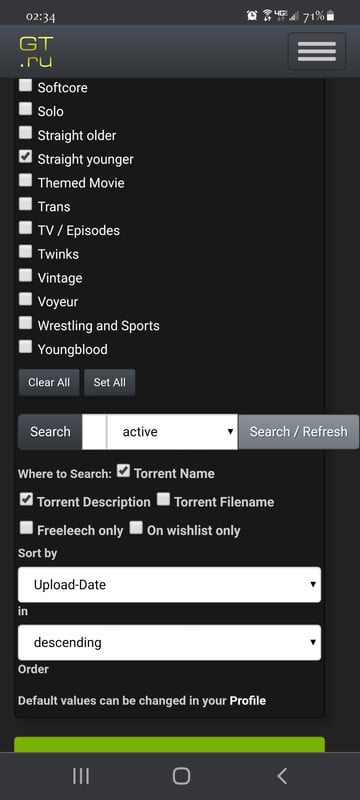
            Great search page, but thumbs are too small.
            Fixed through userscript though.

            GM_addStyle(".thumbnailimage {height:120px !important; width:auto !important}");
            
            1 Reply Last reply Reply Quote 0
            • V Offline
              vashkevron
              last edited by

              The search isn't working properly. If only one of the 'Where to Search' options, "Torrent Name", "Torrent Description" and "Torrent Filename", is selected, it still searches in all three. There are search results returned that don't have any of the words I am searching for when only "Torrent Name" is selected. In fact, I can deselect all three of these and I get the same number of search results as though selecting only one of the optons. This appears to be on both the new and old design. The "Freeleech Only" and "On Wishlist Only" filters appear to still work.

              1 Reply Last reply Reply Quote 0
              • ? This user is from outside of this forum
                Guest
                last edited by

                Hi, was puzzled by something.  Hope it hasn't already been answered.  I know in the old design, after you download a torrent and seed it etc…. the entry becomes green.

                Now I see random torrents that are in a "lighter green"....... what does that mean?

                1 Reply Last reply Reply Quote 0
                • ? Offline
                  A Former User
                  last edited by

                  @lktheartkc:

                  Hi, was puzzled by something.  Hope it hasn't already been answered.  I know in the old design, after you download a torrent and seed it etc…. the entry becomes green.

                  Now I see random torrents that are in a "lighter green"....... what does that mean?

                  Dark Green or Solid Green - completed download
                  Light Green - incomplete download or partial download [exclude FreeLeech]

                  1 Reply Last reply Reply Quote 0
                  • ? This user is from outside of this forum
                    Guest
                    last edited by

                    @john32123666:

                    @lktheartkc:

                    Hi, was puzzled by something.  Hope it hasn't already been answered.  I know in the old design, after you download a torrent and seed it etc…. the entry becomes green.

                    Now I see random torrents that are in a "lighter green"....... what does that mean?

                    Dark Green or Solid Green - completed download
                    Light Green - incomplete download or partial download [exclude FreeLeech]

                    incomplete or partial download by me?? i've never downloaded those torrents…..

                    1 Reply Last reply Reply Quote 0
                    • P Offline
                      pheonixsong
                      last edited by

                      haven't had issues stated here when using firefox browser, except i also get inconsistent preview issues when mousing over the title, sometimes it previews up or down for no apparent reason. at first i thought it was based on how far it was from the top or bottom of the screen, but no

                      1 Reply Last reply Reply Quote 0
                      • D Offline
                        denarami2
                        last edited by

                        Good Work Dear

                        1 Reply Last reply Reply Quote 0
                        • F Offline
                          flozen
                          last edited by

                          I'm enjoying a lot of the aesthetic improvements in the new design, so I wanted to note on the Forum boards, how much more pleasing the "generic" member icons are -- the circle with the member's initial, in a range of groovy colors.

                          It's a great improvement over the previous "empty man" icon -- the circle with just a white head and shoulders in a grey circle, if I recall. Of course, I'd encourage anyone to go beyond the colored circles, and add their own photo or graphic -- let your creativity free!

                          1 Reply Last reply Reply Quote 0
                          • ? Offline
                            A Former User
                            last edited by

                            Also like the small overlay circle to indicate when someone is:

                            Online (green)
                            Away (orange)
                            Do Not Disturb (red)
                            Invisible (or not here - grey)

                            That is, if they choose to share that status.

                            1 Reply Last reply Reply Quote 1
                            • H Offline
                              herbert967
                              last edited by

                              i think its great. much better.

                              1 Reply Last reply Reply Quote 0
                              • ThalionT Offline
                                Thalion @Joker
                                last edited by

                                @joker I Love it!!!!! it is so much easier start a topic and follow it or if you just want to jump into the chat, you can, and also the chat is great!!!! notifications are so clear. i am so glad you staff guys made this change.

                                Talk to me, we'll have fun, skype: thalion66, sc: hurin_thalion20, kik:thalion66

                                1 Reply Last reply Reply Quote 1
                                • ClwnMan76C Offline
                                  ClwnMan76 @Joker
                                  last edited by

                                  @joker Anyone else mentioned the search feature issue on mobile? !

                                  ClwnMan76C 1 Reply Last reply Reply Quote 0
                                  • ClwnMan76C Offline
                                    ClwnMan76 @ClwnMan76
                                    last edited by

                                    Sorry, didn't attach.
                                    Screenshot-20210214-023435-Chrome-Beta.jpg

                                    1 Reply Last reply Reply Quote 0
                                    • T Offline
                                      tommusic
                                      last edited by

                                      Clean & Crisp - CHEERS!
                                      penisfun.jpg

                                      1 Reply Last reply Reply Quote 1
                                      • J Offline
                                        jahzxs
                                        last edited by

                                        I really enjoy the new design and ease of use. You're the best by far. What used to be a cumbersome affair has become simple and pleasant to peruse. Thanks for your thoughtful improvements.

                                        1 Reply Last reply Reply Quote 0
                                        • T Offline
                                          tor666
                                          last edited by

                                          It has a better design than before, in my opinion it is much better. They just need to improve some technical things and details. But it is excellent.

                                          1 Reply Last reply Reply Quote 0
                                          • T Offline
                                            Thebomb
                                            last edited by

                                            When you hover over a title In the search results, it would be great if the photo thumbnail box, when your profile is set for "thumb pics on top right corner," had a similar layout as when your profile is set for "Thumbs appear at mouse position".

                                            The "mouse position" layout is perfect, with all of the thumbnails showing. The "top right corner" layout is a vertical strip, with the top cut off, and not all photos visible:

                                            All pics.jpg

                                            Vertical strip.jpg

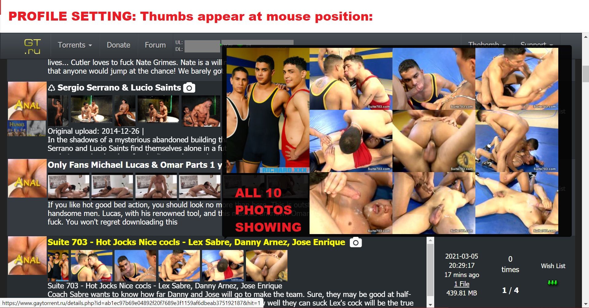
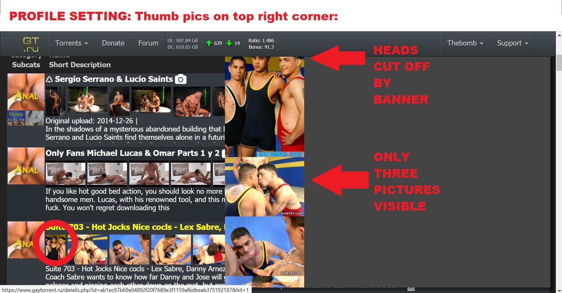
                                            I realize that the different settings control where the thumbnail box appears, but right now the CONTENTS of the thumbnail box are not nearly as good when we use the "top right corner" setting.

                                            1 Reply Last reply Reply Quote 0

                                            Hello! It looks like you're interested in this conversation, but you don't have an account yet.

                                            Getting fed up of having to scroll through the same posts each visit? When you register for an account, you'll always come back to exactly where you were before, and choose to be notified of new replies (either via email, or push notification). You'll also be able to save bookmarks and upvote posts to show your appreciation to other community members.

                                            With your input, this post could be even better 💗

                                            Register Login
                                            • 1
                                            • 2
                                            • 19
                                            • 20
                                            • 21
                                            • 22
                                            • 23
                                            • 23 / 23
                                            • First post
                                              Last post