New Design
-
Oh, I am so amazed that we finally have a layout for mobile, it is wonderful!!!!! Now writing posts from my phone will be more easier. This site keeps improving
(In the screen of reply forum the field for writing the reply is wider than the header)
-
Sincerely, I prefer the old design, too. I'm a creature of habit :afr2:
-
I actually like the older one, altho this one looks clean and less laggy. BUT, I do think ratio should be highlighted or in evidence please
")
requested by many so far: the stats are "ALWAYS ON" again :cheers:
-
New layout is pretty nice, won't take long to get used to since it's pretty straight forward. Looks cleaner and sharper too.
-
Sincerely, I prefer the old design, too. I'm a creature of habit :afr2:
im sorry, but you won't have this option for long…. :blownose:
New layout is pretty nice, won't take long to get used to since it's pretty straight forward. Looks cleaner and sharper too.
This is the reaction im looking for :cheers:
-
I really like the new layout. It's clean, well organized and easy to navigate. Nice job!
")
-
I like it very much. Definitely a cleaner look. The only change I would suggest, is a slight increase on the font for the torrent search pages, to make it more easily visible for users, without needing to increase the page zoom.
-
I like it very much. Definitely a cleaner look. The only change I would suggest, is a slight increase on the font for the torrent search pages, to make it more easily visible for users, without needing to increase the page zoom.
i did.. do you still think it is actually to small? which part exactly?
-
I reverted to the old layout. Initially, the font was too small for me - that seems to have changed now; however, I do prefer the upper banner menu with all links separate vs the drop-down menu. The same is true for my statistics (ratio, bonus points). Absolutely nothing personal in the decision; I guess I'm pretty routine/set in my ways.
-
just curious what percentage of users browse the site on mobile?
-
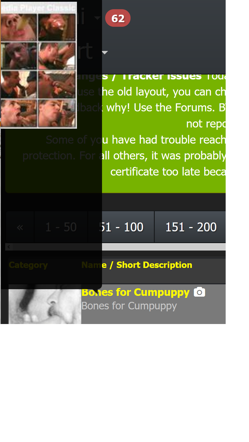
It looks nice and clean. However, I do like to see the 'age' of the torrents, which is now missing.
Alas, the image preview when mousing over the torrent's Name/Short Description, the image pops up to the left of the mouse at my resolution, and most of it is not visible, no matter where i put my mouse.
On a wider resolution, it appears to the right, but my monitor window is not that wide. Because the Name is on the left side of the screen, the image would need to appear on the right for me to see most of it.
Many thanks for your hard work!
-
It looks nice and clean. However, I do like to see the 'age' of the torrents, which is now missing.
Alas, the image preview when mousing over the torrent's Name/Short Description, the image pops up to the left of the mouse at my resolution, and most of it is not visible, no matter where i put my mouse.
On a wider resolution, it appears to the right, but my monitor window is not that wide. Because the Name is on the left side of the screen, the image would need to appear on the right for me to see most of it.
Many thanks for your hard work!
thank you for your kind words. The popup bug gonna be fixed tomorrow. i tried already a lot but i need some rest first.
-
Thank you for the update. I'm loving the new cleaner mobile layout, especially the torrent image browser.
I'm using Samsung Internet Browser v12.0.1.36 on my Essential Phone and I'm having problem clicking on the torrent's title. Everytime I do it, the screen flashes a preview of the first three images of the torrent for a nano second but it does not load the torrent page. It does not matter if I zoom in to enlarge the torrent's title text. It happens with most torrent links. Please try multiple links on the page when trying to reproduce the bug. I was able to reproduce the problem on my Mi Pad 4 as well.
I had similar problem with the previous version of the site, but I was able to get around the problem by clicking near the beginning of the torrent's title.
-
So far, I really like the new design, both functionally and in appearance. The fonts seem okay but I use 110% page zoom for everything. The drop-down menus make navigation easier. I also like that the forum link goes to the menu of the various forum boards, which may cut down on the number of posts on the wrong boards.
The only constructive criticism I could make right now is that the button still says "Shemale" instead of "Trans" for the category on the browse feature. The search feature now uses "Trans" as a category, so maybe the button can be updated, too.
Must have been a lot of hard work. Thank you!
Edit: Okay, I do see that the font used for the title of the torrent on the individual torrent page is smaller than the rest of the fonts on the page when it should be at least the same size since it is the title. It's not hard to read, though, especially since it is in yellow on the dark background.
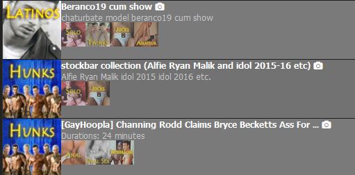
Also noticed that when browsing, if the first photo in the torrent is one of those strips of multiple photos, the entire strip shows up. Maybe that was intentional, though.
-
I see some people have said the fonts are bigger now than they originally were after the update, but I'm using Firefox and haven't noticed a change. The fonts in the list of torrent results on the search page are still way too small. And having grey or white text on a grey background makes things even harder to read.
-
I don't link the reduced numer of page I can link (E.g. 1-50, 51-100 and NOT 101-150 )
-
I would appreciate your feedback on today's design update. Some of you have already reported about fonts that are too small. It is always very important to know where exactly on which page you see a problem. Then we save ourselves unnecessary questions back and forth. Of course I am also happy about every positive feedback, without any change wishes. :cheers:
I am deeply missing the ratio and the bonus on the frontpage - on the new layout.
-
The new design is great. Thanks for your hard work. Nothing personal but I reverted back to the old design only because I am very familiar with it and everything I need/use is on one page. Perhaps it's messier, but so am I
-
I would appreciate your feedback on today's design update. Some of you have already reported about fonts that are too small. It is always very important to know where exactly on which page you see a problem. Then we save ourselves unnecessary questions back and forth. Of course I am also happy about every positive feedback, without any change wishes. :cheers:
I am deeply missing the ratio and the bonus on the frontpage - on the new layout.
I second this, also maybe its just the desktop version but the ratio text doesnt stand out at all, I have to highlight it to read it and i like to keep an eye on it. maybe its the red font?
-
I've had to switch back to the old design as the dropdown menus aren't working. Tried disabling my ad blocker, checked both Chrome and Safari, but it just won't work, oddly.
Any ideas why?
Hello! It looks like you're interested in this conversation, but you don't have an account yet.
Getting fed up of having to scroll through the same posts each visit? When you register for an account, you'll always come back to exactly where you were before, and choose to be notified of new replies (either via email, or push notification). You'll also be able to save bookmarks and upvote posts to show your appreciation to other community members.
With your input, this post could be even better 💗
Register Login