New Design
-
About the Browse interface: it's a common problem that the description is cut off because the entire description will not fit below the image, so there are problems like this:
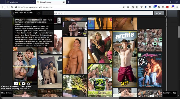
(Of course, this makes the description completely invisible when there are long, vertical images.)
I'd like the descriptions, like the images, to always appear where my cursor is. I don't care if the photo is covered while I'm hovering over the "i." (I have checked the settings, but I don't think there's currently any way to do this.)
About the Search page: yes, it is busy, but I think I can get used to it. I like that there are more photos and that I can read the description right from the Search page.
-
It is well done but I think the text is too large. I like to see more listings on the screen at a time. My hope is that you can keep the old view for that reason! Or maybe a way to change text size! :cheesy2:
-
I would really love it if hovering over a preview image would show an enlarged view of said image. I don't like that i have to click the image to use the image viewer, click through them and then hit the x button. (yea, im that lazy lol :cool2: ). Otherwise, the new search page is great! :bravo:
-
I really like the beta search, I like how you can expand the search to take up the full browser window and also how it shows all the pics from the torrent so that you don't have to hover over each torrent to see the pics anymore, that was really time consuming and now I can not even bother looking at torrents i'm not interested in. However I would prefer if the pics were a little bigger, maybe make an option where we can set the size of the preview images that are shown on the search page? or even better, if hovering over the image would make it full screen (well, with a size limitation obviously since some upload huge images). If this can't be done, can there be a button you can click that would open a page in a new tab with all images shown at full size? then we could quickly scroll down the page and see if the torrent is of interest. I'm just trying to think of ways to quickly see full size images without using the one by one image viewer.
-
I would appreciate your feedback on today's design update. Some of you have already reported about fonts that are too small. It is always very important to know where exactly on which page you see a problem. Then we save ourselves unnecessary questions back and forth. Of course I am also happy about every positive feedback, without any change wishes. :cheers:
Hi, when I try to browse it using android, I was not able to see in the search bar what I'm trying to type - literally, I hope that this will be fixed. Thanks.
-
Hi again, I am trying the new search. (I tried the new look for a while and it was a but too big (font) and also too many images up front.) I prefer a cleaner layout with smaller fonts than the current new search. I would prefer we had a way to decrease the font size and turn off the inline images to create a more concise and clean search results listing. The old search was a bit busy but useful information was there, the new one has like 1/3 the density of items and on my laptop looks comically large. I appreciate the work going into this and that you are asking for feedback. I am very appreciative that you are allowing us to go back to the old, more dense format while you work out the kinks and people's preferences.
-
I really like the new design. I would like to see one other feature which i enjoy on another tracker. A way to see the popular 10 torrents for the last day, week, month, year. I think this would be a great addition to the sites feature list.
Thanks again
-
yeah it's too bulky, i prefer the simple view
-
I really really really really really would love a way to filter out search results for things that are re-uploads, I mean those ones that say something like "Original upload: 2020-02-05 01:07:54". It's the most frustrating thing about this site. Please implement it ;D
-
Is anyone's Torrents menu not working? (meaning the Torrents / Donate / Forum menu on top, torrents button not working suddenly) And there's a broken file image on the very upper left.
-
if you're on Chrome: hit F12 (developer mode) > right click reload page button > Empty cache and hard reload
BOOM! :cool2: -
I would appreciate your feedback on today's design update. Some of you have already reported about fonts that are too small. It is always very important to know where exactly on which page you see a problem. Then we save ourselves unnecessary questions back and forth. Of course I am also happy about every positive feedback, without any change wishes. :cheers:
Hi, when I try to browse it using android, I was not able to see in the search bar what I'm trying to type - literally, I hope that this will be fixed. Thanks.
I find in Chrome on mobile you cannot use the search box. It's small and broken. Can this be fixed please.
-
good work guys!! you re cool
-
Im not finished !
Wait for the next update - this will cover this and other things as well
been 2 months, has this been abandoned half-finished?
-
I'm kinda new and only saw the old layout for a bit before the new one came about. I like the changes.
-
In mobile, search torrent, the box is so tiny I can't see what I typed to search
-
Το λατρεύω!
I love the new design, because of the images. saves time of the browsing.
Keep it up!Σας αγαπώ τσούλες!
-
My main concern, as a colourbind person, is the printing of colours on a black backgroud, as in the main page list of online members, for example. I make many typos. Sorry to those that get wound up! But I do have to be able to read the original text, if I can't that's your problem, not mine. For me, and it won't be the same for everyone, I can read white on black, and (best for me, black on white), but almost any other colour on black, forget it! White background is better, but not text in green or blue, and some shades of yellow!
We are not all the same, as our community should be the first to acknowledge, and catering for everyone is very difficult.
Just my persnal perspective.Thanks for listening
-
You need to put the number range (1-50, 51-100, etc) at the BOTTOM of the page, or both the BOTTOM and TOP, because as it is now, it is necessary to return to the top of the page to go to the next page.
-
The new design is complicated, I really prefer the old design, it much easier to find stuff and I can see everything on the web page without searching for stuff
Hello! It looks like you're interested in this conversation, but you don't have an account yet.
Getting fed up of having to scroll through the same posts each visit? When you register for an account, you'll always come back to exactly where you were before, and choose to be notified of new replies (either via email, or push notification). You'll also be able to save bookmarks and upvote posts to show your appreciation to other community members.
With your input, this post could be even better 💗
Register Login