New Design
-
It is clean. I think I Like it, I'll give it a go. One thing is bothersome: in Browse view, when I mouseover "i" to see info, the popup box sometimes is very wide and goes off the left side of the page. This is only happening in Safari (which I prefer to use). It looks fine in Chrome. Also, under my profile I do not see an option to choose the old layout, although like I said I think I'll get used to the new layout. Nice work
")
This issue should now be fixed.
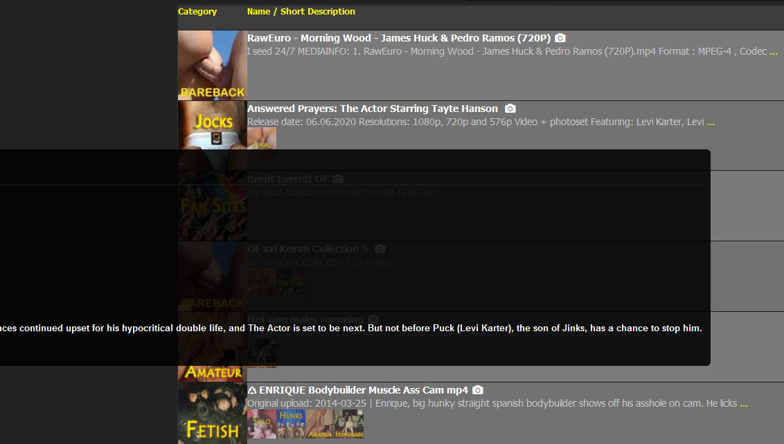
I still get this phenomenon. If I mouse over the description ellipsis on the torrent "Answered Prayers: The Actor Starring Tayte Hanson," the expanded description bleeds off the left side of the screen (see screenshot below). This doesn't happen on all torrent listings, which is odd. It's not a serious issue.
-
It is clean. I think I Like it, I'll give it a go. One thing is bothersome: in Browse view, when I mouseover "i" to see info, the popup box sometimes is very wide and goes off the left side of the page. This is only happening in Safari (which I prefer to use). It looks fine in Chrome. Also, under my profile I do not see an option to choose the old layout, although like I said I think I'll get used to the new layout. Nice work
This issue should now be fixed.
I still get this phenomenon. If I mouse over the description ellipsis on the torrent "Answered Prayers: The Actor Starring Tayte Hanson," the expanded description bleeds off the left side of the screen (see screenshot below). This doesn't happen on all torrent listings, which is odd. It's not a serious issue.
tooltips driving me crazy !!! :crazy2:
i will go into this ASAP.. but first, i need a nap. keep reporting anoying stuff here! -
It's a pity that they don't get in touch here why.
It's worth noting that you didn't actually ask for that. This is the message people see:
"2020-06-06 - Layout changes Today we have activated a new cleaner layout. If you prefer to use the old layout, you can change it in your profile. Feedback? Use the Forums."
If you feedback as to why people switch back, you need to be clearer. After all, why would anyone take the time to provide feedback if they can simply switch back to the former version.
In a future version (where also this forum will get a huge version jump forward) there will be no way to activate the old design. i can't please everybody, but i'll try my best. So give me your feedback, and as exactly as possible what is not as good as before in the new version, so i can work on it.
This is the message you need to give everyone because it gives them a concrete reason (the old design is going away) why they should provide the feedback.
It's also probably a good idea to tell users why you are changing the site. Personally, I'm a "if it ain't broke, don't fix it" person. I respond better to changes if I'm told why the changes are made.
-
sincerely, i prefer the old design. this is to basic and the menus are in topics, the old one the menus are all in bars
-
I like the new layout but the font is a little too small for me as well. Maybe just my eyesight but finding it difficult to read the forums based on size. Good thing I have an eye doctor appointment this week.
-
I am fine with the new look including the font size but as another user stated I miss the always on ratio/stats so I went back to the old layout for now. ;D
-
This is the message you need to give everyone because it gives them a concrete reason (the old design is going away) why they should provide the feedback.
It's also probably a good idea to tell users why you are changing the site. Personally, I'm a "if it ain't broke, don't fix it" person. I respond better to changes if I'm told why the changes are made.
Thanks for your thoughts. I think that after a short time there will be enough feedback. Even if some people still switch back to the old version. I have built this in so that I don't have to work sleeplessly to fix any bugs I didn't find. So everyone can switch again instead of going frustrated.
Why changes at all?
have you ever tried the site from a mobile phone? we have more and more access from mobile devices. especially the forum. . now the design is made to work on mobile devices as well as desktop pc's. there will be more changes in the future. special adapted browse/search for mobile devices, where only the most necessary functions are included. but then they are easier to use. for example you can extend your wishlist on the road and start downloading at home. the new forum also needs a responsive head. That's why I started with the modernization. Knowing that there will be some who will thank me with incomprehension. But that's just the way progress is. No website operator can satisfy all users 100 percent. I give my best ! thank you for your understanding and continue to have fun.I like the new layout but the font is a little too small for me as well. Maybe just my eyesight but finding it difficult to read the forums based on size. Good thing I have an eye doctor appointment this week.
as mentioned earlier, the forum will get another major update very soon… so don't judge it right now, but the rest from the site.
I am fine with the new look including the font size but as another user stated I miss the always on ratio/stats so I went back to the old layout for now. ;D
hahahah thanks for letting me know… i have to think about, where i can integrate this ALWAYS ON stats feature
-
This issue should now be fixed.
sure is, you rock! :cheers:
-
I actually like the older one, altho this one looks clean and less laggy. BUT, I do think ratio should be highlighted or in evidence please
")
-
Oh, I am so amazed that we finally have a layout for mobile, it is wonderful!!!!! Now writing posts from my phone will be more easier. This site keeps improving
(In the screen of reply forum the field for writing the reply is wider than the header)
-
Sincerely, I prefer the old design, too. I'm a creature of habit :afr2:
-
I actually like the older one, altho this one looks clean and less laggy. BUT, I do think ratio should be highlighted or in evidence please
requested by many so far: the stats are "ALWAYS ON" again :cheers:
-
New layout is pretty nice, won't take long to get used to since it's pretty straight forward. Looks cleaner and sharper too.
-
Sincerely, I prefer the old design, too. I'm a creature of habit :afr2:
im sorry, but you won't have this option for long…. :blownose:
New layout is pretty nice, won't take long to get used to since it's pretty straight forward. Looks cleaner and sharper too.
This is the reaction im looking for :cheers:
-
I really like the new layout. It's clean, well organized and easy to navigate. Nice job!
-
I like it very much. Definitely a cleaner look. The only change I would suggest, is a slight increase on the font for the torrent search pages, to make it more easily visible for users, without needing to increase the page zoom.
-
I like it very much. Definitely a cleaner look. The only change I would suggest, is a slight increase on the font for the torrent search pages, to make it more easily visible for users, without needing to increase the page zoom.
i did.. do you still think it is actually to small? which part exactly?
-
I reverted to the old layout. Initially, the font was too small for me - that seems to have changed now; however, I do prefer the upper banner menu with all links separate vs the drop-down menu. The same is true for my statistics (ratio, bonus points). Absolutely nothing personal in the decision; I guess I'm pretty routine/set in my ways.
-
just curious what percentage of users browse the site on mobile?
-
It looks nice and clean. However, I do like to see the 'age' of the torrents, which is now missing.
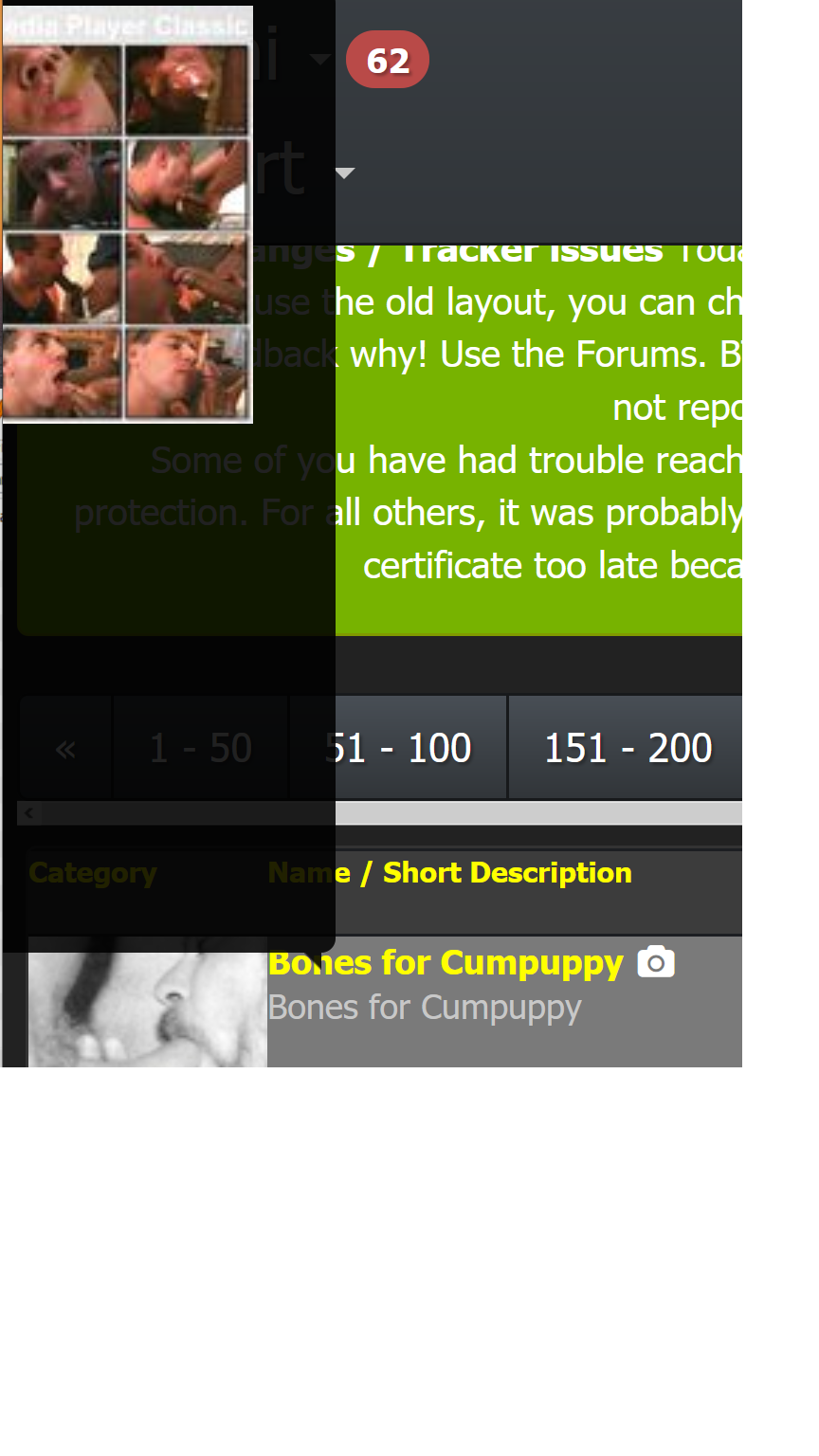
Alas, the image preview when mousing over the torrent's Name/Short Description, the image pops up to the left of the mouse at my resolution, and most of it is not visible, no matter where i put my mouse.
On a wider resolution, it appears to the right, but my monitor window is not that wide. Because the Name is on the left side of the screen, the image would need to appear on the right for me to see most of it.
Many thanks for your hard work!
Hello! It looks like you're interested in this conversation, but you don't have an account yet.
Getting fed up of having to scroll through the same posts each visit? When you register for an account, you'll always come back to exactly where you were before, and choose to be notified of new replies (either via email, or push notification). You'll also be able to save bookmarks and upvote posts to show your appreciation to other community members.
With your input, this post could be even better 💗
Register Login