New Design
-
I understand that you seem to be trying to put all the information onto the main page. I am guessing that some members don't like having to open an individual torrent to find the images or detailed description. However, I find the new design cluttered. It's too much and the relevant info for me gets obscured.
Here are my main likes and dislikes:
1. I like the larger fonts.
2. Please do not remove the ♺ sign from the main title. It quickly allows us to see which torrents are new and what has been renewed/recycled. It has now been buried.
3. The thumbnail images on the main page have become the focal point of the page now, but they're too small to really see anything, so I still have to curse over the title to see something large enough to get a sense of what's in the video. I don't personally think they serve the intended purpose, while creating clutter on my screen.I'll leave it at that. I know I can still revert to the old format, which works fine for me, but I assume that will disappear at some point to leave us only with the new format.
-
I'll be honest, I prefer the "old" search layout, because the photos make the new one look far too busy and cluttered. It would be easier to just allow members to view photos when they navigate directly to each torrent's page, as it was before. Otherwise, I am adjusting well to the new design. I hope a new logo will present itself eventually. The original logo gives strong Microsoft WordArt vibes from the late 90s. Very much outdated.
-
Here are my main likes and dislikes:
1. I like the larger fonts.
2. Please do not remove the ♺ sign from the main title. It quickly allows us to see which torrents are new and what has been renewed/recycled. It has now been buried.
3. The thumbnail images on the main page have become the focal point of the page now, but they're too small to really see anything, so I still have to curse over the title to see something large enough to get a sense of what's in the video. I don't personally think they serve the intended purpose, while creating clutter on my screen.I'll be honest, I prefer the "old" search layout, because the photos make the new one look far too busy and cluttered. It would be easier to just allow members to view photos when they navigate directly to each torrent's page, as it was before. Otherwise, I am adjusting well to the new design. I hope a new logo will present itself eventually. The original logo gives strong Microsoft WordArt vibes from the late 90s. Very much outdated.
finally you will have "all search layout" within the search page (including the old one). you will be able to configure it to your needs. im still testing. i also have ideas to reorder some stuff in those "more info views".. ♺ is back in place.
yeah… the logo... it will be replaced, as soon as i have something new. it should be just a square logo like our favicon (GT.ru). the space gain would be also nice for more menu entries.
the menu... im thinking about to add a little extra row with all infos in it (like in the old blue menu).
My next Update can be expected by the end of the weekend.
-
With the old layout I could RIGHT-CLICK on the Name to view the item in a new tab/window.
In the new layout, I can neither CLICK or RIGHT-CLICK the name since the thumbnails/pics
get in the way.i did a little tweak… could you retry this please ?
Fast service and accurate. Works fine now - excellent. :cheers:
-
With the default layout, the background is dark grey. Nice. Easy on the eye.
But! A visited hypertext link has a font color very close to the dark grey,
rendering it invisible until you select it or hover over it, the latter rendering
a light grey and readable URL.Dunno about unvisited links.
-
With the default layout, the background is dark grey. Nice. Easy on the eye.
But! A visited hypertext link has a font color very close to the dark grey,
rendering it invisible until you select it or hover over it, the latter rendering
a light grey and readable URL.Dunno about unvisited links.
i cannot follow you .. sorry, could you please be more specific?
post the link where you see this problem. tell me if you have activated the "old 2006 layout (colors)" or are you using the new one? -
I like the three new toggles on the right side of the Search page that allows some customization of the Search view. A definite step in the right direction!
-
With the default layout, the background is dark grey. Nice. Easy on the eye.
But! A visited hypertext link has a font color very close to the dark grey,
rendering it invisible until you select it or hover over it, the latter rendering
a light grey and readable URL.Dunno about unvisited links.
i cannot follow you .. sorry, could you please be more specific?
post the link where you see this problem. tell me if you have activated the "old 2006 layout (colors)" or are you using the new one?I am using the default layout.
Here is a sample page:
https://www.gaytor.rent/details.php?id=1a4ab87448876d7527a5684568b163b9039cffd85ab0b2dc
The links in the description are pretty well invisible if you have already visited them.
-
I'm sorry but the new BETA design Search is too crowded. The Old Search is more convenient and easier to read. If I'm looking for new torrents I prefer to scroll and look for certain categories and title descriptions, if I'm curious then I'm checking the thumbnails. I hope you keep the Old Search up and running as an alternative.
-
Still loving the extended view, especially now that it's customizable. You've made tremendous improvements to the site! It's OK if you need to take a few days off. Enjoy the weekend!
")
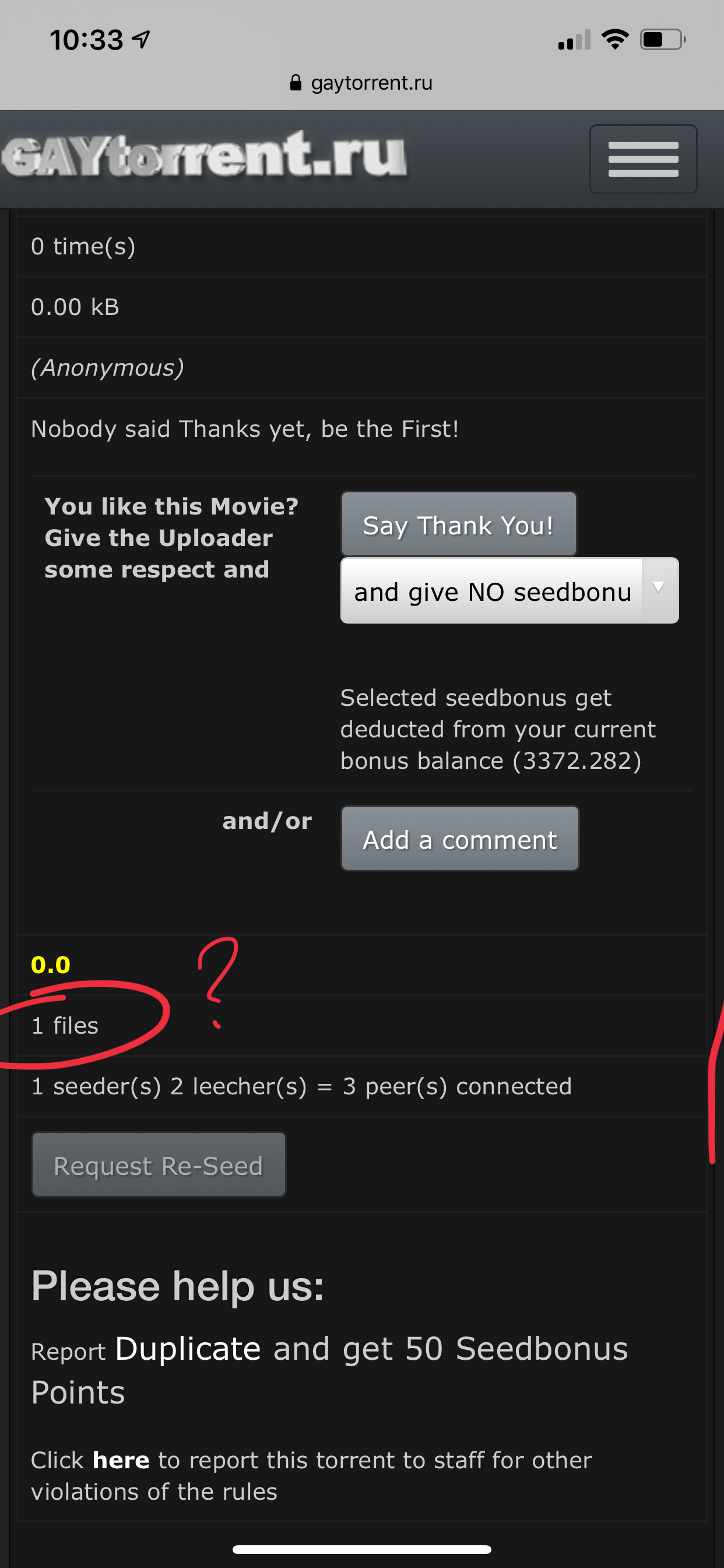
Inside an individual torrent's page, can you change it so that clicking on [File list] shows both the original size in bytes and the truncated base-10 size in KB/MB/GB, like you did with the mouseover view on the search page? (BTW thanks again for adding the exact size, it's so much easier for me to search for duplicates now.)
Still curious if you can change torrents that include .scr files so that they show up outlined in RED instead of looking like normal torrents?
Finally, I was happy when you added the Search link back to the main menu bar. Any chance we can get it back? If you need room, replace the "GAYtorrent.ru" image with simple text "GTRU" in the same font as Torrents and Forum. GTRU is how most of us refer to the site, anyway… and the slightly-askew 3D view big-block text with its metallic shading and odd lighting is definitely part of the 2006 design
 ;D
;DMuchas gracias, vielen danke, arigatou gozaimasu!!!
Now take a few days off!!!
-
I don't wanna sound like a grudge, but I don't like the new version of it. The fonts are too big, also it feels too crowded with too much things. It's weird! I felt like the old one was more organized and easier to follow. For us, grudges lol, is there a way or an option to get the old one back (just like Facebook has this weird new look and has the option to switch to the old one)? :cool2:
-
hi
its nice, but definitely doesnt work for me.
for someone that scrolls thru the pages of torrents just using the finger on the scroll wheel, the new layout is a pain as i may have just moved the mouse a bit and suddenly find i'm now scrolling thru details of a torrent that cant fit in the view of the torrent, and thats not where i want to be, then i have to move the mouse to the right hand side of the page to get out of it and then start scrolling again.i normally put my mouse over the title and see the images if i want to see them quickly, or open the torrent in another tab to read it more indepth. There to much detail on the main page and personally i would prefer not to have the images visible on the main page in case someone walks into a shared room and i dont want them to see what i'm reading, the pics give it all away. i've tried the new layout many times but keep reverting to the old just to get rid of the images and too much detail from showing.
little things like the click on the mail button to read any reseed requests, now messages are buried further down so i now seem to be ignoring them as its another layer down to click to get to them, when they were on the top bar i just went to them.
provided theres options in the profile to have it the old layout available then i will be happy
-
Disabling extended descriptions and photos leaves a lot of blank space that should simply revert the torrent look back to what it was before the update. Now their is 2x the amount of scrolling due to the left over grey area.
-
I never used to like a redesign, as someone earlier stated, "if it ain't broke, don't fix it". However, when it makes sense to cater to other audiences ie: mobile users, then go for it.
I am quite pleased with the new layout. It looks awesome. I cannot review the mobile website as I had never used it on my phone prior to this major update. I am noticing that the thumbnails for the torrents are overlapping when you click into a torrent to download. I can provide a picture if you would like. I am using the latest Chrome browser v81.0.4044.96 on Andriod.
But thanks for all your hard work. It looks incredible!
-
Hey,
Perhaps I’m missing some setting or something, but for mobile, there’s no first column of the table in single torrent’s view, thus making it impossible to view file list (see images attached).
-
Just wanted to say thanks for all your work on the changes and the site in general.
I do tend to prefer the compressed view more but I'm fine with whatever the majority requests.
I like having the SEARCH button readily available. -
i prefer the old design, you say the new design is cleaner but it really isn't. it's far to cluttered and no need for the descriptions on the front screen, just gets in the way when scrolling with the mouse
-
you lost all user functionality because you take ten times longer to find anything . but it looks better. ugh .as a designer i know most people like it when things look pretty. but if it doesnt work ? at all?
-
I like the three new toggles on the right side of the Search page that allows some customization of the Search view. A definite step in the right direction!
I strongly agree…this way people can tailor to the view they like.
Here's another comment: In the new style, we seem to have fallen victim to the web trend of "bigger font is better." But this can make the titles of the torrents rather harsh to eye. The new titles in (which appear to be Verdana Bold) stand out harshly from the background. Dialling back the font colour just a bit, while retaining the font and size, would be easier on the eye. See the image below: The top frame is the current site design, with the lower frame at a slightly darker grey (RGB:225,225,225 to prove that I'm a nerd). Just a thought.
-
Layout is somewhat nicer.. but very cluttered. On my laptop it uses WAY too much of the screen… I prefer the old one.. sorry!
Hello! It looks like you're interested in this conversation, but you don't have an account yet.
Getting fed up of having to scroll through the same posts each visit? When you register for an account, you'll always come back to exactly where you were before, and choose to be notified of new replies (either via email, or push notification). You'll also be able to save bookmarks and upvote posts to show your appreciation to other community members.
With your input, this post could be even better 💗
Register Login