New Design
-
Pictures not showing in Safari browser when mouse it hovering in new version
-
New app does not show pics when hovering over title?
-
HI.
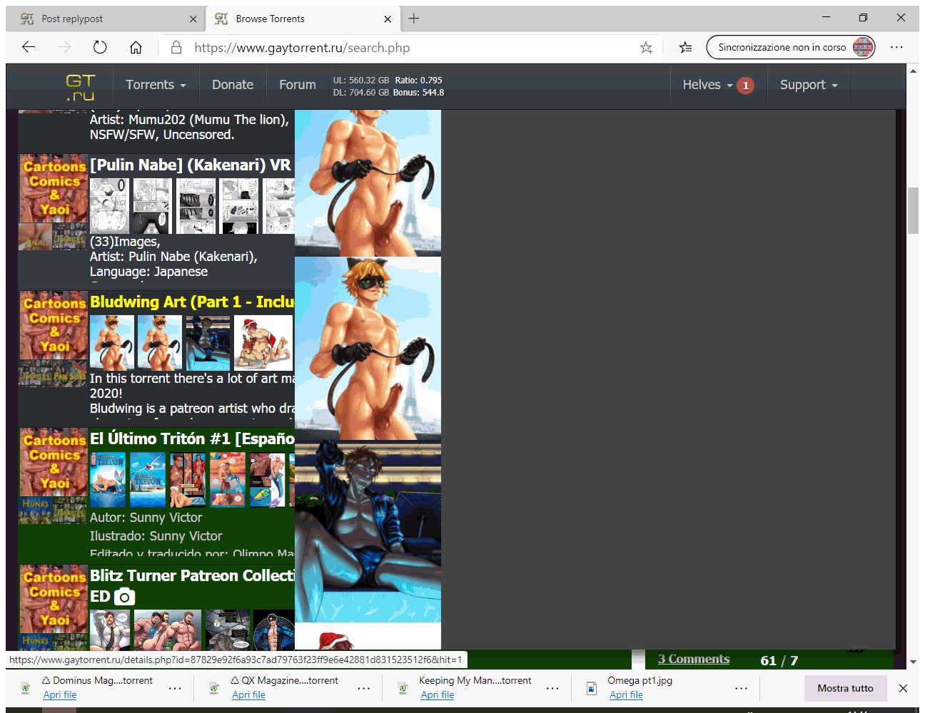
I love the new design. Only a remark: when you put the mouse on the title and the preview of the images comes out, the images are set vertically, so not so easy to be seen, most photos are out of screen. Better would be horizontally and full screen. See attachment.
Kisses
Helves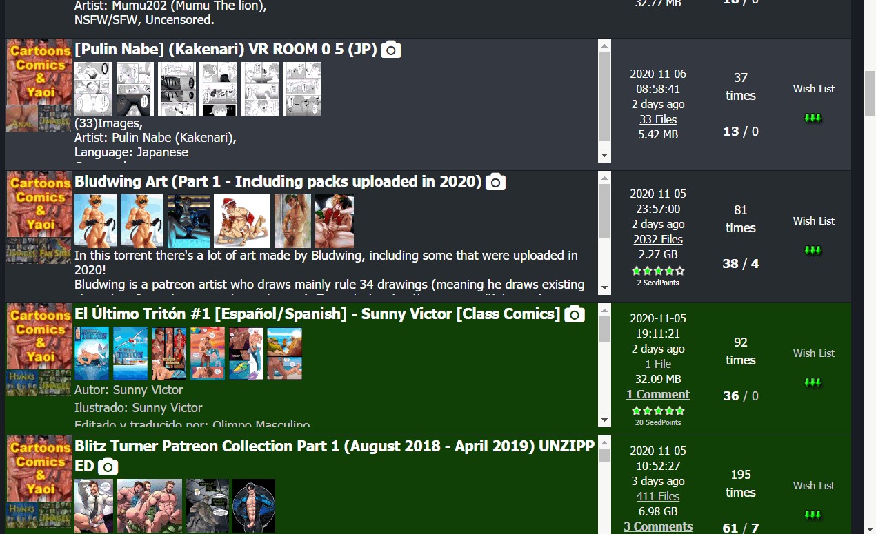
-
I noticed an issue in image popover. If we click on the images displayed in search result, the list in the popover is only limited to the the images displayed in the result, even if the torrent has more images. I have to click on camera icon to view all the images available in the torrent.
For e.g: If a torrent has 10 images and only 6 of them are displayed in the search result, then clicking on the image from search result will scroll through only those 6 images in popover. Clicking on camera icon would scroll through all 10 images. -
I have noticed that the problem with overly tall images causing difficulties in using the imager browser has been fixed with appropriate clip() code! Thanks! :hug2:
-
Just noticed a problem today: No checked boxes in my categories, Browse Torrents screen. Went to Profile, it let me change them - but didn't save changes. Cookie problem?
Name Firefox
")
Version 83.0
Build ID 20201112153044
Windows 10 version 2004 (OS Build 19041.630)Images, downloads working for me, no font problems. Site seems a bit faster.
-
[Update] Problem (checkboxes unchecked) still remains, but less of a problem than I first thought.
When the page initially loads, the boxes are checked. As more items load, the checks flicker and disappear. But, the category selections are still there, so the page works despite looking a bit odd on top.
DISREGARD: Stupid Greasemonkey script working on the wrong webpage…
-
ohhh it looks nice
-
I'm happy! :cheers:
-
Great search page, but thumbs are too small.
Fixed through userscript though.GM_addStyle(".thumbnailimage {height:120px !important; width:auto !important}"); -
The search isn't working properly. If only one of the 'Where to Search' options, "Torrent Name", "Torrent Description" and "Torrent Filename", is selected, it still searches in all three. There are search results returned that don't have any of the words I am searching for when only "Torrent Name" is selected. In fact, I can deselect all three of these and I get the same number of search results as though selecting only one of the optons. This appears to be on both the new and old design. The "Freeleech Only" and "On Wishlist Only" filters appear to still work.
-
Hi, was puzzled by something. Hope it hasn't already been answered. I know in the old design, after you download a torrent and seed it etc…. the entry becomes green.
Now I see random torrents that are in a "lighter green"....... what does that mean?
-
Hi, was puzzled by something. Hope it hasn't already been answered. I know in the old design, after you download a torrent and seed it etc…. the entry becomes green.
Now I see random torrents that are in a "lighter green"....... what does that mean?
Dark Green or Solid Green - completed download
Light Green - incomplete download or partial download [exclude FreeLeech] -
Hi, was puzzled by something. Hope it hasn't already been answered. I know in the old design, after you download a torrent and seed it etc…. the entry becomes green.
Now I see random torrents that are in a "lighter green"....... what does that mean?
Dark Green or Solid Green - completed download
Light Green - incomplete download or partial download [exclude FreeLeech]incomplete or partial download by me?? i've never downloaded those torrents…..
-
haven't had issues stated here when using firefox browser, except i also get inconsistent preview issues when mousing over the title, sometimes it previews up or down for no apparent reason. at first i thought it was based on how far it was from the top or bottom of the screen, but no
-
Good Work Dear
-
I'm enjoying a lot of the aesthetic improvements in the new design, so I wanted to note on the Forum boards, how much more pleasing the "generic" member icons are -- the circle with the member's initial, in a range of groovy colors.
It's a great improvement over the previous "empty man" icon -- the circle with just a white head and shoulders in a grey circle, if I recall. Of course, I'd encourage anyone to go beyond the colored circles, and add their own photo or graphic -- let your creativity free!
-
Also like the small overlay circle to indicate when someone is:
Online (green)
Away (orange)
Do Not Disturb (red)
Invisible (or not here - grey)That is, if they choose to share that status.
-
i think its great. much better.
Hello! It looks like you're interested in this conversation, but you don't have an account yet.
Getting fed up of having to scroll through the same posts each visit? When you register for an account, you'll always come back to exactly where you were before, and choose to be notified of new replies (either via email, or push notification). You'll also be able to save bookmarks and upvote posts to show your appreciation to other community members.
With your input, this post could be even better 💗
Register Login