New Design
-
New design looks great and trimmed down. I don't personally use it on a mobile device, but I can see where it would be more user-friendly now on one. I really liked the addition of hovering the mouse over the title brought up the pictures. So it confused me when I saw the pictures actually show up in addition to that. Then I saw the redesign was in part for mobile devices, so I guess that's why the static pics were added. I'm not sure I like having the static pics there as it seems to have made the columns larger, therefore, cause more scrolling. But if it helps with mobile devices, so be it. Again, it looks great! Awesome job! Thanks for everything ya'll do!
-
browse.php
i liked the new design, until i had noticed i can not reach the link which shows the browse.php with a button;
only picbrowse.php - and this i do not really like. -
Couldn't switch it back fast enough, takes much longer to scroll down on non-mobile. I don't need to read every full description unless I decide to click on something. Not better for me, not sure why it's assumed to be better for all.
A shame this doesn't offer something like a desktop version (old display) plus mobile device version (new display), depending on what is being used, like FB.
-
I like the new design, except of one thing. When I use the "search" option, I dont like to see all the preview pictures at every torrent, it makes everything more complex. Because of all these pictures it takes longer to load a site when searching. There are to many pictures now when I use the search. I can have a look at pictures of a movie when I choose a file, so I dont need to see them in the overview. I would appreciate it, if there would be the option to turn of the pictures when searching.
-
This issue should now be fixed.
sure is, you rock! :cheers:
It seems the search bar is back again at the top of the picture browser covering the controls.
-
Extended view for search results being tested
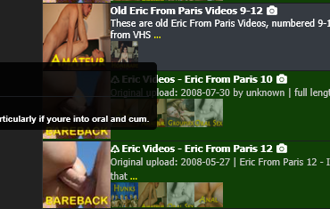
Almost a shock when the new style popped up when I was doing a specific search in response to a reload request. The search I was doing was
Searchresults for "Eric From Paris "What confuses me are the scroll bars that appear on some of the entries.
on EricVideos - Eric From Paris 06 it scrolls just a bit and will not show the description
on Eric From Paris (Video Series Part 3 of 3) (12-17 +20) it shows a couple of lines but not the full text. Switching over to the old view I can hover on the text and see the full description.
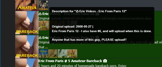
On ones with lots of pictures example Eric From Paris # 5 Amateur Bareback or Eric From Paris # 16 (mp4) Amateur bareback (ericvideos) I can only see top cut off of the description but not readable.Maybe limit pictures to one row. and show description below. If the description too long then similar to the old interface show the three dots (…) at the end where I could hover and see the full description in pop up box.
Speaking of Pop Up boxes I have noticed and issues with some of the descriptions I have seen on the new main search format pages. Most pop up ok and are readable but some are popping up like they are left justified and run off the window to the left and are not viewable. but not be a problem for other entries. It does not appear that the "..." being close to the left side of the screen is what causing the issue.
The first attachment snip is example of a cut off
Yet this one with the "..." even closer to the left pops up correctly (2nd attachment snip)
Also just a comment, I am using the new panels as my primary search. The set of changes you made in the last day or 2 for improved readability Really helped me a lot.
Thanks for all your efforts!!!!
-
It's fantastic that your team is tkaing the time to consider improvements to the user experience. Here are some things I've noticed today. For reference, I'm on a 40 megabit connection and have tested speeds to servers hosted in a number of countries today.
Search Page Load: I've done this multiple times today, and the average page load time is more than a minute. I see a couple of errors in the browser console, but nothing that should cause the slow times. The console is telling me that no individual asset is taking more than about 4.5 ms to download, but there are gaps between requests and responses. Overall, page loads are much slower with the new design.
Computer vs Phone: The new design might be more phone-friendly, but it's the opposite for computer users. In search results, the new design uses a very wide column that holds the description and preview images. This goes across most of the page when the window is wide, such as on a computer. It makes the description text more difficult to read (long lines of text are not easy for human brains) and the mouse makes a long journey left to the right in order to click anything.
The descriptions are also worth talking about. For really longs ones, the text is now in a scrolling region. For computer users who use a mouse and finger-scroll, this catches on those scrolling fields and the page scroll stops in order for the field scroll to continue. This is frustrating and is not how people normally approach a page.
I wonder if it would be possible to have CSS that lays out the page differently for mbile, tablets, laptops, and wide screens? This seems fairly common for websites these days. Could it work for everyone here?
-
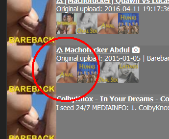
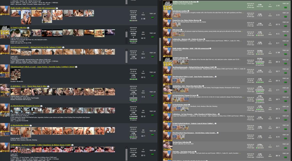
In Browse, a lot of the preview images are obscenely long, taking up 3+ pages. I switched back to the old layout, which is more compact and truncated the previews to a reasonable maximum height. Having some previews take up pages of space makes it VERY difficult to navigate and be able to tell the Browse results apart.
-
I appreciate the new extended view of torrents!
Some general feedback: My critique about the new design is the number of clicks has increased to get to Browse, which is nested under the new "Torrents" menu, and requires an additional click. In my opinion, it would be better to have Browse to the left of the Search button, or instead, have the Torrents menu expand when the mouse hovers over it. Overall, I think the new redesign is great! :love:
-
plz go back to the original format.
-
In re: the new layout and the Search page, I thought it was fine after the small fonts were fixed and the mouseover image popups were fixed to so that they weren't cut off.
Further changes more recently have added some behaviors that I'm not a fan of…
A) The current iteration stretches the table of search results all the way across the window, which means my eye has to travel farther to get from the torrent title to the torrent size...even with my personal browser bookmarks sidebar taking up screen space, the search table width is too wide. The old table width was good.
B) The current iteration sets a fixed height for each search result row in the table, which means that entries that contain too much description text cause the table row to scroll. This greatly disrupts scrolling of the overall search results page because I might try to scroll down while the mouse is over one of these scrolling table rows, scrolling a single torrent description instead of scrolling the page. It's fine to put the torrent description in the search results, but if you do, please let the table rows expand to accommodate the data rather than creating fixed-height rows that scroll when their contents are too large.
C) I don't know about other people, but if I'm interested in the screencaps for a torrent that I like the title or description of, I'll mouseover the title to see the screencaps. The screencaps don't need to be in the search results table as long as we have working mouseover previews that display the screencaps without cutting them off.
I liked the old layout but if I had to choose a version of the new layout, at least for the Search results page which is where I spend most of my time, I prefer the version from after the font size was increased, but before the table width was increased to take up the whole window and before the table rows started scrolling independently.
Thanks
--Leo -
just wanted to give some feedback.
-
I agree with most people that having images of the content makes the layout very cluttered. I'd much rather have 1 thumbnail representing the genre of porn so that the search results are clean and consistent. Having a single thumbnail representing the genre of porn (for example, bear) makes it easier to visually group what we're interested in and then hover a mouse over to know if it's something we want when it pop outs thumbnails.
-
If I rescale by using control+mouse wheel, I was expecting only the text to rescale, but not the entire layout. So if I try to make the font bigger, i'll only see 3-4 results at once on my screen. If I wanted to see more results, I'd have to scale out, but that would cause my font size to become so small it's unreadable
-
with the old layout, I can see ~14 results and by quickly scrolling i can process everything i see - thumbnail subcategory, title of movie, release date all within close proximity can be captured at a glance. this layout only shows 6-7 results, with a lot of eye travel between points, clicking/scrolling for descriptions and it takes a bit more time to assess one line at a line what i am looking at
-
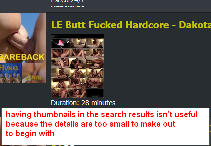
I think the intent to have thumbnails displayed horizontally is a good idea, but because everyone creates images in their own way, it's inconsistent (for example, some create 1 image w/ several thumbnails). Most of the time if the images are generated from the videos, the details are too small to make out as a thumbnail anyways. The only benefit I can see with having images horizontally is if the images are carefully selected - like face thumbnails of the people. I think this works for porn studios who have headshots/studio shots but this doesn't work for amateur/straight from video screenshots
.
Personally, I think the best way to implement the search results is to design it in a way that we can get as much information from a quick glance
-
the category it belongs to
-
title a brief description starting with the YEAR the video was released (or if it's a reupload) that shouldn't be more than 2 lines
-
the size of the video
-
when it was uploaded/if it's a reupload
and usually if I wanted to know more, I would mouse over the title and it would popout images.
Honestly I don't think the responsive design is bad. Here's what I would change.
-
remove are the thumbnails under the titles and keep the description/text.
-
remove the mouseover over #of comments where it pops up a massive window showing comments obscuring the search results.
-
I think Info/Snatched/Functions columns should actually be right next to the Subcategory thumbnails. They give good information and often it's what I look at before I click on the link itself (uploaded date/fileSize/Rating is important). If you put it next to the subcategory thumbnails, it's less eye travel and a more efficient use of space.
In the end, I think it's more important to emphasize on efficiency. It's not that it's "hard to click on one more link", but it's because this website has many torrents that can be uploaded in one day and that "one click" eventually adds up.
-
-
I'm noticing that in browse mode, with photos that are very long vertically, the full length is being displayed and taking up multiple row's worth of space. So instead of one torrent per block of image, it takes up a whole bunch. And it's hard to keep track of which torrent I've already seen or not.
-
Not a fan of the images being on the Search page, but because I think that people should be able to see them if they want to then I'd like the option to turn them off via a setting.
-
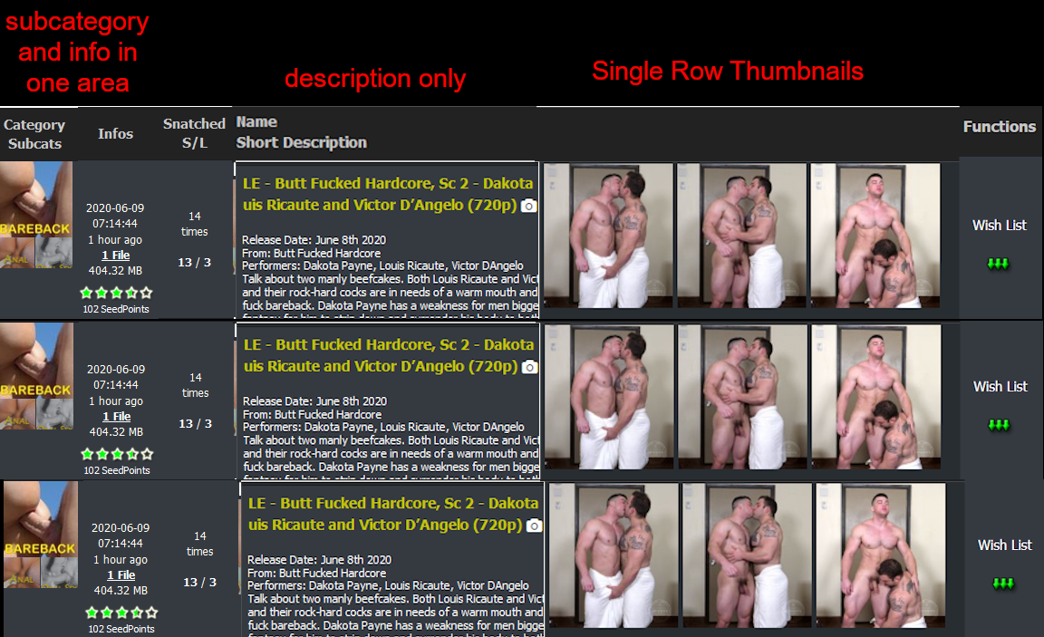
I just did a quick sloppy mock up of what could be improved from the current design.
-
Put Info/Snatched columns on the left, next to subcategory thumbnail column
-
Name/Description column right after. Text only.
-
Thumbnail column that displays only a SINGLE row of images.
You can still make it responsive. The first three columns (Category, Info, Description) will always be present and the amount of thumbnails shown would be relative to the width of the user's browser.
Additionally, maybe the user can also choose to disable/enable the thumbnail column should they only want text in their search results - so disabling thumbnail column means the description column would expand. Could save on bandwidth for both the site and the user and because it is responsive, the height of each line is also smaller allowing the page to display more results
Vertical space is also precious real estate and I think being able to display as much results in one page makes more sense (especially for something that is a search function). A comparison of the new design where you can see 8 results and the old one where you can see around 17 results (both sites are zoomed in the same).
I would even say if possible, i would omit the thumbnails for subcategories (because it forces a minimum row height) and instead just use Colored, styled text.
I do like the new color scheme. Improvement from the previous one. you're definitely on the right track, though and I think the new redesign definitely has good potential with some tweaks.
-
-
In general, I like the new design very much, more concise and less cluttered. However, for the torrent search result page, I think it's the opposite because thumbnails are now shown inline for every result. In the old design, I could quickly browse the titles/descriptions of the search results and only look at screenshots that interested me by hovering the title. In the new design the thumnnails overpower the title/description and it takes me much longer to find things I'm interested in. So I second the previous commenter's sentiment to make the thumbnails optional via a profile setting, not just for bandwidth saving reasons but also for the reasons outlined above. It would be much appreciated if that would be possible!
-
Good Morning,
I prefer the old version.
In the browse section, there are images that elongate and it does not display it correctly.
And I prefer older top menus, they seem faster to me.
Thanks!!
-
I think new layout is too wide on PC. Search results have no margins on left and right, so text ant table cells is near borders of screen. It's inconvenient.
-
its kinda okay-ish (i like the new colours) but theres sadly so much wrong/broken now

Desktop:
- overall: max-width for the content-area would be awesome (something like 1200px/80vw for desktop?)
- torrent-overview: i still "hate" those image-hover effects over the torrent-titles. would be awesome to move them to the camera-icon. they also now kinda obsolete because the images are now shown in the description-field
- torrent-overview: as i talked about the description: please truncate those and/or make the container-height dynamic. scrolling containers is bad practice and also fucks up the regular scroll if the mouse is placed in the middle
- torrent-overview: the screengrabs kinda (optically) clash with the section-images -> move them (screengrabs) to a new place or maybe replace the section-icons with something more abstract so they don't look like screengrab-images?
Mobile:
- overall menu + screen-elements (buttons, select-fields, checkbox etc) are way to big. got an iphone 11 pro and the poll-box on the frontpage takes almost 50% of my screen. with the huge menubar its more than 50% for not much information. (also the question is missing on mobile+desktop?!)
- search field is obfuscated by the huge dropdowns (move them to a new line?)
- viewport is kinda buggy/broken, could be also due to the wayy to huge boxes (overflowing horizontally)
thanks for your effort of this redesign. i'm pretty sure with some fixes this could be a great new design for gt.ru :hug:
-
Not a fan of the images being on the Search page, but because I think that people should be able to see them if they want to then I'd like the option to turn them off via a setting.
yeah ..don't worry.. at the end you will find some toggles on that page where you can switch between long and short description, if you want to see pics, all pics or no pics. etc… give it some time. it'll evolve for the better.
Hello! It looks like you're interested in this conversation, but you don't have an account yet.
Getting fed up of having to scroll through the same posts each visit? When you register for an account, you'll always come back to exactly where you were before, and choose to be notified of new replies (either via email, or push notification). You'll also be able to save bookmarks and upvote posts to show your appreciation to other community members.
With your input, this post could be even better 💗
Register Login