New Design
-
Honestly i'm not going to complain much i have only 2 requests (with 1 bonus)
1. I only use this site on my computer and when i click on the photos while i'm looking to download a torrent, usually the images all come up on the SAME page and i can click from right to left then X it and still have the original page right in front of me. It was neat and easy. Now as soon as i click on a picture, i'm out of the torrent page and i just have the JPEG. So then i have to load the previous page again, and the same thing with every other picture… Can you fix that please, sir ?
2. The BROWSE button is kind of... the most important one ? I wish it had been chosen as one of the main tabs at the top of the page.
Bonus : I wish the option to keep the old version was never taken away from us.....EVER ! And i say that for every site that has updates :afr2: But is the reasoning that it will start fucking up after a while ?
-
pls go back to how it was. the current one is messy
-
pls go back to how it was. the current one is messy
super not helpful ! how about use another site then?
Honestly i'm not going to complain much i have only 2 requests (with 1 bonus)
1. I only use this site on my computer and when i click on the photos while i'm looking to download a torrent, usually the images all come up on the SAME page and i can click from right to left then X it and still have the original page right in front of me. It was neat and easy. Now as soon as i click on a picture, i'm out of the torrent page and i just have the JPEG. So then i have to load the previous page again, and the same thing with every other picture… Can you fix that please, sir ?
2. The BROWSE button is kind of... the most important one ? I wish it had been chosen as one of the main tabs at the top of the page.
Bonus : I wish the option to keep the old version was never taken away from us.....EVER ! And i say that for every site that has updates :afr2: But is the reasoning that it will start fucking up after a while ?
1. can you clear your browser cache? this still should work as expected.
2. Other people think the "search" button is the most important one. DAMN is it so hard to click one more time?
3. if anything changes in your life… do you complain or try to get used to it?! -
pls go back to how it was. the current one is messy
uhmm there is a button for that, as stated, multiple times.
-
I would appreciate your feedback on today's design update. Some of you have already reported about fonts that are too small. It is always very important to know where exactly on which page you see a problem. Then we save ourselves unnecessary questions back and forth. Of course I am also happy about every positive feedback, without any change wishes. :cheers:
I love the new streamlined design. For me it's easier to navigate. I'm on an older mac device and it actually seems to work better than the previous incarnation.
-
The cleaner layout is nice, but it would be helpful, I think, if you provided the ability to control some aspects of the search page.
- choices of how much description to display, and an option to provide it via hover popup or a click-to-expand button on the item listing instead
- choices of displaying the category thumbnail image or perhaps a primary uploaded image related to the torrent.
- perhaps choosing from a selection of column styles where there are full scrollable description columns as well as shortened minimal description columns; expand this to even having individual columns for things currently combined into one, like the "Info" column, which could also allow for a category image column and a torrent image column.
For my use, the current new version is exceedingly too spread out and too noisy. I intend to keep using whatever the default is as you develop this, though, just in case it's just something I need to get used to.
")
Also, just to mention, I have never really used the "Browse" option, but I think it would be more useful to me if it offered a way to easily indivicate what I've already downloaded, perhaps like "Freeleech" is overlaid as a banner, or dimming the image until it is hovered over.
-
The cleaner layout is nice, but it would be helpful, I think, if you provided the ability to control some aspects of the search page.
- choices of how much description to display, and an option to provide it via hover popup or a click-to-expand button on the item listing instead
- choices of displaying the category thumbnail image or perhaps a primary uploaded image related to the torrent.
- perhaps choosing from a selection of column styles where there are full scrollable description columns as well as shortened minimal description columns; expand this to even having individual columns for things currently combined into one, like the "Info" column, which could also allow for a category image column and a torrent image column.
For my use, the current new version is exceedingly too spread out and too noisy. I intend to keep using whatever the default is as you develop this, though, just in case it's just something I need to get used to.
Also, just to mention, I have never really used the "Browse" option, but I think it would be more useful to me if it offered a way to easily indivicate what I've already downloaded, perhaps like "Freeleech" is overlaid as a banner, or dimming the image until it is hovered over.
there will come configuration options of this view… at the moment, you see also pics in that view.. i would call this EXTENDED view...
-
New design is much, much, much better that previous one.
:cheesy2:
Thanks| -
The link to Search has now been moved out of the Torrent drop-down menu and put back on the menu bar. That inconsistency is confusing. If you are going to use drop-down menus, commit to them. It took me a few seconds to realize that Search was really missing from the drop-down menu and then to spot it in the new location.
-
I have two problems with the new design and both are about usability.
1. Showing pictures on search by default makes it more difficult to navigate, and not easier. There's too much information on screen, I'm bombarded with thumbnails of torrents I'm not necessarily interested in until I get to find the ones I want to see. 2. Then the new way to zoom in the images to check more than the thumbnails is not intuitive. In the end I get to see less of what I want and way more of what I don't care about.
Not everyone uses browse as primary way to find their files.
I like the new fonts, but about the new color scheme at first I thought somebody had died and the site was mourning… -
I have two problems with the new design and both are about usability.
1. Showing pictures on search by default makes it more difficult to navigate, and not easier. There's too much information on screen, I'm bombarded with thumbnails of torrents I'm not necessarily interested in until I get to find the ones I want to see. 2. Then the new way to zoom in the images to check more than the thumbnails is not intuitive. In the end I get to see less of what I want and way more of what I don't care about.
Not everyone uses browse as primary way to find their files.
I like the new fonts, but about the new color scheme at first I thought somebody had died and the site was mourning…I for one like having pictures in search. Looks a bit cluttered atm but there is potential for it to look better (limiting number of visible photos, uniform sizing, better placement…). Still wish the search is less wide though.
Also when you scroll if there is an entry with super long description you have to scroll though the whole thing before it continue to scroll down the page. Please limit the description length to fit the container height and put ... at the end. -
The search page is very loaded.
Try to make it simple:
The images in the category - The name of the file - <text icon="">(Positioning the mouse over or clicking on, opens a window with the description) - (Positioning the mouse over or clicking on, opens a window with the images side by side).</text>
-
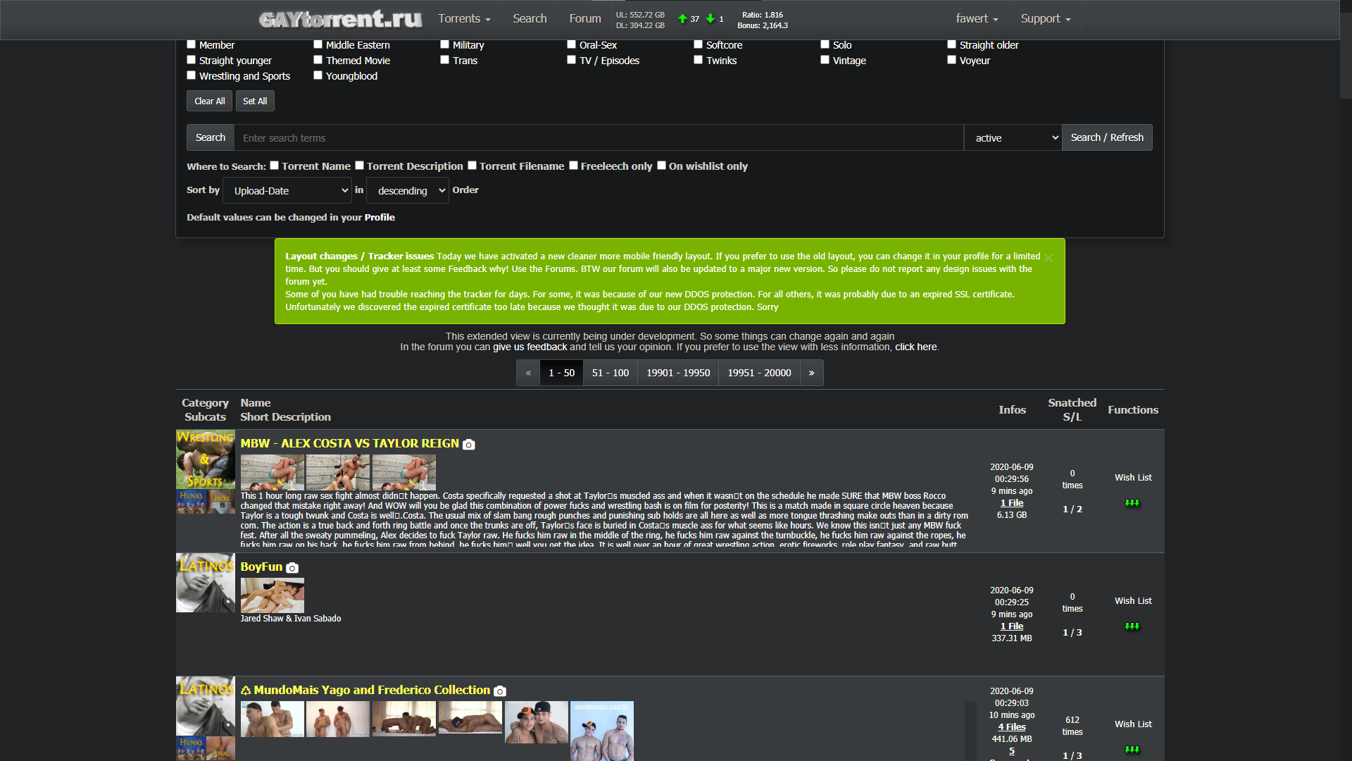
In case there is someone like me who like the (just a bit cluttered) new search but want it to be thinner like the the old one:
1. Download Stylus extension for whatever browser you're using.
2. Write a new style
3. Follow the 1st image
4. Result (2nd image)Or if you dont care about having pictures in search just disable the new style in profile setting.
This is just a temporary solution you wont need this once the size picker feature is added in the future.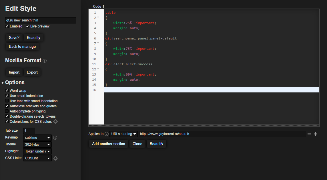
-
I just tried the new Search page again.
All I can say is… wow! Just wow.
You fixed all the problems and now I like it much better than the older version.
Thanks a million! Just adding the exact file size to the description, and getting rid of the page title change for new messages, makes this site much more usable. But you've done so much more than that. Very impressive! Thanks again!!!
:cheers:
-
I think, in the effort to please just about everyone, the new search page is…a lot. It's busy.
Two considerations:
1. Perhaps limit the thumbnails on the search page to one and people can navigate to the others by the usual means of passing the cursor over the title/hotlink or by clicking on the camera icon.2. Long descriptions that require scrolling interfere with overall page scrolling. Perhaps provide as the additional space for text as you've done then use the old way of passing the cursor over the ellipsis.
You're obviously working hard to make the site as effective as possible. Thanks!
-
New design looks great and trimmed down. I don't personally use it on a mobile device, but I can see where it would be more user-friendly now on one. I really liked the addition of hovering the mouse over the title brought up the pictures. So it confused me when I saw the pictures actually show up in addition to that. Then I saw the redesign was in part for mobile devices, so I guess that's why the static pics were added. I'm not sure I like having the static pics there as it seems to have made the columns larger, therefore, cause more scrolling. But if it helps with mobile devices, so be it. Again, it looks great! Awesome job! Thanks for everything ya'll do!
-
browse.php
i liked the new design, until i had noticed i can not reach the link which shows the browse.php with a button;
only picbrowse.php - and this i do not really like. -
Couldn't switch it back fast enough, takes much longer to scroll down on non-mobile. I don't need to read every full description unless I decide to click on something. Not better for me, not sure why it's assumed to be better for all.
A shame this doesn't offer something like a desktop version (old display) plus mobile device version (new display), depending on what is being used, like FB.
-
I like the new design, except of one thing. When I use the "search" option, I dont like to see all the preview pictures at every torrent, it makes everything more complex. Because of all these pictures it takes longer to load a site when searching. There are to many pictures now when I use the search. I can have a look at pictures of a movie when I choose a file, so I dont need to see them in the overview. I would appreciate it, if there would be the option to turn of the pictures when searching.
-
This issue should now be fixed.
sure is, you rock! :cheers:
It seems the search bar is back again at the top of the picture browser covering the controls.
Hello! It looks like you're interested in this conversation, but you don't have an account yet.
Getting fed up of having to scroll through the same posts each visit? When you register for an account, you'll always come back to exactly where you were before, and choose to be notified of new replies (either via email, or push notification). You'll also be able to save bookmarks and upvote posts to show your appreciation to other community members.
With your input, this post could be even better 💗
Register Login