New Design
-
I miss having the upload date in the search results.
Also, this is old feedback, but before the query optimizations a year ago or so, I could do a wildcard search. For example, if I wanted hypnosis videos, I could search "hypn" and it would bring back results for hypnosis, hypnotist, hypnotizing, hypnotize, hypnotized, hypno, etc… Now I have to search each of these separately and I'm still probably missing some. Any way we could get a wildcard search operator like "hypn*" ?
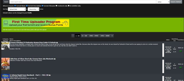
the upload date is visible: the column "added" !?!
just tried the wildcard search for 'hypn*' without a problem. got more than 700 results -
So I have been using the new design the past 24 hours. It took a while but I do think it is a real improvement over the old design. One small issue I had with the new design was the Search button buried under the Torrents button. What I found after using the new design is that by having the top bar frozen at the top of the page, instead of needing to scroll to the top of the page to click on Search, I now use only two clicks from anywhere I happen to be on the page: Torrents>Search. An overall better design. Thanks again for your hard work.
-
i don't like to do double click fore serach or inbox etc…
-
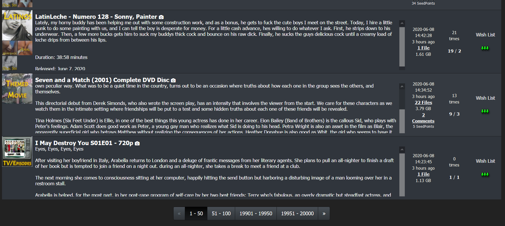
I love the new design for the most part. My only issue, is that now torrents with a large horizontal preview image get the entire image loaded in browse… The old layout didn't do that. And now I sometimes have to scroll quite a ways to load the next batch. I fiddled with it and couldn't seem to find a toggle to affect that specifically. Am I missing something? Otherwise...great stuff!
-
I love the new design for the most part. My only issue, is that now torrents with a large horizontal preview image get the entire image loaded in browse… The old layout didn't do that. And now I sometimes have to scroll quite a ways to load the next batch. I fiddled with it and couldn't seem to find a toggle to affect that specifically. Am I missing something? Otherwise...great stuff!
you are talking about the pic browser. Yes… this module needs some rewrites. the popups dont work as expected and a lot other stuff.. actually i have more focus und the menu and the search page.. but i will get back to this also !
btw. you can give this version of search a try... im working on that one actually. its not live for everyone.. just for those who read this and give it a try
-
If the forum has been here…, I just found it much cleaner look up top i like it. The drop down menus are not working... I click but nothing happens.
Google Chrome Version 83.0.4103.97 (Official Build) (64-bit) Up-To-Date -
something broke on the search page
-
something broke on the search page
it just went fullscreen to use all the space your browser has to offer
-
Glad it's more mobile friendly. On desktop, Browse should be a single click link like search instead of having to click Torrents. And the Torrents menu should me moved to the end labeled More. Otherwise, it's good.
-
Ona desktop system, the new layout uses MUCH larger fonts and so FAR fewer results are viewable at a time, which I find is a big disadvantage. An ability to change the size would help.
-
something broke on the search page
it just went fullscreen to use all the space your browser has to offer
can i disable the descriptions, though? It doesn't look well
i tried revering back to the old layout but that didn't help -
Hi to the design team!
")
The idea of a new design is really good, but I'm not sure why GAYtorrent should be 'more mobile friendly' as down-/uploading takes usually place on a stationary PC. But anyway, I have two things to report, which are irritating me:- Within the new search listing it's now more difficult to identify each torrent, because the font sizes are similar and due to the more space between the torrents you see much more text and cannot easily identify each torrent - that was much earlier in the old version
- The text description are not visible completely - I don't know why this is that way, but I'm using Firefox and my screen is set to 125% scaling (with a 2560x1600 resolution)
Both topics can be seen in the screenshot.
All other aspects are really good! Thx!
-
If I use number page bar I can't go beyond the number 10001-10050 (page 200).
I use Firefox and Tor browsers.200 pages is maximum. use the search option for less result. the Pager (as higher the page as more work it is todo for the database. so this option to page till the end will not be available anymore for performance reasons)
Ona desktop system, the new layout uses MUCH larger fonts and so FAR fewer results are viewable at a time, which I find is a big disadvantage. An ability to change the size would help.
well.. at the end i might put some toggles to change the view in realtime.
can i disable the descriptions, though? It doesn't look well
i tried revering back to the old layout but that didn't helpthis was not my intention.. so when you use the "old layout" the search button directs you to the old version again
- Within the new search listing it's now more difficult to identify each torrent, because the font sizes are similar and due to the more space between the torrents you see much more text and cannot easily identify each torrent - that was much earlier in the old version
- The text description are not visible completely - I don't know why this is that way, but I'm using Firefox and my screen is set to 125% scaling (with a 2560x1600 resolution)
1. i change the colors again… the title has now a light yellow color which makes it easie to seperate each torrent. also the background colors are now more different to reflect the different torrents better.
2. the description: if there is to much, a little scrollbar should appear (only if to much text avail) this is how it is ment to be -
One of the things I am really liking is the better contrast of colors. I had to switch back and forth a bit to double check, but both the dark grey being a little more darker and the green in a few places popping more make it easier to parse (at least in my head). Everything is looking a lot more sharper and distinct. The paler green of the notice/message area really shows how much better the new colors improve the site!!!
-
I generally like the new layout but:
1. I'm seeing more and more pictures in picture view that are either too long or too short. (You cant click on the picture if it's too short since the hover popup covers the whole thing. And the long pictures just takes up too much space unnecessarily)
2. The search view on pc is spanned across the whole screen which makes it very hard to take in the information because you have to move your eyes a lot while there is too much white space in the middle. The old layout got this right but there is no option to turn off search 2.0.I look forward to the final version of this but for now please let me change back to old search view. Thank you!
-
I actually like the older one, altho this one looks clean and less laggy. BUT, I do think ratio should be highlighted or in evidence please
")
requested by many so far: the stats are "ALWAYS ON" again :cheers:
I do like, as the screen width gets smaller, that the stats "disappear" in sections and then all together. A small minor suggestion that might help, having the up and down numbers on top of each other (Stop it, just, no. Stop.) instead of side by side (as the others are stacked) would eeck out another few pixels before disappearing.
-
I do like, as the screen width gets smaller, that the stats "disappear" in sections and then all together. A small minor suggestion that might help, having the up and down numbers on top of each other (Stop it, just, no. Stop.) instead of side by side (as the others are stacked) would eeck out another few pixels before disappearing.
i have no final ideas yet, but i like to add also the messages to the view. so you see again ALL informations as long your browser size allows it.
I generally like the new layout but:
1. I'm seeing more and more pictures in picture view that are either too long or too short. (You cant click on the picture if it's too short since the hover popup covers the whole thing. And the long pictures just takes up too much space unnecessarily)
2. The search view on pc is spanned across the whole screen which makes it very hard to take in the information because you have to move your eyes a lot while there is too much white space in the middle. The old layout got this right but there is no option to turn off search 2.0.I look forward to the final version of this but for now please let me change back to old search view. Thank you!
1. i have to work on that module…. actually i am on search2.0 how you call it.
2. it is ment to be fullscreen. you just could decrese the size of the browser window. i have plans to add some of the pictures here too. so you see even more of each torrent without to have to click. maybe there will come a switch to toggle between a "smaller" view and the lets say "extended view" -
I like it, especially the main index pane (strip) that stays frozen at the top of the page, even when one scrolls down.
…
Members can be reminded that pages can grow (or shrink) with browser controls (e.g., "Cntrl" & mouse wheel).This is definitely worth noting. If zoomed in too far, some elements from the top bar disappear (traffic statistics, active torrents, ratio, bonus…).
For the shy:
Holding down the Ctrl key on the keyboard and moving the mouse wheel up or down will enlarge or shrink the web page contents (which direction performs which action depends on your system settings). In most browsers, Ctrl-zero on the keyboard will restore the contents to their default size (also called 100% zoom).You can also zoom in or out using just the keyboard:
Zoom IN: Ctrl and + (⌘ and + on a Mac)
Zoom OUT: Ctrl and - (⌘ and - on a Mac) -
I very much appreciate all the work that has gone onto this, and i do find a lot of the design much cleaner and friendly, but….
I regret to say that I find the SEARCH page is filled with too much information for each torrent. It feels like I am being assaulted with more information that I want, and this makes it difficult to identify and focus on the information and torrents that I do want. And because each torrent is given more real estate on the page, there are fewer torrents on the screen as you scroll through; I find this very disorienting as it is hard to tell where I am on the page - it is disorienting I much prefer this page as it was: giving me a very brief teaser with mouse-rollover to access to pictures, helping me decide quickly if I wanted to explore the torrent further. With the new layout, I found myself developing a headache trying to weed through what is worth reading and what is not worth reading, and finally giving up. Sometimes less information is actually more, because it helps one focus and choose. Too much information defeats that purpose.
But, again, thanks for all the care and good work.
Hello! It looks like you're interested in this conversation, but you don't have an account yet.
Getting fed up of having to scroll through the same posts each visit? When you register for an account, you'll always come back to exactly where you were before, and choose to be notified of new replies (either via email, or push notification). You'll also be able to save bookmarks and upvote posts to show your appreciation to other community members.
With your input, this post could be even better 💗
Register Login