New Design
-
I would appreciate your feedback on today's design update. Some of you have already reported about fonts that are too small. It is always very important to know where exactly on which page you see a problem. Then we save ourselves unnecessary questions back and forth. Of course I am also happy about every positive feedback, without any change wishes. :cheers:
It doesn't work for me. I can't search for anything and the whole site is really slow.
-
I can't search for anything and the whole site is really slow.
we had some network issues the past hours… i just fixes that
-
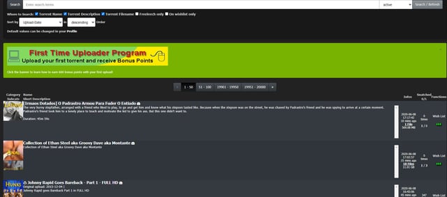
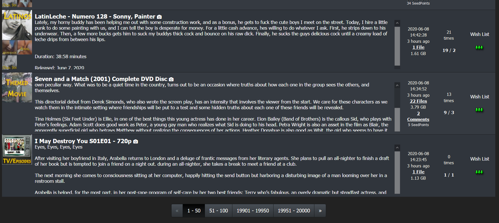
The new interface is kinda inconvenient. As when I am on the SEARCH pages and I want to go to pages 251-300, in the new interface, I have to click through 1-50, then 51-100 and so on. Kinda inconvenient though.
-
I like the new look, but I really do miss the rainbow flag at the top of the site. It added some personality and some pride to the site.
-
I like the new look, but I really do miss the rainbow flag at the top of the site. It added some personality and some pride to the site.
wow, i did not expect this reactions. That people even get feelings for a design from the year 2006.
It is not finished yet. First i would like to have the functionality. People miss some direct accessible functions in the Menu.
When the menu is final, we might consider adding some pride to it. maybe with a new logo. i did not have one, so i re-used the old one.The new interface is kinda inconvenient. As when I am on the SEARCH pages and I want to go to pages 251-300, in the new interface, I have to click through 1-50, then 51-100 and so on. Kinda inconvenient though.
In a future version there will not even be a pager. Just like in the Browse page, the contents will be loaded while scrolling. In the meantime I'll see what I can do with the pager.
The "Added" and "Size/Infos" columns are too close together.
The page skip "1 - 50 | 51 - 100" is missing some ranges.
The "Search" button at the top is now a two click (Click Torrents then click Search) process, but that's the button I click on most often.
No message counter displayed on header, requires two clicks also.
I'm sure the new design will come along eventually. :clap2:Thanks for your comments. I will tweak the Menu. Most people miss the "search" button i guess. Also, the "new message" from the title of the page will get removed - as requested elsewhere.
@urx585: apologize accepted.
- If more of the torrent title was included before being cut off and replaced with ellipses. There is a BIG difference between torrents that end with 480P and torrents that end with 1080P, but this often gets cut off. There is no reason to truncate the torrent title. Simply wrap to a second line, if necessary.
i need to break the design for this.
On the left side you can see the picture of the main category. It has always been the goal to never need more space than this picture takes. 80px in height. Meanwhile I think this is too little. What would you think if I would show the 4 subcategories under the main category picture? Then you would have twice as much space on the right side for information. This would solve your issue as well.- The torrent title and description should be in readable fonts with high contrast to background.
look how it is now: dark background with white text.. this should be readable enough
- If more of the description was shown without having to mouse over the ellipses, that would be helpful. When we do mouse over, we should see as much of the description as will fit on the screen. It doesn't matter if it takes up most of the screen, because it will disappear when we mouse away.
i will take care of it. be patient
- When we mouse over the torrent title, the pictures should be shown in as large a box as possible. As above, it's OK if the pictures are so large they cover most of the screen, because they will disappear when we mouse away.
depending on the different screen sizes, this make a lot problems. this has to be completly rewritten as well.
- The "gtru :: 1 Message" notification in the page title MUST GO AWAY. Because the site alters and obscures ALL of the tabbed page titles every time some !@#$-%^&* sends yet another reseed request, it makes it impossible to find the tab you were looking for… unless you open your Inbox and then wait minutes for all the stupid warnings to disappear.
i turned this off. nobody told me, that this can be annoying. maybe we need a switch like "notification settings" were you can turn this on/off
Finally, when we click on "File List" we should see the EXACT FILE SIZE in BYTES. That is the precise size of the file, with no conversion or truncation – exactly as it is shown in the torrent file itself. Converting to base 10, then truncating and adding KB/MB/GB makes it IMPOSSIBLE to detect duplicates based on file size. I can still do it if there is only one file in the torrent -- the main page shows the exact size in bytes (THANK YOU!!!) but if it has two or more files, I can't see the exact sizes of the individual files unless I download the torrent.
If the UI redesign effort was to make it easier for mobile phone users, why not just allow users to choose the interface based on how they access it? Most of this site's users don't access it via phones. The screens are too small, and the keyboards suck.
i tweaked this as you might already noticed. and here we have a problem. i cannot tweak this jusr for the "new" version. so i had to change this sidewide. i dont want to mess around with more than 1 code base. Im working as a single individual on it. I am not Microsoft with 1000 developers onboard. hope you understand, why i will put the old layout offline sooner or later and try to make you guys happy with the new design. Just complaining and then turning it off is just mean and not helpful. I hope you realize that now.
those changes need to be done. it is not just about a new look. it is the possibility to continue developing new features for the site.
-
I miss having the upload date in the search results.
Also, this is old feedback, but before the query optimizations a year ago or so, I could do a wildcard search. For example, if I wanted hypnosis videos, I could search "hypn" and it would bring back results for hypnosis, hypnotist, hypnotizing, hypnotize, hypnotized, hypno, etc… Now I have to search each of these separately and I'm still probably missing some. Any way we could get a wildcard search operator like "hypn*" ?
the upload date is visible: the column "added" !?!
just tried the wildcard search for 'hypn*' without a problem. got more than 700 results -
So I have been using the new design the past 24 hours. It took a while but I do think it is a real improvement over the old design. One small issue I had with the new design was the Search button buried under the Torrents button. What I found after using the new design is that by having the top bar frozen at the top of the page, instead of needing to scroll to the top of the page to click on Search, I now use only two clicks from anywhere I happen to be on the page: Torrents>Search. An overall better design. Thanks again for your hard work.
-
i don't like to do double click fore serach or inbox etc…
-
I love the new design for the most part. My only issue, is that now torrents with a large horizontal preview image get the entire image loaded in browse… The old layout didn't do that. And now I sometimes have to scroll quite a ways to load the next batch. I fiddled with it and couldn't seem to find a toggle to affect that specifically. Am I missing something? Otherwise...great stuff!
you are talking about the pic browser. Yes… this module needs some rewrites. the popups dont work as expected and a lot other stuff.. actually i have more focus und the menu and the search page.. but i will get back to this also !
btw. you can give this version of search a try... im working on that one actually. its not live for everyone.. just for those who read this and give it a try
-
If the forum has been here…, I just found it much cleaner look up top i like it. The drop down menus are not working... I click but nothing happens.
Google Chrome Version 83.0.4103.97 (Official Build) (64-bit) Up-To-Date -
something broke on the search page
-
something broke on the search page
it just went fullscreen to use all the space your browser has to offer
-
Glad it's more mobile friendly. On desktop, Browse should be a single click link like search instead of having to click Torrents. And the Torrents menu should me moved to the end labeled More. Otherwise, it's good.
-
Ona desktop system, the new layout uses MUCH larger fonts and so FAR fewer results are viewable at a time, which I find is a big disadvantage. An ability to change the size would help.
-
something broke on the search page
it just went fullscreen to use all the space your browser has to offer
can i disable the descriptions, though? It doesn't look well
i tried revering back to the old layout but that didn't help -
Hi to the design team!
")
The idea of a new design is really good, but I'm not sure why GAYtorrent should be 'more mobile friendly' as down-/uploading takes usually place on a stationary PC. But anyway, I have two things to report, which are irritating me:- Within the new search listing it's now more difficult to identify each torrent, because the font sizes are similar and due to the more space between the torrents you see much more text and cannot easily identify each torrent - that was much earlier in the old version
- The text description are not visible completely - I don't know why this is that way, but I'm using Firefox and my screen is set to 125% scaling (with a 2560x1600 resolution)
Both topics can be seen in the screenshot.
All other aspects are really good! Thx!
-
If I use number page bar I can't go beyond the number 10001-10050 (page 200).
I use Firefox and Tor browsers.200 pages is maximum. use the search option for less result. the Pager (as higher the page as more work it is todo for the database. so this option to page till the end will not be available anymore for performance reasons)
Ona desktop system, the new layout uses MUCH larger fonts and so FAR fewer results are viewable at a time, which I find is a big disadvantage. An ability to change the size would help.
well.. at the end i might put some toggles to change the view in realtime.
can i disable the descriptions, though? It doesn't look well
i tried revering back to the old layout but that didn't helpthis was not my intention.. so when you use the "old layout" the search button directs you to the old version again
- Within the new search listing it's now more difficult to identify each torrent, because the font sizes are similar and due to the more space between the torrents you see much more text and cannot easily identify each torrent - that was much earlier in the old version
- The text description are not visible completely - I don't know why this is that way, but I'm using Firefox and my screen is set to 125% scaling (with a 2560x1600 resolution)
1. i change the colors again… the title has now a light yellow color which makes it easie to seperate each torrent. also the background colors are now more different to reflect the different torrents better.
2. the description: if there is to much, a little scrollbar should appear (only if to much text avail) this is how it is ment to be -
One of the things I am really liking is the better contrast of colors. I had to switch back and forth a bit to double check, but both the dark grey being a little more darker and the green in a few places popping more make it easier to parse (at least in my head). Everything is looking a lot more sharper and distinct. The paler green of the notice/message area really shows how much better the new colors improve the site!!!
Hello! It looks like you're interested in this conversation, but you don't have an account yet.
Getting fed up of having to scroll through the same posts each visit? When you register for an account, you'll always come back to exactly where you were before, and choose to be notified of new replies (either via email, or push notification). You'll also be able to save bookmarks and upvote posts to show your appreciation to other community members.
With your input, this post could be even better 💗
Register Login