New Icons
-
Thank you for the offer. Maybe You put up a new Topic for this to discuss. Maybe those icons should not even use pictures. Instead those icons like metioned earlier in this topic.
I did something quick here to be the base, we would replace the black background with the image that would represent the category:

It would be good to do some research afterwards to find out what most people think.
-
I've splitted the topic so we can talk about the icons separately.
interesting suggestion. even if i don't know if the blue fits well. but for that you can discuss here…
thanks for your input in advance -
Guys, I will be offering to redo the icons of the categories that exist here on the site. I used the model above as an example and would like your opinion:
-
What color do you think would be cool to use behind the category name?
-
On the black background, do you think it is better to place an icon symbolizing the category or an image or just the text ??
-
If the majority thought it would be better to use an icon or an image, could you help with suggestions?
Please, your opinion is of great importance to make the site more incredible than it already is.
-
-
I made two models, I need your feeback.


Those that are related to ethnicity, physical types, age … Just find an actor that is the guy in the category that I edit:
-
I would prefer no photos but just words on a background because they would be easier to read. Icons don't generally have photos, anyway.
Photos are not necessarily clear in meaning or representative of a broad category. For instance, the "Daddy" photo above might be mistaken for "Tattoos", "Grey & Older", "Daddies & Sons", or "Straight Older". What races should be in the photo for "Interracial"? One of each? Then it might be "Group Sex".
yeah.. so right.. if we use pics again, we can keep the existing icons.. it should be real icons without pics in it at all.
btw. "daddy" is a definition we all see our own version of it in our mind. This guy looks for not like a "daddy". Its more a hunk -
This guy looks for not like a "daddy". Its more a hunk
He looks more like "aging circuit party boy" to me!
-
Many categories could be unified into new categories
Homemade and Amateur. Is there a difference?
We could make simple icons with only one background color and the word with the name of the category in the center, for example:
The categories that represent the Ethnicities, could have a specific background color and in the center, the name of the categories: Asian, Latin, Black, Middle Eastern … We could check if there is any more ethnicity that needs to be added...
A background color for categories that represent body types and ages: Hunks, Twinks, Bear, Jocks (Could be combined with the category "Wrestling and Sports) ... Perhaps the categories "Mature", "Gray / Older" and "Daddies" could be unified.
There would also be a color for the categories that represent Fetishes: Military, Uniforms, Leather, Scat, Fisting, BDSN, Feet, Public, Voyeur ...
Another color for the category that represents what happens in the scene: Anal, Oral, Bareback...
It would have a color for the Entertainment category that would be TV, Books, Magazines, Themed Movies ...
I didn't mention all of them because there are so many, but you can get a sense of what I meant.
-
I edited an image with only the text. The background color can be changed later to be some color that matches the site.

-
The categories that represent the Ethnicities, could have a specific background color and in the center, the name of the categories: Asian, Latin, Black, Middle Eastern … We could check if there is any more ethnicity that needs to be added...
White should be added as a category because it should not be the assumed default for ethnicity/race.
The icon with the shading looks great to me and the color scheme for various category groups would be helpful.
-
Ready! I finished all the models following the pattern of a background color and the name in the center!
I believe that some categories could be renamed, created or unified
Rename:
Dildos = Toys
Group-Sex = Orgy
Sons (from Daddies / Sons) = Young
Military = Uniforms (It would cover more options in a single category)Unify:
Jocks + Wrestling & Sports = Jocks
Gray / Older + Mature + Daddies = Mature
Straight Old + Straight Young = StraightCreate:
Leather
CaucasianDo you have any suggestions to Rename, Create or Unify?
I would now need to group the categories, as mentioned above, ethnicities, physical type, age… and define a color for each. Does anyone have any suggestions as to which should have the same background color and which color to use?
Maybe "White" instead of "Caucasian" as that has pretty much fallen out of usage in speech and even in writing. I rarely see "caucasian" used any more and when I do, it almost always is preceded by "white" and a slash as "white/caucasian." That is U.S. usage, though, I can't speak to usage in English for that term globally.
"Daddies and Sons" maybe leave as-is instead of renaming to "Young" as there are already Twinks and Youngblood. Gets confusing.
Everything else I agree with. The "Jocks" idea is great. For a long time, I though "Jocks" was referring to jockstraps even though it seemed very specific. Also the "Uniform" idea is good. UPS and Doorman uniforms should get more love!
Maybe check with the site owner to see how easy or difficult it is to rename and combine categories before putting much work into it. Once there is a reasonably definitive list, I'll be glad to help group the categories in subcategories.
-
Keeping in mind that these icons will be small, the “less is more” trope is even more important. I really liked the “Bareback” icon you designed; it’s simple, to the point, and easy to see at a glance. Different colors ought to be used for each, but there’s no need to link any color with a specific category. I mean, I get maybe using black for BDSM (or maybe Fetish) but what is the color of Themed Movies or Oral Sex?
I do think some of the more vague and/or severely underused categories should be merged eventually. Some of the examples already given (grey/older and mature, Homemade and Amateur, etc) are spot-on. Towards this I really like the new Fansite category - because most of those sites are pay sites, the performers are earning money, and many of them are already professionals in the wider porn industry.
I’ve always had a little difficulty with the “Anal” category. I assume most people to understand that Anal refers to fucking and does NOT include fingering, rimming, or fisting as the main event. Given that we have a Bareback category, I would like to suggest changing Anal to something along the lines of “Condoms” or “Safe Sex,” which is how I already think about the Anal designation. Let’s face it; all bareback sex IS anal sex but if we’re going to distinguish it from non-bareback fucking, what are we left with? Safe sex/fucking using condoms.
The discussion around using “White” and/or “Caucasian” is interesting given what’s going on right now, and also very delicate and tricky. Be very careful that this thread doesn’t blow up. It taps into the definitions of race and culture. To give a personal example: my mom was Mexican American but I look very WASP (White Anglo-Saxon Protestant - it’s a term often used in the US) and culturally I grew up in mainstream American culture. I have cousins who look as “white” as me (also some who are a lot darker), but grew up/live in Mexico and are CULTURALLY Latino. But I have never thought of any of them - light or dark - as a different race from myself. For me, the difference has always been cultural. To further the example, most Argentinians look European, because the indigenous people were basically wiped out and there was little to no mixing with the remnants (as opposed to, say, Mexico or Bolivia). Are the Argentinians “white” or Latino? And Brazil - Brazilians are very different from the rest of Latin America, and many consider themselves separate. Are they Latinos?
My comments above are only my own experience. I’m not claiming to be right, or an authority, or that other people’s perspectives’ aren’t valid.
I bring this up only to remind everyone that such classifications are difficult to make in the real world and here we are trying to come up with a system that works for porn.
I personally feel that we don’t have to have a category for “white/Caucasian” and this is why: It IS TRUE, as a previous commentator pointed out, that white is the default in porn, to which I might add that this is unfortunately true outside porn as well. Generally speaking, this is a bad thing, and we should all try to examine our own outlook on such things. But the point of these icons is to help users make quick decisions about what they want to see. Good or bad (personally I think bad, but that’s only my feeling) we all know that the majority of any particular movies we download are going to feature white guys as part of the cast. And a huge chunk of movies with white cast members are going to be all white. Therefore if you want to watch two white guys fuck, it’s already very easy to find; just hit the Search button. For this same reason I would say it would be pointless to have a “Gay” category; the vast, vast majority of films on this site feature all-gay action, and for those of us who like the idea of straight guys doing gay stuff, or a little female in the mix, we can easily look that category up.
Again, let me emphasize that in my belief, “white/Caucasian” as the default image of porn we envision is not a good thing. But I also want to point out that the icons are not meant to convey anything other than a quick-and-dirty, if imperfect, way to help downloaders zero in on what they want to see at that moment.
I do agree with updating some of the terms, changing She-Male to Trans, for example.
Just my thoughts on that topic.
Thanks, all, for wading through my ramblings. I’m looking forward to more ideas.
-
Oops - sorry. One more quick comment.
Would it be possible to create a South Asian category? The term encompasses folks from the subcontinent - India, Pakistan, Bangladesh, Sri Lanka and Maldives as well as self-identified overseas (ie: Desi) community members. I bring this up because in terms of looks, body types, etc. South Asians are distinct from those further east and I think (perhaps incorrectly) when most people think of Asia they first think about China, Japan, etc.
Yes, yes, the subcontinent is part of Asia. But i would point out that so too is the much of Middle East, and we have a separate category for that.
Thanks.
-
Keeping in mind that these icons will be small, the “less is more” trope is even more important. I really liked the “Bareback” icon you designed; it’s simple, to the point, and easy to see at a glance. Different colors ought to be used for each, but there’s no need to link any color with a specific category. I mean, I get maybe using black for BDSM (or maybe Fetish) but what is the color of Themed Movies or Oral Sex?
I do think some of the more vague and/or severely underused categories should be merged eventually. Some of the examples already given (grey/older and mature, Homemade and Amateur, etc) are spot-on. Towards this I really like the new Fansite category - because most of those sites are pay sites, the performers are earning money, and many of them are already professionals in the wider porn industry.
I’ve always had a little difficulty with the “Anal” category. I assume most people to understand that Anal refers to fucking and does NOT include fingering, rimming, or fisting as the main event. Given that we have a Bareback category, I would like to suggest changing Anal to something along the lines of “Condoms” or “Safe Sex,” which is how I already think about the Anal designation. Let’s face it; all bareback sex IS anal sex but if we’re going to distinguish it from non-bareback fucking, what are we left with? Safe sex/fucking using condoms.
The discussion around using “White” and/or “Caucasian” is interesting given what’s going on right now, and also very delicate and tricky. Be very careful that this thread doesn’t blow up. It taps into the definitions of race and culture. To give a personal example: my mom was Mexican American but I look very WASP (White Anglo-Saxon Protestant - it’s a term often used in the US) and culturally I grew up in mainstream American culture. I have cousins who look as “white” as me (also some who are a lot darker), but grew up/live in Mexico and are CULTURALLY Latino. But I have never thought of any of them - light or dark - as a different race from myself. For me, the difference has always been cultural. To further the example, most Argentinians look European, because the indigenous people were basically wiped out and there was little to no mixing with the remnants (as opposed to, say, Mexico or Bolivia). Are the Argentinians “white” or Latino? And Brazil - Brazilians are very different from the rest of Latin America, and many consider themselves separate. Are they Latinos?
My comments above are only my own experience. I’m not claiming to be right, or an authority, or that other people’s perspectives’ aren’t valid.
I bring this up only to remind everyone that such classifications are difficult to make in the real world and here we are trying to come up with a system that works for porn.
I personally feel that we don’t have to have a category for “white/Caucasian” and this is why: It IS TRUE, as a previous commentator pointed out, that white is the default in porn, to which I might add that this is unfortunately true outside porn as well. Generally speaking, this is a bad thing, and we should all try to examine our own outlook on such things. But the point of these icons is to help users make quick decisions about what they want to see. Good or bad (personally I think bad, but that’s only my feeling) we all know that the majority of any particular movies we download are going to feature white guys as part of the cast. And a huge chunk of movies with white cast members are going to be all white. Therefore if you want to watch two white guys fuck, it’s already very easy to find; just hit the Search button. For this same reason I would say it would be pointless to have a “Gay” category; the vast, vast majority of films on this site feature all-gay action, and for those of us who like the idea of straight guys doing gay stuff, or a little female in the mix, we can easily look that category up.
Again, let me emphasize that in my belief, “white/Caucasian” as the default image of porn we envision is not a good thing. But I also want to point out that the icons are not meant to convey anything other than a quick-and-dirty, if imperfect, way to help downloaders zero in on what they want to see at that moment.
I do agree with updating some of the terms, changing She-Male to Trans, for example.
Just my thoughts on that topic.
Thanks, all, for wading through my ramblings. I’m looking forward to more ideas.
Oops - sorry. One more quick comment.
Would it be possible to create a South Asian category? The term encompasses folks from the subcontinent - India, Pakistan, Bangladesh, Sri Lanka and Maldives as well as self-identified overseas (ie: Desi) community members. I bring this up because in terms of looks, body types, etc. South Asians are distinct from those further east and I think (perhaps incorrectly) when most people think of Asia they first think about China, Japan, etc.
Yes, yes, the subcontinent is part of Asia. But i would point out that so too is the much of Middle East, and we have a separate category for that.
Thanks.
I really appreciate your opinion and agree with everything you said!
About Brazilians, well, I'm Brazilian and I can say, our mix of races is huge, it's like the whole world has a piece of themselves in my country and we embrace anyone who needs our help, I believe it is the best part of my country.
I think it is better to focus on new categories, as you mentioned "anal". Most videos are anal, rating between safe and bareback is perfect.
-
Presently there are 2 icon sizes used here.
So icons should be tested for legibilty at these sizes:
80 x80
40x40
See what happens to the great looking DADDY icon at this size
-
If using text only then could also use diagonal of square to increase size of text..
Also could match font style to categor
Here using a military stencil font.
Also can have background to match category (Could use gay handkerchief color code)
But not so good when in small icon size…

-
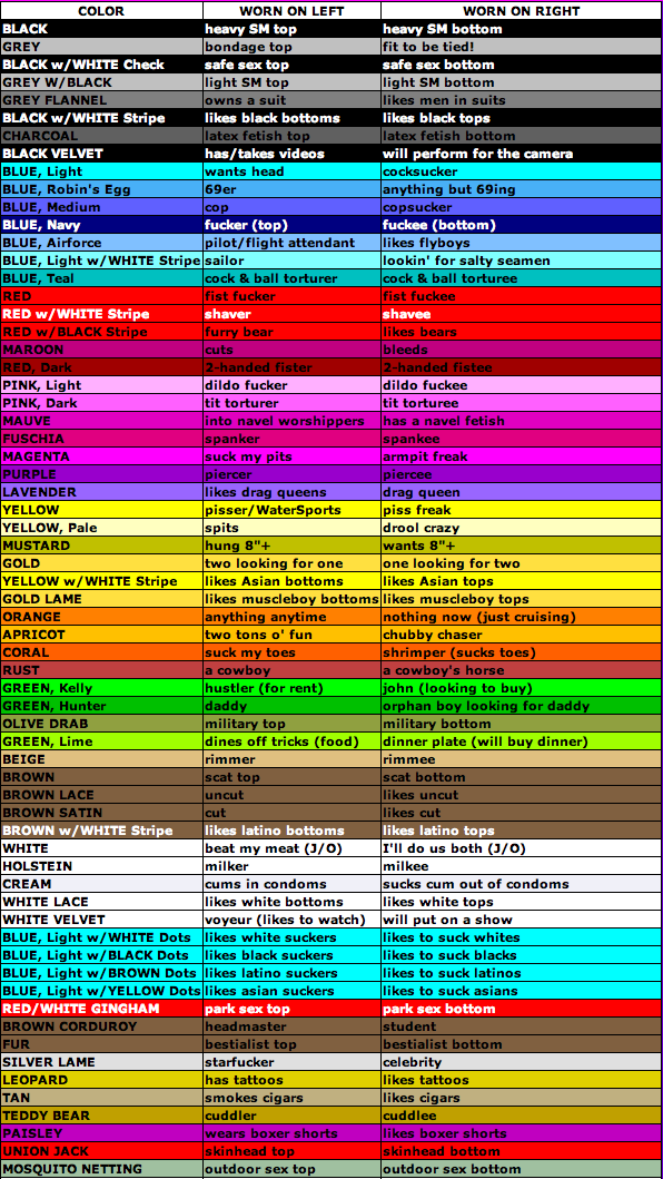
Use the Handkerchief Color Code?
-
If using text only then could also use diagonal of square to increase size of text..
Also could match font style to categor
Here using a military stencil font.
Also can have background to match category (Could use gay handkerchief color code)
But not so good when in small icon size…
I did the test with a background image and saw that it wouldn't work very well on small images, so I thought of something that would look good:
The image of the main category would have 80x80 and the images of the subcaterogies would have 80x40 and would be aligned below the main.
Attached an example in which I just left different colors to illustrate, but it can be all the same color or whatever.

-
High contrast icon opossibilities
Hello! It looks like you're interested in this conversation, but you don't have an account yet.
Getting fed up of having to scroll through the same posts each visit? When you register for an account, you'll always come back to exactly where you were before, and choose to be notified of new replies (either via email, or push notification). You'll also be able to save bookmarks and upvote posts to show your appreciation to other community members.
With your input, this post could be even better 💗
Register Login