New Design
-
P.S. I just noticed that in the header you do indeed have quick links for torrents/forums and the ratio information. In Safari on an iPad it doesn’t appear in portrait mode, it just displays in landscape mode.
So if that information can be squeezed into the space in portrait mode as well that would be fantastic")
-
like the color scheme, less garish colors. still can't up or download, that part sucks.
-
I loved the new design update ;D
-
Overall I like the new look. I like the recent changes including the larger font size and keeping the ration/bonus/etc. info at the top. Would love to see "Search" shown on its own rather than being under the Torrent menu as it's something that I click on a lot, but if I now nee to click twice instead of once so be it. I also love the suggestions made by SuitAndTieX as there seems to be a lot of empty space (when browsing from a laptop). I can understand interacting with the Forum on a phone or iPad, but I am curious to understand why someone would use a phone or iPad to browse the torrent list. As I download files to my laptop hard drive or attached storage, how do you download when using a phone?
Thanks for all the hard work. Love the site and appreciate everyone's contribution to it!
-
I loved the new design update ;D
are you still in love?
or did you love it until you found out something was wrong? :cheers:like the color scheme, less garish colors. still can't up or download, that part sucks.
Can you give me some more details? The best thing to do is to contact the helpdesk. Then our moderators can see how they can help you.
Overall I like the new look. I like the recent changes including the larger font size and keeping the ration/bonus/etc. info at the top. Would love to see "Search" shown on its own rather than being under the Torrent menu as it's something that I click on a lot, but if I now nee to click twice instead of once so be it. I also love the suggestions made by SuitAndTieX as there seems to be a lot of empty space (when browsing from a laptop). I can understand interacting with the Forum on a phone or iPad, but I am curious to understand why someone would use a phone or iPad to browse the torrent list. As I download files to my laptop hard drive or attached storage, how do you download when using a phone?
Thanks for all the hard work. Love the site and appreciate everyone's contribution to it!
I will deal extensively with the menu and depending on the window size I will bring more or less functions into direct access. I'm even thinking about a small configuration option for each individual. e.g. a selectable menu item will always be visible, even in the smallest view. But these are all new ideas that still have to be tried out. Give me a little more time.
Also all suggestions of SuitAndTieX make sense and will be implemented. Also here in search-mod a lot will happen depending on the window size.
There were already suggestions for a new icon design above. What do you think about it? I really need help there. and someone who prepares photoshop files for me. There are always some new categories (like trans) coming up from time to time. And if the designer is gone, someone else has to do it. I'm not so good at it (as you can see).Understand this new version as a work-in-progress version. Of course I hoped for feedback from you and now I get more and more what I expected: You are all really great ! Thank you for taking the time to think about it.
-
I have to agree with flox38 above. I don't know know if it's related to the redesign or just something I noticed coincidentally for the first time today, but in "Browse" some torrents have ridiculously tall vertical-banner type main images that are just way too big. One of them forced me to scroll down nearly two pages to get to the end of it to get more torrents to load and then scroll back up to see them. A maximum image height in browse would be amazing.
Other than that I mostly like the redesign a lot. I'll have to get used to the new menu (specifically the Torrents drop down), but I realize I'm a creature of habit and I appreciate the work that went into this. It's looking good!
-
The new layout is absolutely beautiful, and even seems more functional. I immediately noticed the cleaner look the moment I logged in. No complaints / Just praise.
-
I have to agree with flox38 above. I don't know know if it's related to the redesign or just something I noticed coincidentally for the first time today, but in "Browse" some torrents have ridiculously tall vertical-banner type main images that are just way too big. One of them forced me to scroll down nearly two pages to get to the end of it to get more torrents to load and then scroll back up to see them. A maximum image height in browse would be amazing.
Other than that I mostly like the redesign a lot. I'll have to get used to the new menu (specifically the Torrents drop down), but I realize I'm a creature of habit and I appreciate the work that went into this. It's looking good!
i saw this myself.. there will be a maximum height of pics. if they are higher, the system cuts the rest. i dont see any other solution. i dont understand why people upload such strange format pics :crazy2:
The new layout is absolutely beautiful, and even seems more functional. I immediately noticed the cleaner look the moment I logged in. No complaints / Just praise.
I want to respond to this positive message on behalf of all the other positive comments:THANK YOU :love: :love: :love: !! I am glad that you like it so much. The new layout is not yet perfect. You can see that from the comments of the others. But I think we all notice that this update will bring fresh wind into our site. Your feedback motivates me to go through code that is more than 10 years old. A very rocky but necessary road. It opens the doors to some completely new features you wouldn't even dream of. You can be curious. But first the layout has to be adjusted to our satisfaction. After that I have to take a look at this forum. Its a mess. No search and destructed design. I'm afraid of it because it's very complicated (it even needs db downgrades before it can be updated..) and the forum will be offline for several days. Just a warning: Not everything will be the same as before. I ask for your understanding in advance. But after that I can finally unleash my creativity. No doubt: you gonna freak out !
-
Also all suggestions of SuitAndTieX make sense and will be implemented. Also here in search-mod a lot will happen depending on the window size.
There were already suggestions for a new icon design above. What do you think about it? I really need help there. and someone who prepares photoshop files for me. There are always some new categories (like trans) coming up from time to time. And if the designer is gone, someone else has to do it. I'm not so good at it (as you can see).I'm very good with photoshop and I can even prepare a file to be used as a base for future categories, so if a new category comes up, it would be easy to create a new icon to match the others.
It would be a little difficult for me to select images to use, but if there was a small group or a specific forum for suggestions of these images, it would be very nice and I would offer to help in editing.
-
I keep getting 'plugin blocked' in chrome. what's with that?
That notification is because Chrome is blocking Flash. It's annoying but is not specific to this site. You can click on the little jigsaw puzzle piece in the address bar to read it.
Might be a good idea to look at getting rid of any Flash on the site, though, because Chrome no longer supports it.
-
I use only desktop PC. I would appreciate, on search main menu, instead of jumping to end, please can you give more page option; for example, now it is:
«Previous 1 - 50 51 - 100 183101 - 183150 183151 - 183186 »Next
Instead if you don't mind
«Previous 1 - 50 51 - 100 101 - 150 151 - 200 183151 - 183186 »Next
That would be very helpful!
Thanks!!
-
Looks clean, however, the light grey font on the main page (search) is nearly unreadable for me…. maybe just a bit less shadowed font / background combination? Thank you
-
I'm very good with photoshop and I can even prepare a file to be used as a base for future categories, so if a new category comes up, it would be easy to create a new icon to match the others.
It would be a little difficult for me to select images to use, but if there was a small group or a specific forum for suggestions of these images, it would be very nice and I would offer to help in editing.
Thank you for the offer. Maybe You put up a new Topic for this to discuss. Maybe those icons should not even use pictures. Instead those icons like metioned earlier in this topic.
-
I switched back to the old design as it's just way nicer to have one bar with all the information instead of all the different tabs with all the information.
-
I switched back to the old design as it's just way nicer to have one bar with all the information instead of all the different tabs with all the information.
you got a point.. i try to put those infos back into the menu. im not sure how - yet. be patient and give it another try
and to the rest of you, what do you think of my recent color tweak in the search results ? now you should be able to read it good. nice constrast
-
I want to respond to this positive message on behalf of all the other positive comments:THANK YOU :love: :love: :love: !! I am glad that you like it so much. Your feedback motivates me to go through code that is more than 10 years old. Its a mess. No search and destructed design. Not everything will be the same as before. I ask for your understanding in advance. But after that I can finally unleash my creativity.
No doubt: you gonna freak out !
Happy to be the spark that further propels your creative process. I know it's tedious work. Plan carefully, then go wild! I look forward to freaking out!
-
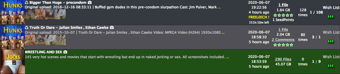
Hi, the colors of a non-downloaded and completed torrent need to be changed. It is very difficult to ascertain what is which with the new color scheme.
For the old layout, it was:
Non-downloaded: Grey
Downloaded, but not completed: Light green
Completed: Dark GreenFor the new layout it is
Non-downloaded: Dark Grey
Downloaded, but not completed: Green
Completed: Light GreyPlease can you change the light grey to something easier on the eyes and easy to identify.
-
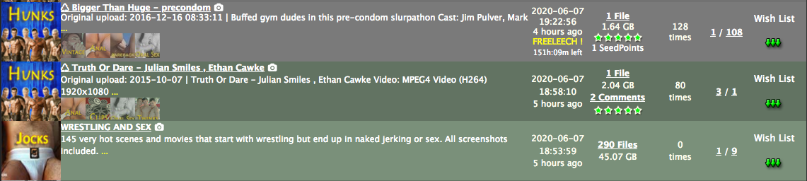
Hi, the colors of a non-downloaded and a downloaded but not completed torrent need to be changed. It is very difficult to ascertain what is which with the new color scheme.
For the old layout, it was:
Non-downloaded: Grey
Downloaded, but not completed: Light green
Completed: Dark GreenFor the new layout it is
Non-downloaded: Dark Grey
Downloaded, but not completed: Light Grey
Completed: GreenPlease can you change the light grey to something easier on the eyes and easy to identify.
i agree
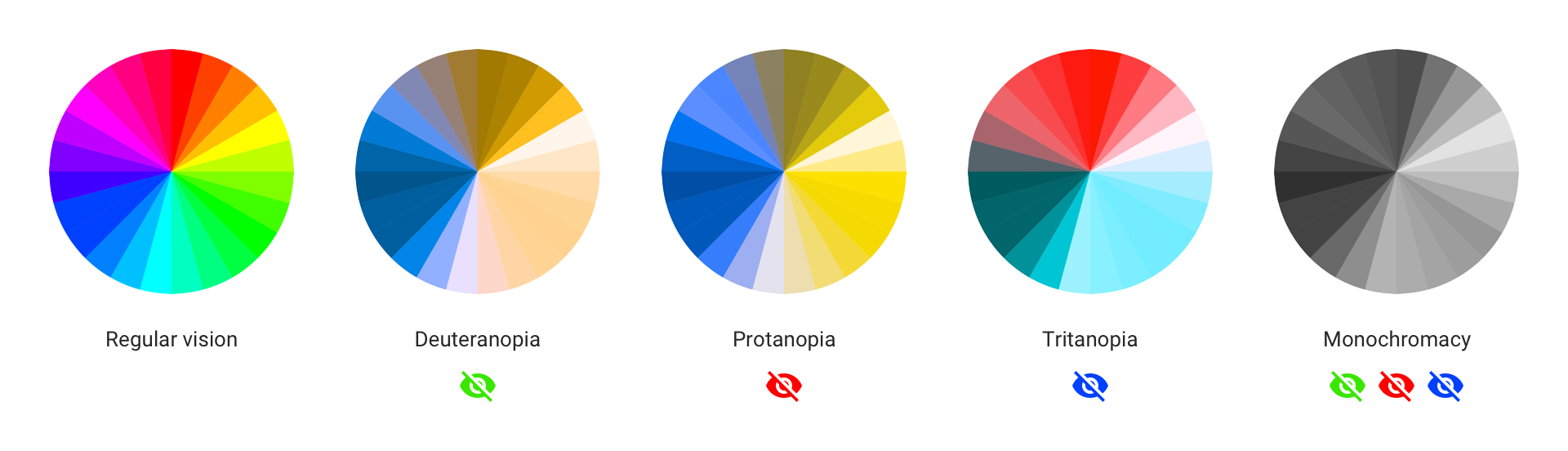
well im color blind and would like to get some help here.. could you please supply 2 color codes you think are the best here?edit: now we have "light green" for "downloaded"
"dark green" for "completed"hope this is better..
but i still dont like the green tone … so if someone please supply 2 better greens, i would highly appreciate it. -
Hi, the colors of a non-downloaded and a downloaded but not completed torrent need to be changed. It is very difficult to ascertain what is which with the new color scheme.
For the old layout, it was:
Non-downloaded: Grey
Downloaded, but not completed: Light green
Completed: Dark GreenFor the new layout it is
Non-downloaded: Dark Grey
Downloaded, but not completed: Light Grey
Completed: GreenPlease can you change the light grey to something easier on the eyes and easy to identify.
i agree
well im color blind and would like to get some help here.. could you please supply 2 color codes you think are the best here?Hi, which colors would you find most comfortable? If you're color blind that shouldn't exclude you either - colorblindness and visual fidelity loss with age mainly affects the red/green tones (i've attached a picture). Maybe it would be best to go with blue for complete (0A84FF) and teal for downloaded but not complete (64D2FF)? I'm not 100% sure since I haven't looked into UX design for a while, but there's a reason why most websites are blue (Facebook, Twitter, etc). Or we can go with another color set of your liking?
-
i dont like this colors together with the existing rest.. this would need a complete redesign of all colors.
for that, someone would need to edit the CSS and supply a complete new skin
Hello! It looks like you're interested in this conversation, but you don't have an account yet.
Getting fed up of having to scroll through the same posts each visit? When you register for an account, you'll always come back to exactly where you were before, and choose to be notified of new replies (either via email, or push notification). You'll also be able to save bookmarks and upvote posts to show your appreciation to other community members.
With your input, this post could be even better 💗
Register Login